Quantcast
Channel: The Watercolour Log
Viewing all 502 articles
Browse latest View live

Book Review - Experimental Landscapes in Watercolour' by Ann Blockley

$
0
0
Ann Blockley, previously better known for her flower paintings, has in recent years changed direction somewhat and this book is the latest manifestation. Her flower paintings were never botanical, being more of flowers in the garden or landscape, but they were never abstract. My sister, who lives in the Cotswolds not very far from Ann Blockley, has two of her earlier paintings, one of snowdrops the other Hollyhocks so I have been able to study them in the flesh. (This review is by courtesy of Yvonne Harry who loaned me the book.)


Ann Blockley at work

 Ann's father was the famous John Blockley, one of the leading artists, a contemporary of Wesson  in landscape painting in watercolour, although many of his paintings were of fairly bleak scenes, including coal mines in Wales, hill cottages and farms. Colours tended to be muted. Late in his career he changed style completely and his later paintings bore little resemblance with brilliant colours and an almost abstract approach. As well as watercolour he also painted with pastels and was President of the Pastel Society. I have two of his books, `Watercolour Practice & Progress' and  `Country Landscapes in Watercolour'.


John Blockley

Ann has written several books and I have `Watercolour Textures', published in 2007. This latest book goes well beyond that.


Approx.10 x 9 inches, 128 pages, Batsford 2014 UK £18.99 USA $27.95

The book is divided into 6 sections, with the largest one on `Methods and Medium'. This involves the use of Acrylic ink, gouache, scraping, scratching and cutting, salt techniques, granulation textures, cling film, cellophane, fabrics and much else. There is a chapter on the use of Gesso and collage. The book is profusely illustrated showing and describing the use of these various techniques. There are some paintings I like but many that are too abstract for my taste. Nearly all are very colourful.

I am certainly not averse to using different techniques in watercolour and if you are into this then this book could be very useful. I am somewhat lukewarm about it and it is a step too far for me. On the other hand several of the ladies at my Artists group are big fans of hers and intend to visit - or have visited - her latest exhibition which is tied in with the book launch. The book has been printed in China and the initial tranche supplied to the UK soon sold out. Ann was trying to get more for the exhibition. Added 05/06/14: Jan Weeks visited the exhibition, which is on this week, and said the paintings were `fantastic'. Apparently some visitors expressed disappointment as there were no flower paintings on view.

If you are into all the various techniques mentioned above you could look at the books by the American author Cathy Johnson which are available on Amazon at very good prices. These illustrate the various methods, materials and techniques individually. 


Latest Paintings

$
0
0
These are my latest paintings which continue my interest in Native Americans, in this case Eskimo or Inuit women with children and a Nez Perce man.


Ist Painting 16" x 12" 


2nd painting 16" x 12"

I was very taken by photos of these Amerindian (Eskimo) women with child on `Moses on the Mesa' on Facebook. Possibly I could have been a little more subtle and I'm tempted to have another try, particularly of the first one.


Pa-tik-he-ke-heci . A Nez Perce man 1908 - 16" x 12" from the wonderful resource for American Indian photographs on Facebook "Moses on the Mesa"


 The Agami Heron

This is the latest bird painting for the `Paint Colorful Birds for Fun" community on Facebook. I love these bird studies!


Daler-Rowney Watercolours

$
0
0
Daler- Rowney are one of the very oldest watercolour manufacturers dating from 1783. The company was started by Richard and Thomas Rowney and they supplied, and were family friends of, famous artists like Turner and Constable.

In 1963 they introduced the first artists acrylic paints in Europe and in 1969 moved from Central London to Bracknell, where they currently reside. I have actually visited the factory and seen watercolours being produced.

Generations of Rowney children running the company ended in 1969 when the last MD Tom Rowney, who was childless, sold the company to Morgan Crucible, a conglomerate who had managed Rowney's operations for a number of years.The Daler board company was incorporated in 1946 and the American brush maker, Robert Simmons, purchased in 1994. To my surprise I also discovered that the German paint maker Lukas became part of the Rowney group in 2013.

While Rowney produce a wide range of artists  products this is about the watercolour line or should I say lines. These are the Top of the range Artists Watercolours, Aquafine student colours and Simply. I am primarily concerned with the top artist's range and have no experience with these cheaper products.


The range comprises 80 colours in total, 66% single pigment paints. and are priced in only two series. Prices are generally very good and paints are cheaper than many of the other artists quality paints. In my opinion quality is good and on a combined price/quality basis they are an excellent buy  - one of the best in fact.  Not everyone can afford Daniel Smith and the other more expensive makes. Surprisingly so are (or were) Lukas so it will be interesting to see what effect the Rowney ownership will have. 

How good are the paints? Bruce McEvoy of Handprint in 2000, pretty much damned them as a `second Tier' brand in both price and quality. I have a great regard for Bruce but I think he is somewhat harsh in his criticisms. He did single out and praise Warm Orange (PO73), Indian Yellow (PY153) and Cobalt Blue Deep (PB72). A few years ago I did some workshops with the artist Trevor Waugh and he was then using Rowney paints, although he did say he preferred some colours in other makes. Amongst other subjects he painted flowers and the results were superb. Many other British professional artists use Daler-Rowney watercolours quite happily. I do use some Rowney colours, Indian Yellow and Cobalt Blue Deep being staples plus a few others. With the Indian Yellow the demise of PY153 puts a question mark over this one although I still have several tubes. I actually bought them at F.J Harris in Bath, a local art shop , who have been selling Rowney watercolours for months at better prices than the mail order specialists! Windsor & Newton and Rowney pretty much have a monopoly in British art shops so I imagine it is in their interest to support local shops rather than let them be swamped by the mail order specialists. I've noticed the local shops having some better deals in the last year or two.

Of course personal preference plays a large part in selecting paints and what suits one doesn't necessarily suit another. If you are looking for a good quality watercolour at a keen price then they are worth a try. www.daler-rowney.com/


The European Crested Tit

$
0
0
This is the latest subject, no actually another has just been posted the Grey Heron, for the `Paint Colorful Birds For Fun' community on Facebook.


12" x 9" Paper (?)

It struck me I was painting many of the birds on too large a sheet of paper so this one is smaller. As can be seen it allowed my preference for colourful subjects to flourish. After a careful contour drawing I used Pebeo Drawing Gum (masking fluid) on the head, mainly on the area above the eyes. There is also a little in the wing area, in every case just fine lines - no large areas, as well as  the tree trunk. This was applied with a ruling pen, which I find very useful for this type of work.  I know a  number of artists urge caution about the use of masking fluid but it is very useful as long as it isn't overdone.


Geronimo!

$
0
0
Geronimo was the famous or infamous Chiricahua Apache leader who terrorized the South-West of America and large tracts of Northern Mexico during the mid to late period of the 19th century. His band were (officially) the last hostiles to surrender in 1881. Immediately following the surrender they and their families were bundled on a train and exiled to Florida. Eventually he was rehabilitated and lived out the last stages of his life as something of a celebrity. This study was painted from a photograph taken during the latter period. Some Apaches allied with Geronimo never surrendered and took refuge in the wild and largely uninhabited Sierra Madre mountains of Northern Mexico. There were reports of incidents as late as the 1920s and I suppose it is possible remnants still remain to this day. 


My setup with guide photo 


 Contour drawing graphite mechanical Pentel pencil 07 2B 

I first made a careful contour drawing ensuring everything, eyes, nose, mouth were in the right place and to scale. The two things that struck me about this photo were the hard, piercing eyes and the steel trap of a mouth, although less daunting than in his hostile days. 


Geronimo - Waterford 16" x 12" High White Not 140lbs (300gsm) 

I first painted the eyes, then the nose followed by the mouth. In order to get the skin colour fairly dark I used Translucent Brown (Scminke PBr41) as the main component instead of Cadmium Red. Cadmium Red also featured as a secondary colour with very small amounts of Raw Sienna.To darken I used Cobalt Blue Deep.(Rowney PB72). When painting the face I didn't stop at the boundaries but continued into the hair. I tried to harmonize the whole avoiding cutouts and painted mostly wet in wet. The hat colours are Ultramarine Blue,  Translucent Brown and Raw Umber, again mainly wet in wet. Overall I avoided too `pretty' an approach and adopted the `be slightly crude' advice of Charles Reid. I'm happy with the result.

Brushes were the usual Isabeys and the Da Vinci Artissimo 44.

Watercolour Brushes Pt.2 Sables

$
0
0
"the very best and most expensive watercolour brushes are made from the winter tail hairs of Mustela Sibirica, called in the art world a Kolinsky, but sometimes referred to as a Siberian Mountain Weasel - although there seem to be a lot in China, seen often in Beijing, where it is called a `Yellow Rat Weasel'. I believe `rat' is in the name because it kills rats, and traffic will sometimes stop in Beijing to let one across the street because of this propensity........brushes are also made from Martes zibellica, called a marten, and from `Kazan Blue Squirrel' (and a few other Russian squirrels) which I have not been able to identify.....The problem I want to address, to put it bluntly is that there is a lot of cheating and obfuscation going on in the brush market mostly around kolinsky brushes which, as I have said, are very expensive - running in the hundreds of dollars...."

As the weasel family is quite large, and not all confined to China and Russia, Canada and Korea for example are another source of tail hair, then it seems likely other similar species are involved but presumably expert brushmakers can determine what is genuine and what isn't. Can they? Does it matter if the species are very close? If marketed as genuine Kolinsky the answer is yes.

The above but one paragraph is an extract of an e-mail published on Wetcancas from the collections manager of the mammal department of the American Museum of Natural History in New York, so I have assumed, he knows what he is talking about.


The Kola Peninsula in Siberia. Is this the only place where genuine Kolinsky sable hair was once  obtained? Are any weasels of the right species still living or are they extinct? I have read that they are `endangered' or alternatively (see above) running about the streets in Beijing! Who or what to believe? According to the excellent blog Channeling Winslow Homer Mustela Siberica has long been trapped to extinction in Siberia and other species of weasels - similar in many ways - are used instead. It would seem therefore that the use of `Kolinsky' is largely a misnomer. A bit like Cheddar cheese. www.channeling-winslow-homer.com

Most sources say the finest hair is from the male animal and should be harvested at a particular time of the year - the Siberian Winter is normally quoted. However Wikpedia says that `most brushes have a mix of about 60/40 male-to female hair'.

Another piece says:

`Manufacturers obtain the hair for their brushes from hair dealers, who, in turn, get hair in a rough state (pelts, tails, etc) through the fur industry. The hair dealers `dress' (de-grease- clean etc) the hair,  grade it, and bundle it by size and weight. A brushmaker is then offered the different grades and mixtures. If he is not careful, however, he may unknowingly receive summer coat instead of winter coat, or other hair mixed in with the Kolinsky hair.'

I could go on and on as there is a mass of information to delve into but where do you end? The final buyer, ie us artists, haven't a clue as to whether we are getting the genuine article or not. All reputable brushmakers claim that they use `the very finest' hair and so they may or indeed think that is what has been supplied.

Rosemary of Rosemary & Co says:

 `like most things the better the ingredients and raw materials the finer the end result. Beware of the less expensive so called `sable brushes. many contain little or no genuine sable at all regardless of what it says on the handle. Others may contain sable hair which hasn't been `dressed' properly or indeed sorted by length.'

What to make of all this? My response is a great deal of scepticism since we all know that all is not what it seems and even well-known companies cannot be 100% relied upon. I'm not suggesting they deliberately mislead, but when we see what is and has happened in other spheres why should the art world be any different?

Now to the brushes. I can only comment on my own limited experience but perhaps point you in the right direction when making choices. There are many brushmakers and the ones I know most about are European. I know little or nothing about those in America, Asia or elsewhere. If any readers would like to share their experiences I'd be delighted to add them to this piece.


Winsor & Newton Series 7


Where do we start? To my mind Winsor & Newton series 7, which are the most expensive sables of the lot. Winsor & Newton are no longer the famous British company of old, having been sold first to a Swedish Company and then most recently to a German one. They've even moved manufacture of the artists watercolours to France. Are the old traditions being maintained? The ether has been thick with innuendo and rumour about W & N for sometime, the general drift being that standards have slipped and quality is not what it was. This applies to brushes and paints. Some of this may well be misinformation spread by jealous rivals but it does make you wonder when you look at the way the company has been hawked around. Frankly the prices of series 7 are ridiculous and I wouldn't contemplate buying them when such excellent brushes are available at much lower prices. See what Rosemary says in her catalogue in the questions and answers section.
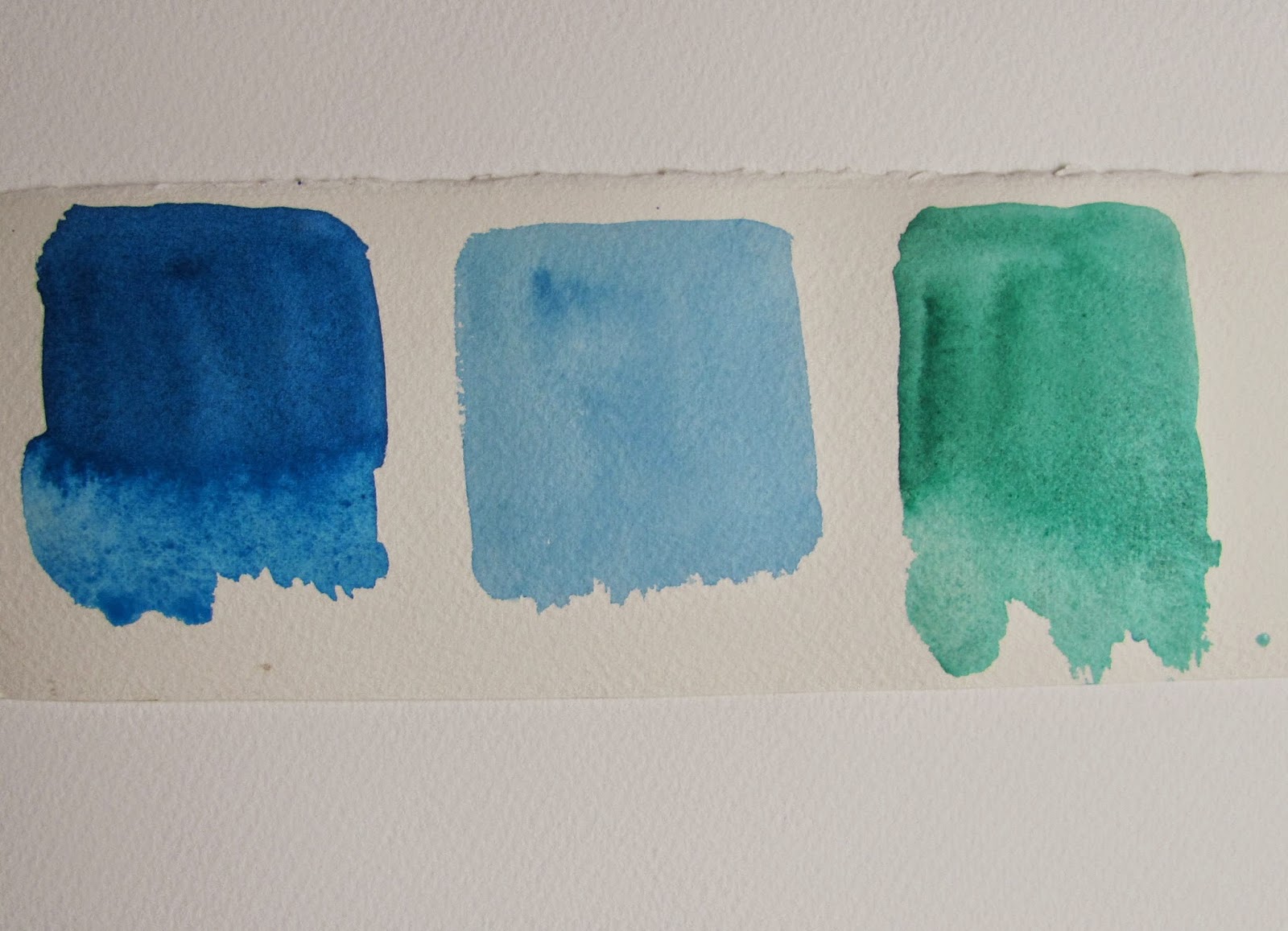

The above illustration comes from the excellent website of Dakota Brushes www.dakotabrushes.com/ I cannot recommend this website highly enough for the mass of useful information. Detailed statistics on all the makes above with brushhead diameter and length given for every size so that you can easily see which - at least in volume of hair - are the best buys. Highly informative and a good source of brushes in North America.

Let us first of all look at sizing. The above are all size 8 but as you can see there is considerable variation. Winsor & Newton claim their series 7 are up to two sizes larger than most other makes but in the above comparison the one that stands out is Da Vinci, while Escoda who are being heavily promoted by a number of high profile artists, is easily the smallest but comparable to Isabey. Naturally price comparisons have also to be made in association with actual size. In that respect Escoda don't fare too badly.


The above are three Da Vinci series. It appears the numbering may vary in different markets.


This is from the excellent website of  Luxartis run by the wife (I believe) of the artist Jake Winkle. They claim the brushes are longer and slimmer than most other makes. I purchased a No.8 which is yet to be christened but examination of it didn't seem to validate their claim. www.luxartis.biz/ 


From top to bottom: SAA Kolinsky 10 (made I'm told by Raphael), Da Vinci Maestro 10 series 10, SAA Size 8, Escoda 1212 Size 10, Da Vinci Maestro 8, Luxartis 10.

As you can see there is considerable variation in the actual  size of the brush head. Raphael look pretty good and so does Da Vinci. Since I did this I obtained some Isabey brushes and like them a lot. They are on the small side size wise but long and slim. 


Rosemary offers a wide range of sable brushes, listed as either Kolinsky or red sable. She maintains she uses the best quality hair, as all the leading makers do, and her comprehensive range is well worth investigating. This includes some nice travel brushes. I have had a number of her brushes over the years. The most popular sable range is Series 33 and many good artists swear by them. I purchased a sable mop some time ago and regretted it ever since. It was under the previous ABS label but as the Rosemary range is identical (with additions) to the ABS one then I imagine the current mops are similar. Why don't I like it? It certainly doesn't point well and is useful only as a wash brush. You can get good wash brushes for a lot less than £50. I think the one I bought was too large for my purposes.  I have found that brushes  from ABS and Rosemary can vary. Some are splendid but others have been less satisfactory. I have heard claims that `they don't point well' from some artists I've met but others love them. You can't really compare Series 33 with the top of the range Da Vinci, Raphael and Isabey, all of which are much more expensive. Rosemary does a top of the range Series 22 which is comparable, certainly in price. With a superb catalogue, enormous range and excellent worldwide service, Rosemary brushes are well worth considering. www.rosemaryandco.com

Raphael, who are French as are Isabey, make a wide range of `Kolinsky' sables. They have several types of round with different characteristics. The best source I know is Great Art www.greatart.co.uk, whose website gives full details of the range. My SAA brushes remain pristine as does a Raphael Series 8404 size 8 so I have yet to us them. Gilles Durand, a fine French professional artist who I met on several Charles Reid workshops said they lost their point after about six months. The brushes look good to me  but prices are  steep.

Da Vinci, a German company but - I am told - with no connection to the American paint maker Da Vinci, are a favourite and recommendation to his students for many years from Charles Reid. They make excellent brushes. So far I've only used the Artissimo 44 Kolinsky mop Size 2. This is roughly equivalent to a 14 in the normal type. I like it a lot but recently the hair became detached from the brush head! the whole head just popped out! Fortunately I was able to  put it back in again but this is not good for a brush costing £50 or so. 

Escoda the Catalonian company are making a stir with a high profile marketing campaign using some very well-known workshop artists. They market an increasing number of sets - usually three brushes - with the artists name on the handle. Escoda are a good company and well worth considering. Some of these artists go over the top with their claims that Escoda are `the best in the World'. Good certainly but best in the World?  I doubt some of the others would concede that and neither do I, although I do think they are excellent brushes.

This is only a snapshot of what is available. Pro Arte, better known for synthetics, make an expensive Kolinsky range. Both Winsor & Newton and Daler Rowney have other sables, some classed as `less expensive'. I have heard good reports of the Israeli Rekab brushes and so on. Art suppliers have their own label Sable or Kolinsky brushes and more seem to be appearing.  It is bewildering and also confused by variable reports from different artists.

I asked my good friends Michael Carney and John Softly on their views. Mick prefers Da Vinci and Raphael but was not impressed with the Windor & Newton series 7. He has had mixed experiences with Rosemary brushes, rather similar to me it would seem. John is cynical about `Kolinsky' and believes most if not all so-called Kolinsky brushes are not genuine. After my research so am I, although it seems there are several species of weasel that are very similar.


ABS (now Rosemary) Eskdale, 8, 10, 12, & 14 plus W & N Series 7, 3,4 & 7

John has 38 in total, I must be close to that figure (!), a mixture of ABS Eskdale,  Roymak, Escoda and Series 7. I don't know Roymak, but some of them date back 15 years or more and still point well. For an extensive amount of information on brushes as experienced by members try Wetcanvas, then Watercolor, then The Learning Zone and search for `Brush reviews'. This is particularly applicable to the experiences of American members. You can find out much more if you are interested by `googling' around.

Now to pricing. Taking Jacksons www.jacksonsart.co.uk as a fairly reasonable guide the following prices are current, all size 8. Escoda 1212 £13.20p, Raphael 8404 £22.50p, W & N Series 7 £105, Isabey £29.25p, Jacksons Tajmir (made by Escoda) £11.00p, Jacksons Kolinsky £14.60p, Da Vinci Maestro  10 £26.50p, Da Vinci Maestro 35 £30.30p. Rosemary Series 33 £12.75p and Series 22 £29.95p. Once past size 8 prices leap into the stratosphere. The dearest Series 7 is a 10 at £151.00p! Da Vinci Maestro Series 10 go to a huge Size 50 (who would want such a thing?) at an incredible £1024.00p. Escoda make an 18 at £115.60p, Raphael; a 16 at £113.00p and Isabey a 14 at £101.20p. Rosemary makes a size 24 in series 33 at £450.00p and a series 22 in size 20 at £517.50p. Eyes watering  and head spinning yet? 

As you can see there is quite a variation from the ridiculous £105 of W & N - how they get away with it I just don't know - to the £11.00 of Jacksons own brand. As I've highlighted earlier size is only a rough guide as brands vary since there is no recognized industry standard so this is also a factor in deciding what to buy.

The final question. Do you need to buy sable brushes, whether they are called Kolinsky, red sable or just plain sable  to produce good paintings. The advantages of sables are said to be much better water retention and controlled release of paint plus control over brush strokes. However despite these qualities the answer is NO and if you read what some of the fine artists I've featured use you will see this is so.  The real key is the hand that controls the brush. Okay I'm a brush freak but that's just me.  

I think I'll end it there. 


Jaguar

$
0
0
Normally I'd post this in the previous AVA post but as It has created quite a lot of interest, both at the meeting and subsequently when I posted on Facebook, decided to cover it separately in slightly more detail.


As setup at the session. You can see the guide photo on the left.


Roughly half-way through - the danger point where things can go badly wrong.

I decided to try and do something a little more adventurous in subject matter  but consequently difficult. I made a careful contour drawing at home the previous day as I thought I might arrive rather later than actually occurred, due to the hearing aid appointment. Actually I also made another  drawing of a snow leopard. but more on that later.


Studying the drawing and photograph I started with the eye on the right hand side because I thought this would be the difference between success and failure. Get the eyes right and the first real hurdle is overcome. I proceeded to paint the area around the eye, initially with Quinacridone Gold (Daniel Smith PO49), Quinacridone Rust (Graham PO48), Raw Sienna (Pbr7) up to and including the ear. There is Ivory Black around the eye. I added the black spots, Maimeri Ivory Black, more or less as I was going along after most parts were dry. There was some wet in wet but  only a little. I then painted the nose area before proceeding to the left hand side, which was mostly in shade. I did the eye first with the small yellow areas around it then proceeded to paint the shadow with various mixtures of Ultramarine and Burnt Umber plus some Ivory Black. I was careful to try and avoid a `Paynes Grey effect' - where the greys can be really dead and flat looking. I added some more blue and Burnt Umber later wet into wet. I also added similar mixes on the right hand side adjacent to the head. I  added the black spots as I went along but can't remember the exact sequence.


16" x 12" Saunders Waterford High White 140lb (300gsm) not

I should add I used Pebeo Drawing Gum, carefully applied in thin lines with a ruling pen, for the whiskers at the time I completed the drawing and the day after the AVA session a few touches of Galeria Acrylic White. Both the Pebeo and the Galeria need careful handling, get them on your clothes and lookout! Brushes were my Rosemary travel Kolinsky brushes sizes 6 and 10 with the Isabey size 6 for the fine work. There are elements in this painting I've never attempted before and I'm pleased with the result. I should add though that yesterday I started painting the snow leopard, made a complete mess and scrapped it. I shall attempt another today. 


Latest Paintings - Three Different Subjects.

$
0
0
I mentioned in the Jaguar piece that I'd also drawn a Snow Leopard but then made a mess of the painting, so scrapped it at an early stage. My usual reaction to disaster is to go straight back in so the following day I started again.


The drawing - my usual mechanical 07 2B pencil


Stage 1 completed I painted the rest the following day.


Snow Leopard - 16" x 12" Waterford High White 140lb (300g) not

I was moderately pleased after finishing this, although I think the Jaguar painting is superior. I keep looking at it and think it is missing something. I suspect I know what it is and to do with the background. I used several colours and my usual brushes.

My next painting is another Amerindian, in this case a Chippewa warrior circa 1869. His Indian name is a lengthy and complicated one but apparently a loose translation is `Evening Sun'. What attracted me to it oddly enough was the large fur cap he wore and even shaggier fur coat. Amidst all this his face is quite small. Normally I concentrate on the face and fill most of the paper with it.


16" x 12" Fabriano Artistico Extra White 140lb (300gsm) not

While I'm again quite pleased with this painting one error is that I've made the feather too large relative to the remainder. You can see this quite clearly in the guide photograph.  I used Translucent Brown (Schminke Pbr41) with a little Raw Sienna as the skin colour darkened with either Cerulean or Cobalt Blue. Three brushes were involved, the Rosemary Kolinsky travel brushes sizes 6 and 10, and the Isabey travel brush size 6. The Isabey, while long is much smaller in diameter than the Rosemary 6. It is good for the detail, especially the eyes. About 2 hours max. 


16" x 12" Great Art Centenaire 140lb (300gsm) not

This was my submission for the AVA subject `Interiors' last Thursday. It is on the back of a discarded painting as is the Amerindian. Once again I forgot my camera so cannot cover my fellow artists work. Colours are mostly blues plus Ultramarine Violet, Quinacridone Coral, Perylene Maroon, Raw Sienna and touches of a few others. It is simple and modest  but I quite like it as the subject is one I wouldn't paint by choice.   


Tropical Fruit

$
0
0
This was the subject at Thursday's AVA session. Attendance was on the light side with only thirteen present, possibly due to grandparenting duties as it was half-term.. Below are a number of the members shown at work.


Pauline Vowles


Pat Walker


Yvonne Harry


Robert Heal


Yvonne Harry


Pat Walker


Peter Ward

I wasn't too happy with this. I actually played around with an ipad app called  Waterlogue. This converts photographs into watercolour images. There are about ten variations. I showed this to both Pat and  Pauline who were both impressed with the possibilities. Yvonne's first impression was negative in that she thought it was copying a painting, which is prohibited. Actually it isn't as these are computer generated images and not paintings. You can then paint the subject and having seen the generated images it perhaps suggests ways of tackling the subject. I think the possibilities are there but it needs much experimentation and is no panacea. The resulting painting is overworked and I don't think the Centenaire paper helped, especially as it was on the back - technically the wrong side - of a reject painting.


The paintings put up at the end of the session. A colourful selection. 


Sofia Helin

$
0
0
Sofia Helin is the star of the Nordic drama/thriller `The Bridge'. The two series have been a dramatic hit on TV's BBC4 and a third one is planned. It is one of the several Foreign subtitled dramas shown in recent years on BBC4, including Wallander, Inspector Montalbano, The Killing, Borgen and two rather dark French series Spiral and Branque. Not sure if I've got the last named correct. I've enjoyed them all and they make a welcome change from the way special effects, especially in films,  have overwhelmed dialogue and storylines in many English speaking productions. 

The amazing thing is that she looks completely different from her damaged character Saga Noren; which illustrates what a brilliant actress she is. I was inspired to do this from  a cover photo on the Guardian Weekend magazine for which thanks.


Sofia Helin - 16" x 12" Waterford High White 140lb (300gsm) not

I first made a careful drawing - as careful as I'm able - using my favourite Pentel mechanical pencil 07 2B. I began by painting the eyes followed by the nose and mouth. Colours were Cadmium Red Pale (Rowney), Cadmium Yellow Pale (Lukas I think) with a very little Cerulean. Her complexion is extremely light and the photograph doesn't lend itself to pronounced shading. Another problem was the hair, which is almost white-blond in places. I was taken by the overall colours, particularly the red cap but her eyes - to me - are the key feature so I concentrated on those. 

Colours for the hair were Raw Sienna, Raw Umber and Quinacridone Gold (Daniel Smith PO49). There is a little Burnt Umber in places. The hat is Quinacridone Coral (Daniel Smith PR209) a fabulous colour.The blue in her top is Ultramarine.

Brushes were all Isabey, travel brushes 4 & 6 and Kolinsky sables 4, 6, and 8.

I'm quite pleased with this one. The likeness, while not perfect, is pretty close.


Keynsham Art Trail

$
0
0
Avon Valley Artists participated in this annual (or is it bi-annual?) event on Saturday and Sunday 29th and 30th June.  I have become disenchanted with exhibiting but was persuaded to do so once again. 


Our leaders Yvonne Harry and Jan Weeks


The two top and bottom left are mine. I'm afraid I didn't note the others.


The painting on the left is by Jan and that on the right by Yvonne.


Pauline Vowles on the left, Jan Weeks on the right


Due to the size of the hall paintings were restricted to 4 framed per member plus as many unframed as you wished. This resulted in a total of 70 framed paintings making an excellent exhibition as can be seen above. Quality is high for an amateur group. There was a steady stream of visitors over the two days.

I don't know what the final sales total was but once again Yvonne  and Jan were the most successful artists, . Interest has been expressed in my painting of the Jaguar but I decided it was NFS.


Sitting Bull

$
0
0
My latest Amerindian is another attempt at Sitting Bull, the famous Sioux leader and implacable foe of the white man. His opposition eventually got him killed while in captivity. He obviously didn't appreciate his photograph being taken, many Amerindians felt the same, mostly on superstitious grounds which is why he usually scowls. 

This is the sequence the painting took, purely to show how I did it, not claiming in any way that this is good or the way to proceed.


I now mainly use the ipad for references due to the high cost of printings photographs on the inkjet.


I made the drawing by drawing visually without using any mechanical measuring aids. This involved a certain amount of erasing and redrawing but (for me) that's normal. A mechanical pencil the Pentel O7 3B.


I began with the eyes then nose and mouth.


The above three photographs show the approximate sequence I followed.


Sitting Bull - 16" x 12" Waterford High White 140lb. (300gsm) not

As I am constantly criticized by my friend Hap, who knows many native Amerindians, about my skin colours not being dark enough I have altered my skin mix, although I'm not confident the above will meet with his approval. Instead of Cerulean I used Ultramarine Blue and cut down slightly on Cadmium Red.I also used some Translucent Brown (Schminke Pbr41). I played around with the combinations and when dry added some pure Cadmium red in diluted form. The hair was a mix of Ultramarine and Burnt Umber, with Ultramarine predominant. Brushes used were my usual Isabey sables including retractables.  

I am reasonably happy with the above result. His face has a `craggy' look so I used a little dry brush and added acrylic white for highlights when fully dry. Texture is difficult in watercolour, although books have been and are being written using clingfilm, gesso, scraping, scratching and heaven knows what else to achieve this. I'm not against any sort of aids but it is easy to overdo it and lose the vibrancy and freshness that is the main charm of watercolour.


Paynes Gray - Hero or Villain?

$
0
0
The title may be melodramatic but this paint is one of the most controversial there is, damned by some and praised - or at least used - by other artists. Grey is even spelt differently,  `grey' or `gray'!


Maimeri : Paynes Grey on left, Ivory Black on right.

That doyen of Australian artists, Robert Wade, had this to say " My present palette does not include......Paynes Gray (and when you mention that colour, say it in a hushed whisper!)". He also calls it a `dead' colour  (in the same piece he also damns Burnt Umber and Yellow Ochre!) . One of his reasons is that the colour dries several values lighter BUT whose Paynes Gray does he refer to since this is a convenience colour? I suspect Winsor & Newton  as he was using W & N at the time he wrote the book  `Robert Wades Watercolor Workshop Handbook' (International Artist Publishing 2002).

We then go to Ron Ranson who mentioned the controversy in at least one of his many books saying that combined with some yellows Paynes Gray made some interesting greens and concluded by saying it was " a tremendously useful colour". Charles Reid, while not having Paynes Gray in his normal palette certainly used it on occasion, mainly for skies.

What does Handprint say? This from Bruce McEvoy : " The watercolourists four traditional shadow colors were Neutral Tint, Payne's Gray, Indigo (See the Indigo convenience mixtures) and Sepia (see the convenience mixtures under Pbr7)"

Pigment information for Winsor & Newton is PB15 (Blue), PBk6 ( Black) and PV19 (Quinacridone Rose or Red), in other words a blue, black and red combination. Daniel Smith, the flavour of the moment combine PB29 Ultramarine Blue, PBk9 Black and PY42  a yellow often featured in Yellow Ochre or Raw Sienna paints. Maimeri on the other hand combine PB29 Ultramarine Blue with PBk9 black. Holbein have four pigments in their version PR83, PB27, PB29 and Pbr7 - note a red, two blues and a black. Schminke offer two versions, Paynes Grey (PR101, PB29, Pbr7) and Paynes Grey bluish (PBk6, PB15:6), which they say was produced `by demand', and finally Daler Rowney who use PBk7 and PB29 - a black and a blue. These are the ones I've looked at but I'm sure you get the picture. What to do and do you really need this colour?

The swatch is from an old tube of Maimeri Payne's Grey I've had for years. It is still viable although I haven't used this colour in recent years. I hesitate to differ from someone as exalted as Robert Wade, a charming man as well as a superb artist, but in my limited experience it was useful for dark storm clouds. As for making greens I wouldn't know.

Do you need this colour? I'm inclined to say no as it is easy to mix an approximate `Payne's Gray' from a combination of Ultramarine Blue, Burnt Umber or Burnt Sienna. You might have to play around with the  proportions but you get there in the end.

Charles Reid

$
0
0
I'm not exactly certain when I first became aware of Charles Reid. I believe it may have been an article in `The Artist' magazine in association with his latest book. Initially I had mixed feelings about his style as it was so different to most others, and his methods and teachings went against much of the existing orthodoxy.  Despite these misgivings - I had in the meantime bought `Painting  Flowers in Watercolour ( First published 2001 with two DVD's) - I gradually became more and more intrigued and about this time came into contact with Craig Young, from whom I bought a palette. At that time Craig was organizing Charles UK workshops and he told me that all Charles various techniques were explained in the flower book. His approach to all subjects is the same.

One thing led to another - including the acquisition of more of his books and DVD's - and I started my Charles Reid journey. In 2006 I heard that his next UK workshop would be at Burford in Oxfordshire close to where my sister lives. Although the workshop was residential I asked if I could exclude the hotel costs as I could stay with my sister. Jane Duke, who by this time was organizing the workshops, agreed  but suggested that I would miss an important element by doing so. I was persuaded and she was absolutely right in that meeting and being with the other students outside the working part was very beneficial. These workshops are restricted to less than 20 and, while expensive, demand is very high. If you don't apply as soon as announced you may well miss out.

The hotel in Burford was very nice - it had originally been the Lord of the Manor's residence in distant times - situated just off the high street. Burford is a typically Cotswold village, quite small but a major tourist attraction. We arrived on the Sunday evening and met Charles and Judy at dinner. The students, who included some professional artists, came from far and wide, including France, America and New Zealand.

On Monday morning the workshop began. Charles basic approach when indoors is to do a demonstration utilising models if a portrait, and still lifes with flowers. Actually he painted the portrait in the garden of the hotel having persuaded a young member of staff to be the model. This was my first Charles Reid demonstration of the roughly 30 I have subsequently seen. 


First Burford Demo - this young man worked at the hotel.


This first workshop was a tough experience. Charles commented at one stage about the high quality of the students work, as good if not better than on any previous ones. I don't think he was just saying this as none of my subsequent workshops have been quite such high quality. Many painted quite large, the half sheet being the norm. Here I first met Gilles Durand a top French artist. Frankly I was out of my depth and struggled to hang on in there. I was certainly in the bottom two or three. Nevertheless I made it and came away determined to improve.


A typical Charles Reid figure painting.


At that time I had no plans to do more - very expensive as I've mentioned - but later learned he was going to Catalonia in 2008 for Angel Barbi's EPC Art Courses. I immediately suggested to my wife she go as a non painting partner and contacted Angela Barbi - a  delightful lady with perfect English - who was very helpful. We had to arrange our own flights which was our first and only experience of the controversial Ryanair. You have to obey their rules but punctuality of the flights was better than most other airlines.


This was the first demo at Roses.

On arriving at Verona we were picked up by a private hire minibus with one other student - if I remember correctly she came from Canada.  This transported us to our hotel in Roses, right on the beach, where accommodation and  facilities were good. In particular meals were a substantial and varied buffet.


Charles does quite a few boat paintings but usually adds figures.

To my surprise and pleasure I discovered Judi Whitton was at the workshop, accompanied by her husband Pete. As Judi doesn't like to fly they had travelled leisurely by car, with stops on the way. I had previously and subsequently been on several of Judi's workshops. Also met for the first time was Don Glynn, another British professional artist and great character, who had been involved in organizing Angela's workshops in previous years. EPC have since expanded and run annual courses with many high profile artists. There were several Spanish artists on the workshop, some whose English was not so good so we had one of the others interpreting all the time!


This is an unusual one depicting American troops in the Korean war.


This workshop was a 10 day experience, four days, then a day off then four more days. More or less two workshops in one. At the end I told both Charles and Angela how good this format was but I don't believe it has been repeated. 

On this occasion we began with an outside demo, a beach scene incorporating a man selling tickets for something or other. There was an indoor session for portraits and visits to various places where Charles demonstrated then we painted.

Overall I didn't think the demos were the best I have seen from Charles but it was an excellent experience in that it worked as a holiday as well as a painting workshop. Overall the standard  of students varied from very good - Judi did several superb paintings - to average and I considered I was somewhere in the middle this time.


My next workshop was at Urchfont in Wiltshire comparatively close to where I live but residential. I had heard about previous workshops Charles held at Urchfont and it is certainly a favourite of his. He had previously got to know several of the locals and is fascinated by the history and stories they tell. What to say? He was certainly on form that week with several excellent demos. The first one was superb and I said to him that he was on form repeating this to Judy Reid. His demos do vary as the mood takes him and he doesn't paint to a fixed pattern. Unfortunately I cannot find photos of the demos he did.


Urchfont itself? Here I met the irrepressible Mick Carney and once again Gilles Durand. There were others there like Genevieve Buchanan and a few more from Burford. It is amazing how many workshops some have attended. Frequently they go on to the second week. Urchfont itself was a mixed bag. The house and grounds are owned by the council - it is not a hotel. Accommodation was spartan to say the least but the food was good and plentiful and also the studio facilities. By the end of the week my painting was showing signs of improvement and the last still life painting, now hanging in my `studio', was reasonable. Gilles Durand commented on it.


Three years ahead and it was Crantock Bay in Cornwall. As it happened Crantock closed at the end of the year so we were probably the last workshop held there. Judi Whitton was there the previous week and had been going for twenty years. My wife, as non-painting partner, and I had been to five of Judi's Crantock workshops previously and thoroughly enjoyed the experience. When I heard Charles would be at Crantock that was it. Once again the wife accompanied me and it was somewhat poignant when we heard it was closing.  See report October 2011.


Another demo.

We had a good week at Crantock, Mick Carney and some others I knew were  there, but not everyone liked the location 'it was too quiet' and the hotel not grand enough. The location on top of the cliffs, overlooking the sea and large bay to the right, is fantastic. Mick absolutely loved it and said he would return. I  have reported in great detail on this workshop in October 2011 so won't say any more.


Joseph Wolfskin - painted several times by Charles on American workshops.

And so 2 years on in 2013 my last and possibly final Charles Reid workshop. He may well come in 2015 when he will by 78 - my Australian friend Ray Maclachlan thinks he might be cutting out overseas trips next year - as on the last three he has filmed a DVD immediately afterwards. I haven't ruled out going entirely (should he come) but I'm unsure. I think mentally I've probably absorbed as much as my capabilities allow and while the social side is good - meeting interesting people from previous workshops - this isn't the main purpose of attending. 

This last workshop was at Stow-on-the Wold in the Cotswolds, a renowned beauty spot and major tourist area. This one wasn't residential so you had to make your own arrangements for accommodation, a list of places being given to each participant. I don't know the full ins and outs of the situation but Jane Duke, who was again the organizer, did indicate  that she had suffered considerable problems with insurance and other matters causing her sleepless nights, and I wondered if she might well want to opt out of further involvement.


In many ways this was my most disappointing workshop. I stayed at my sisters home, only 20 miles away, so it was less expensive. Many of the previous regulars were missing and some of the newcomers were of a mixed standard, one lady never having before painted in watercolour. I had gone hoping to really show my progress but was in the middle of a planned house move, which showed every sign of going wrong, and what with this involving calls to the estate agent I was thoroughly off key.  The last day partly restored things but overall a mixed week. I have written a detailed report on this workshop in May 2013 so will say no more.

A few more paintings to finish things off.


Another demo


Famous artists that Charles admires.


Joseph Wolfskin again.


To sum up a great experience with one of my favourite artists, meeting numerous interesting and nice people and I think I learned a lot. Naturally I can't paint like Charles but then who can? The workshops I've reported on contain far more detailed information, plus much else so if you are interested look them up. Apart from the detailed workshop reports on Crantock and Stow there are various other pieces concerning Charles Reid, reviews of books and DVD's primarily. I plan an Index of sorts soon so it is easier to navigate and find older posts.


INDEX

$
0
0
For some considerable time I have been aware that the lack of an index is a problem, especially as the blog is now nearly five years old. One lady did give me instructions how to do one but I'm afraid things simply did not work out so, not being a technical `geek'. I was afraid to proceed further as I was likely to fall off a cliff so gave up - at least temporarily. This attempt is not ideal but will have to do and I can point readers towards it from time to time, while updating will also take place. I have not listed everything. My own work has been excluded and also stuff that has dated too much. Anyway here goes. I hope it helps.

ARTISTS.

Viktoria & Slawa Prischedko - FEB 2011
Gerda Mertens - APRIL 2011
More on Viktoria Prischedko - APRIL 2011
Piet Lap - AUGUST 2011
Charles Reid at Crantock (9 posts) OCTOBER 2011
Charles Reid at Stow - MAY 2013 (7 POSTS)
Charles Reid - Watercolour Supply Lists. - JUNE 2013
Charles Reid - JULY 2014
John Palmer - DECEMBER 2011
Ann Blockley - JANUARY 2012
Fealing Lin - JUNE 2012
More on the Prischedkos - JULY 2012
Gerard Hendriks - JULY 2012
Evie by Gerard Hendriks -July 2012
Bev Jozwiak - OCTOBER 2012
Paul Weaver at Avon Valley Artists - NOVEMBER 2012
Bei-An-CAO - FEBRUARY 2013
Stan Miller - MAY 2013

ACCESSORIES & PRODUCTS

The Swedish Walkstool - JANUARY 2010
Palettes Pt 1 - AUGUST 2010
Palettes Pt 2 - AUGUST 2010
Palettes Pt 3 - MARCH 2011
Palette Update - MARCH 2013
The Craig Young Experience - MARCH 2011
Easels and Stools - FEBRUARY 2010
Pebeo Drawing Gum - JULY 2013
New Insert for my Craig Young Palette - AUGUST 2013

BOOK REVIEWS

Watercolour Solutions - Charles Reid - MARCH 2010
Portrait Painting  in Watercolour - Charles Reid - MARCH 2010
Realistic Abstracts - Kees Van Aalst - MAY 2011
Atmospheric Watercolours - Jean Haines - JULY 2012
Two Books on Watercolour Techniques - JULY 2012
Watercolour Secrets - Charles Reid -  SEPTEMBER 2012
Transparent Watercolours by William Condit - NOVEMBER 2012
Experimental Landscapes in Watercolour - Ann Blockley - JUNE 2014

BRUSHES

Luxartis & Brush sizes - OCTOBER 2010
Watercolour Brushes Pt 1 - Synthetics - SEPTEMBER 2012
Watercolour Brushes Pt 2 - Sables - FEBRUARY 2014
Watercolour Brushes Pt 3 - Mops - MAY 2014

DVDs

Watercolour Landscape Masterclass - Charles Reid - JANUARY 2010
Charles Reid 10 Lesson Course - Charles Reid - SEPTEMBER 2010
Figurative Watercolours - Charles Reid - MARCH 2012

PAINT MANUFACTURERS

Graham Watercolours - DECEMBER 2009
Daniel Smith Watercolours - OCTOBER 2010
More on Daniel Smith Watercolours - OCTOBER 2010
Sennelier Watercolours - MARCH 2012
Daniel Smith Pts 1/2/3 - MARCH 2012
Daniel Smith Lunar Colours - JUNE 2012
Lukas - JANUARY 2013
Korean watercolour Paints - JUNE 2013
Sennelier Watercolours - JULY 2013
Mijello Watercolours - AUGUST 2013
New Colours for Daniel Smith - OCTOBER 2013
Ken Bromley Watercolours - OCTOBER 2013
New Watercolours from Winsor & Newton - APRIL 2014
Daler Rowney - JUNE 2014
Schminke Watercolour Paints - JULY 2013

PAINTS (PIGMENTS)

Quinacridone Gold (PO49) - APRIL 2010
Top Forty Yellows - FEBRUARY 2011
Alazarin Crimson (PR83) - MAY 2011
Permanent Alazarin Crimson - MAY 2011
Quinacridone Gold (PO49) (2) - JULY 2011
Quinacridone Rose (PV19) - SEPTEMBER 2011
Quinacridone Violet (PV19) - SEPTEMBER 2011
Mineral Violet (PV16) - SEPTEMBER 2011
Cadmium Orange (PO20) - DECEMBER 2011
Green-Gold (PY129) - DECEMBER 2012
Indanthrene Blue (PB60) - JANUARY 2012
Translucent Orange (PO71) - JULY 2012
Quinacridone Purple (PV55) - SEPTEMBER 2012
PO48 & PO49 Quinacridones - FEBRUARY 2013
Turquoise (PB16) - MARCH 2013
Cobalt Violet (PV14) - APRIL 2013
A replacement for PY153 - AUGUST 2013
Paynes Grey - JULY 2014
Translucent Orange (PO71) & Translucent Brown (PBr41) -JANUARY 2013

FEATURED PAINTINGS

Paintings I like - JULY 2013
Complimentary Colours - SEPTEMBER 2012
Landscape Paintings I Like - SEPTEMBER 2013
Flower Paintings in Watercolour - SEPTEMBER 2013
Portraits in Watercolour - OCTOBER 2013
More Paintings (Mostly Buildings) - OCTOBER 2013
Animals in Watercolour - NOVEMBER 2013
Birds in Watercolour -DECEMBER 2013
More Paintings I like - MARCH 2013

OTHERS (VARIOUS SUBJECTS)

Reflections on Two Painting Courses - DECEMBER 2009
Moldau watercolour Paper - DECEMBER 2009
Artists or Student Quality? - JANUARY 2010
Jacksons Eco Handmade Paper - MAY 2010
On Watercolour Paper - JUNE 2010
Latest Acquisitions - JUNE 2010
Thoughts on Painting Courses- JANUARY 2011
Greens - AUGUST 2011
More on Greens - SEPTEMBER 2011
Fugitive Paints ? - NOVEMBER 2011
Texture & More - DECEMBER 2012
Ten Drawings by Leonardo da Vinci - JUNE 2012
Problem Colours or Pigments? - OCTOBER 2012
Watercolour Painting on a Budget Pt 1 Paints - APRIL 2013
New Palette - JANUARY 2014
Watercolour Painting on a Budget - JUNE 2011

Sitting Bull Again

$
0
0
Sitting Bull is one of the major figures in the history of the conflict between the American Indians and the settlers/ American cavalry. All the photos I've seen show a hostile implacable demeanor - he never smiles - but then many Indians didn't - particularly in the early years, because they had a superstitious dread of so losing their soul. In numerous instances they were physically restrained and held while being photographed.

Sitting Bull - Arches Hot Press 16" x 12"

This is only the second painting I've done using hot press paper -  Arches. A partially used block was given  me by Jan Weeks of Avon Valley Artists some time ago. The effect is different but I rather like it so will try some more, although I don't buy Arches as it has become so expensive. 

As for the painting the likeness is not 100%, mainly due to the eyes not being quite right. In the guide photo his stare is riveting! I'm also resisting becoming too tight and used the Da Vinci Artissimo 44 No 2, roughly similar in size to a 14 round, although a different shape, as much as possible. The features were completed with the Isabey Size 6 retractable.

I made an initial pencil drawing with an 07 2B mechanical pencil without using any mechanical aids to get the proportions right. I don't think there any major errors. The guide photo used was on the ipad. I don't want an exact result as I'm not keen on photorealistic paintings of any sort.

The colours were mainly Cadmium Red mixed with Ultramarine Blue, in different mixes, plus some Cobalt Violet. The hair is Ultramarine and (mainly) Burnt Sienna/Burnt Umber, again in various dilutions. 


Mountain Sheep

$
0
0
This is a fairly quick study (11/2 hours with breaks) I painted it at the AVA `unofficial' session on Thursday. Only ten members were present and all did their own thing. I arrived there not knowing what to do so it was very much `off the cuff' so to speak.


Mountain Sheep - Waterford 16" x 12" High White

The guide photograph had another sheep to the left and further back but in the interest of simplification I left it out. I made a loose drawing, apart from the head where I was more careful. I also put some masking fluid on, the Schminke ammonia-free variety, a sort of milky white. This is the first time I've tried it so no real views as yet.

The original guide photo is of a very large panorama, which I changed by making the sheep much larger and making it the main feature. Colours included Green-Gold (PY129), Sap Green (Graham), Quinacridone Gold (Daniel Smith (PO49), Cerulean and Phalo Blue (PB15). Greens for the trees were mixtures of yellows, Hansa Yellow Medium (Daniel Smith PY97), Indian Yellow (Rowney (PY153) and blues, mainly Ultramarine (PB29).  Its a mixture of hot and cold with the `hot' colours in the forefront and the `cool' receding into the distance.

Usual brushes, only two or three Escoda and Rosemary retractables.

Thalo, Phalo or Phthalo Blue PB15:0 - 6 (Pigment Blue 15)

$
0
0
"Phthalocyanine blue PB15 in its various shades (PB15:1 and PB15:6 are middle or reddish shades; PB15:3 is the greenish shade)...." so says Handprint,  but we also have PB15:0 which is also a red shade. Confusing isn't it? Presumably there must be differences between the various numbers but apart from the green shade all the remainder are described as red shades. I've only got the one shown below but have rarely used it..


Left: Maimeri Primary Blue Cyan (PB15:3) full strength, middle heavily diluted, right Phalo Green (PG7) Michael Wilcox (Da Vinci). The diluted version tropical skies?


This is a lightfast, transparent, strongly staining, very dark valued, moderately intense blue pigment described as a `workhorse industrial blue colorant'. In watercolours virtually all manufacturers offer at least one, and sometimes more phalo paints, and it also features in student quality paints, where, with the addition of white, it is used to substitute for the dearer pigments in Cerulean and Cobalt Blue.

While many call it variations of phthalo blue it also features as Berlin Blue (Maimeri), Helio Blue (Schminke), Winsor Blue (W & N) and Primary Blue (Maimeri and Lukas). Once again don't be taken in by names - check the pigment numbers. All these shades are usually in series 1 so are the cheapest of the blue pigments. The colour itself is on the harsh side, especially if used in a strong mixture but is less `in your face' if heavily diluted. Watch the staining though on your palette as well as the painting.

Is this a worthwhile pigment? The fact that everyone offers it in one of the above numbers suggests it is and it is rated as a good mixer. Winsor & Newton, offer both Winsor Blue Red Shade (PB15:1) and Winsor Blue Green Shade (PB15:3). Lukas (now owned by Daler Rowney) have several versions and it also features in Turquoise shades, Maimeri, Rowney, Daniel Smith, where it is combined with phthalocyanine green (PG7 or PG36) .

If you decide to give it a try then proceed with caution as it is an unforgiving colour and thought needs to be given as to where and in what subject(s) it is suitable for. That's my view others may differ.

Landscapes, Buildings and a Car!

$
0
0
I can't paint at the moment due to an accident, involving my right hand yesterday and resulting in a visit to the Bath RUH A & E. Still it could be worse I only dislocated my little finger - no break. I can just about type so here goes! This is another selection of paintings I've downloaded. Many of the artists are unknown to me but appear somewhere on Facebook.


Beata Gugnacka


The famous Hercules Brabazon, master of the minimalist approach. Many of his best watercolours were said to be painted in thirty minutes. He didn't receive recognition until he was 80.


Cemal Selimgil


Chan Chang How


Geoffrey Johnson


Gilles Durand

I had the pleasure of meeting Gilles on three Charles Reid workshops


Atnas Matsoureff


The very excellent and modest Trevor Lingard


Millind Mullick, terrific artist, very prolific


Yesim Bilge


Xian Yaping


Yuko Nagayama - the famed Japanese watercolour artist. An unusual subject for her.

This then is a varied selection showing several different styles. Some you may like others perhaps not, but in general all well worth studying. I may not have the names quite right in a few instances so apologies if that is the case. Actually a few of the above aren't actually landscapes but interesting nevertheless.

INDEX FOR THE BLOG - SEE JULY 2014

Quinacridone Maroon PR 206 (Pigment Red 206)

$
0
0
Looking at the heading one might think what is this colour? The old colour was Brown Madder now replaced or replicated by this modern organic pigment. It is now known as Brown Madder, correctly a `hue', from Winsor & Newton, Transparent Red Brown from Daler Rowney, Quinacridone Burnt Scarlet from Daniel Smith and Avignon Orange from Maimeri. Some of these are favourites of several artists, probably many more, and make no mistake this is a great pigment. I have had Avignon Orange for some years but haven't used it much recently. Why I ask myself? Schinke added this pigment at the last upgrade to their range calling it Madder Brown. They recommend it for `portraits and nudes'.


Left: Avignon Orange (Maimeri), Centre: Transparent Red Brown (Daler Rowney), Right: Perylene Maroon (Daler Rowney)

Not much difference between them is there? The Maimeri paint was from an old tube and when I squeezed it out liquid first emerged then pigment. This is separation due to age, so the paintout is a little streaky. I like the Transparent Red Brown but others might prefer the Perylene Maroon which is darker valued.

Added later : I've had a comment which seems to suggest I'm misleading readers as quote ` the two paints (PR206 and PR179) are totally different'. I've now looked at the Winsor & Newton chip chart and certainly the PR179 chip looks much darker than the adjacent Brown Madder PR206. As for Schminke I only have a printed colour chart (printed charts are generally considered much less accurate) but even so the Deep Red (PR179) and Madder Brown (PR206) don't look a million miles apart in colour shade.  You decide as paints from different manufacturers, even with the same pigment, can be very different. It all depends on the additives and the way the pigment is processed. However as you can see the above paints are not so very different and the swatches were freshly painted , although on further study the Perylene Maroon looks redder.

Handprint lists it in the earth colours and describes it as lightfast, semi-transparent, mildly staining, dark valued, and moderately intense. It's main weakness is a slightly weak tinting strength, which means it might be overridden by more dominant colours. Handprint recommend it for botanicals, portraits and landscapes and say it is a versatile neutralizing complement with a wide range of blues and blue-green pigments. The pigment database describes it as  `Dark Orange to Violet Brown'. Bruce McEvoy prefers PR179 Perylene Maroon because of its greater strength.

PR206 isn't listed at all by Graham, Rembrandt, DaVinci, Sennelier or Holbein. Some obviously prefer PR179 Perylene Maroon. It does appear in a few mixed pigments though. Looking at the rare Daler Rowney chip chart I possess  the two pigments are side by side, and while very similar, PR179 does appear slightly darker valued. Permanent Alazarin Crimson from Winsor & Newton has PR206 as one of the two ingredients.

If you decide to try this colour what to buy? As readers of the blog will know I'm pragmatic and combine price and quality in any decision when I buy. All these paints are good. A check today on Jacksons shows Daniel Smith the dearest at £10.92p while Daler Rowney is only £6.80p. No contest as far as I'm concerned but hang on Winsor & Newton is currently £6.87p! Maimeri come in at £8.60p with Schminke at £7.33p. Best buys therefore Daler Rowney and Winsor & Newton. Daniel Smith, however good, worth this hefty price? Not in this instance. As for Perylene Maroon the Rowney price is the same but Winsor & Newton put it in Series 2 at (currently) £8.89p.


Viewing all 502 articles
Browse latest View live


Latest Images