Quantcast
Channel: The Watercolour Log
Viewing all 502 articles
Browse latest View live

More Paintings

$
0
0
To start off September here is another selection of paintings I've picked out covering a range of subjects. Some of the artists are well-known, others less so. At the moment, due to an accident to my right hand, I'm not painting at all, although I can still two finger type. I'm afraid I'm also suffering a lack of  inspiration, probably due to the trauma of the injury which was quite a nasty one, so have nothing immediate in the pipeline other than another brush article on specialist watercolor brushes. My friend John Softly is the lead on this and it will follow in due course once received from him. 

The following are in no particular order but illustrate the varied work of some very high profile artists, and some not so well known. As usual my penchant for impressionistic paintings influenced the selection. If I've misspelt any names I do apologize.


Keest van Aalst


Viktoria Prischedko


Ilya Ibryaev


Dianne C Benoit


Virgil Carter


Milind Mullick


Alvaro Castagnet


Edward Seago


Pol Ledent


Liu Fenglen


Gerard Hendriks


Stan Miller

I hope you agree, a varied selection of high quality watercolour paintings. More to come.


Graham Watercolour Paints

$
0
0
M Graham and Co, one of the three principal American manufacturers, the others are Daniel Smith and Da Vinci, are one of the favourites of Bruce McEvoy of Handprint (well they would be wouldn't they - just kidding Bruce).

The company are family run and have only been in existence since 1992 so are very much a newcomer to the world of paint makers. In that time the watercolours have gained a good reputation, certainly in America where they are well-priced and widely available, according to Bruce mainly through independent retailers. In England the only source  is Lawrence of Hove who seem to have a monopoly, incidentally also with Da Vinci. In the rest of Europe they are available from Denmark www.gefa-art.dk The only other source outside the USA is in Australia.

The initial offering was only 36 colours but a few years ago, following prodding I feel sure from Handprint, the range increased to 70 colours, 80% of them single pigment paints. I have quite a few Graham paints and a particular favourite is Quinacridone Rust (PO48). All the standard (high quality) pigments are there along with a few exotic ones like Ultramarine Pink (PR259).


This was the best I could find. Look on the Graham site.

As already said Bruce McEvoy of Handprint was effusive in his praise of Graham, probably the best review of any maker `..all in all,  these paints reflect great care and craftsmanship.....one of the most satisfactory brands of watercolour paints'... because of the high pigment load all the paints dilute out to glowing tints' and so on although he does say due to the way they are formulated several paints stain aggressively. See what he says in full on the Handprint site under `watercolour brands'.www.handprint.com/HP/WCL/pigmt2.html . Is this American bias? Try them and make your own mind up. While Bruce praises the American brands generally I think he is sufficiently professional not to let national pride influence his judgement - well not much anyway! Graham have an excellent website where you can see details of the individual colours with pigment details and good colour swatches. www.mgraham.com

We now come to a few caveats based on my own experience. Graham paints are made using a honey humectant which gives them a thick honey like consistency. I have read comments by American artists that Graham paints don't travel well, as in high temperatures they remain very liquid.  This is a problem if you are travelling with a filled paintbox. Schminke, the long-standing German paint maker are against the use of honey although the French firm Sennelier certainly add honey. In earlier posts I related the problems I had with the Mineral Violet (PV16). After a few months the paints resembled a thick brown sludge. Complaints to Lawrence brought a prompt response and Graham supplied a replacement, blaming the pigment supplier which they said had now been changed. The second tube went the same way and the third tube, supposedly problem solved, did the same thing although it took longer to do so. I then gave up and Mineral Violet is no longer on my radar. It does seem as PV16 might be a problem pigment, although I haven't heard anything about other makes so don't really know. The other problem is slightly puzzling. I noticed some tubes were sticky and it appeared that something (honey?) was leaking notably from the yellow ochre. Not all were affected so it may have been only one or two but I can only wonder if pin holes are responsible as it didn't seem to come from the cap. 

Am I knocking Graham? No I am not but nobody is perfect. Overall the paints are excellent and the only problem in the UK is having to buy them from a single source, who don't offer free postage whatever the amount you buy, although they have had an offer recently at £75. Basic prices are high but Lawrence offer a 20% discount if you buy 6. However postage adds £4.99p which on 6 tubes is an extra 83p per tube. Even with this they are cheaper than Daniel Smith. I think they are proving quite popular. www.lawrence.co.uk


Birds in Watercolour (2)

$
0
0
This is a selection of bird paintings, some from my favourite artists, others that I like but don't know much about the artist. If I've got any names wrong I do apologize. Corrections welcomed.


Gerard Hendriks


Morten E Solberg Snr


Beata Gugnacka


Bev Jozwiak 


Dean Crouser


Lars Kruse


Peter Nilsson


Susan Crouch


Gerard Hendriks


Vickie Nelson 
Kristen Borresen


Bev Jozwiak

Peter Williams

A varied selection I hope you'll agree and a wonderful demonstration showing different approaches. Even if not into birds the use of colour and movement are worth studying In the case of Bev Jozwiak they MAY be acrylic, I'm not certain as she does vary the mediums she uses.

EXTENSIVE INDEX TO BLOG POSTS - JULY 2014

Back to Painting - Mystery Animal

$
0
0
After a hiatus of several weeks with no painting, due to the accident to my hand, concerns about my eyes and other family worries I finally returned to activity last Thursday.  This was at the weekly Avon Valley Artists session with the subject of `Mystery Animal'. We had no idea beforehand what this would be but it materialized as photographs of a specific cat and dog.

We were rather light this week with only ten members present, why I don't know.


Only ten members!


Kath Wilkins at 86 our oldest member (?). That white band is a fault caused by my photography


Yvonne Harry


Jan Weeks


This is mine - the early stages


The completed work - 16" x 12" waterford High White


The large painting at bottom right is pastel.

I was slightly apprehensive after doing nothing for weeks especially as I once read you needed to paint at least thrice weekly just to stand still. On that basis I expected to regress - hor far I wasn't sure.

New Watercolours from Golden

$
0
0
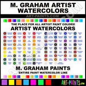
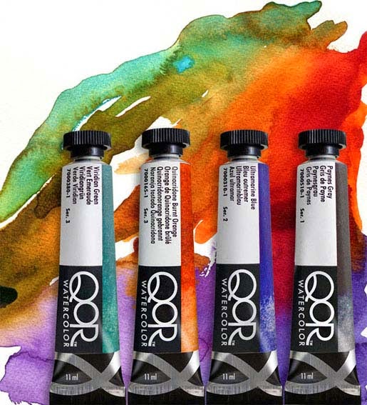
W.E.Lawrence the Hove art shop and mail order specialist have just announced a new range of watercolours from a company called `Golden Artists Colours'.  The range of 91 colours is described as a `thoroughly modern watercolour'... The name is QoR - pronounced `Core' and is different in that quote `a conservation quality binder is used called Aquasol instead of the traditional gum arabic'. Presumably this implies improved lightfastness and hence longevity, a longstanding question mark against watercolours, although modern pigments are much improved in this respect nevertheless..... 


Lawrence go on to say `We have tested them with some of our art studio tutors and the results have been quite remarkable. One tutor (unnamed) said ",,,,these are absolutely amazing. Some of the colours are beyond good"....They are totally compatible with traditional watercolours....... QoR is an acronym for "Quality of Results"......

What do we have here? There appear to be 91 colours with most of the names similar to that of the main manufacturers. A few variations do exist but overall a good range of colours. As far as I can see there are no pigment details and I don't know if this is given on the tubes. Although it doesn't say so specifically presumably the claim is that these watercolour paints will produce results that won't fade hence the use of `conservation quality'.

Are there any downsides YES THERE ARE! First of all where are the pigment details?  Are they on the tubes? They may be there but I wouldn't consider buying any watercolours without knowing what pigments are used. We then come to the real bombshell PRICE. These paints are only offered in a small  11 ml tube not the more normal 15 or 14 ml or even larger in some instances. There seems to be four series with the cheapest - examples Raw Sienna, Burnt Sienna - at the introductory price of £9.20p (rpp£12.95p), Ultramarine Blue is £11.30p (rpp£12.80p), Cadmium Yellow Light, Cobalt Blue, `French' Cerulean Blue (what is that?) all at £14.20p (rpp £19.95p), Indian Yellow £11.30p (rpp £12.80p) and Quinacridone Burnt Orange £12.80p (rpp £17.95p). Work out the price per ml then compare with Winsor & Newton and others. Open mouthed and speechless? I was!

I don't know who these watercolours are aimed at. Are they just for the `top' professionals who can perhaps afford them?  I can't see many amateurs paying these prices when there are superb watercolours available from the established leading manufacturers at lower - in some instances much lower -  prices. Even the brilliant range from Daniel Smith, the most expensive, at least in Europe, are cheaper in the conventional ranges.

If you are interested then I suggest you explore the range at www.lawrence.co.uk.

Added 05/10/2014: Thanks to Beverley (see comment below) I now have full pigment details. the link is  www.qorcolors.com/products/watercolors There are 83 paints not 91. Some 63 are single pigments, 1 four, 9 three and 7 two. Three iridescent paints are included. All paints listed are given either excellent or very good ratings ASTM LF but - oddly - 25 are listed as `not yet tested'. Most or all of these apart from the iridescent ones  contain pigments in common use that other makers have rated. The pdf file also includes details of opacity, staining and granulation.

All the pigments listed are those in use by the leading makers. I can't see anything exceptional or really different. There are a few oddities in paint compositions but in general all seems pretty straightforward. I realise that I haven't tested these paints so they may have some superior qualities but the only difference (on paper) I can see is the use of `aquasol', described as a `conservation quality binder'. I'll be interested in what the artists magazines say about these paints but I won't be trying them at these prices.

Added 10/10/2014: Enclosed with the November issue of `The Artist' is a large 4 page colour brochure giving printed images of all the colours. The back page has  pigment details and other information. From the brochure comes the following:
`Deep, rich beautiful colour, QoR's exclusive binder provides more pigment in every brushstroke while providing the best qualities of traditional watercolours. QoR offers a strength, range and versatility unmatched in the history of watercolours' 

 Some tall claim and I still maintain price is important, with many excellent makes - who have a long history of making watercolours - at lower prices, and with watercolours already expensive I doubt whether this will resonate with many artists. We shall see.


Latest Painting - Seed Heads

$
0
0
At the most recent AVA session the subject was seed heads. Not an easy subject but I managed to find a few small branches of berries. Not perhaps as intended when the subjects were drawn up but they are seeds after all.


This was my small arrangement


This is only the second painting I've done since I damaged my hand. I coped alright but  holding paintbrushes is still awkward. The other factor was that I've hardly done anything - not just over the injury - for nearly three months. Apart from the problems of dry paint - necessitating regular use of the spray bottle - I read once that you need to paint three times a week just to maintain existing standards and more than this if you wish to improve. I was therefore slightly apprehensive. I was reasonably happy with the result although it seemed my ability to do small areas of detail is still impeded.

I used a lot of Schminke Translucent Orange (PO71) and lesser amounts of Quinacridone Rose for the berries, Sap and Apatite Green for the foliage and some Teal Blue to make the vase stand out from the background. I know it is far from perfect but hopefully I can continue to improve with regular painting. Brushes were my usual Isabey, Escoda and Rosemary retractables 4, 6 (Isabey), 8, 10 and 12.


Experimental

$
0
0
This was the title (subject) at the most recent AVA session. In reality we weren't allowed to use a brush except to mix the paints. I went without a clue of what to attempt.  It then transpired we could do an initial drawing so that changed things a little. As I carry much of my kit with me I chose a small palette knife and home-made bamboo pen. I decided to try an Indian portrait using a guide photo from the ipad. I made a quick loose pencil drawing as a preliminary.


Indian Warrior - 16" x 12" centenaire 140lb (300gsm) not

I've never tried anything like this previously (just as well do I hear!) although I've seen it done in a book by the late Zoltan Szabo. He used a palette knife to paint trees. I painted the eyes mainly with the bamboo pen but this was difficult as you cannot pick up much paint, or conversely too much. In other words control is difficult. Apart from a few small touches all the rest was done with the palette knife. I also used my fingers to spread the paint in places. As you can see it is very loose other then the main detail and one of the advantages trying this is it encourages a loose approach. I'm sure with practice I could improve on it. It certainly gives food for thought.

Paint has to be mixed generously and very liquid so you can pick it up. Sometimes you pick up too much but you can spread it about. I made no attempt to get realistic skin tones and used mainly muted colours with blues (Ultramarine Blue) and reds (Quinacridone Rose) to get darks and purples, Raw Umber, Raw Sienna, Gold Ochre and Burnt Umber are also in there together with Sap Green.

Latest Amerindian

$
0
0
This is my latest attempt at an Amerindian circa 1900. I don't know his name or the tribe. 


Unknown - 16" x 12" Centenaire 140lb (300gsm) not

I made an initial pencil drawing using one of my most recent acquisitions a Pentel 07 Graphgear 1000 Draughting pencil. I'm not sure that this is any better than the cheaper Pentels I normally use, possibly more durable. Recent portraits have been done without the time consuming measuring and careful working out or spacing of features. I don't want to become too mechanical in my approach and not be fixated on copying the photo exactly. I don't think the above is too bad in that respect but the facing eye looks a little threatening and perhaps should have been toned down a little. I think the result is fair if not quite up to the standard of my better ones. I'm also trying to stick to Charles Reid's mantra of `small areas of detail, large areas of generality and have been (again) looking at my reports of the Stow workshop and his approach to the portrait he painted.

Colours used for the features and skin were Cadmium Red Light, Raw Sienna and Cerulean. To darken the eye shadows Ultramarine Blue was added. The hair is a mixture of Ultramarine, Burnt Umber and Raw Umber. The colours of the shirt include Quinacridone Gold (Daniel Smith PO49), Raw Sienna, Cobalt Violet etc.

Brushes used were mainly the Isabey retractable size 6 and Rosemary Kolinsky retractable sable size 6 plus Escoda retractable Kolinsky sables sizes 8 and 10. The reason for the retractables is that this was done at my art group Thursday session.


Reflections

$
0
0
This was the subject of last Thursdays AVA session. Slightly down on members with only 12 or so present.


Pat Walker at work.


My setup also with ipad reference 


Slightly únderstrength 


Pauline Vowles


Robert Heal


Gerald Pink


Jo McKenna


Pat Walker


Yvonne Harry (unfinished)


Peter Ward

An interesting session, not one of my favourite subjects but you have to take them as they come and it does stretch you.


Maimeri Watercolours

$
0
0
"A well regarded art materials manufacturer in Milan (Italy)" So says Handprint of this still family owned company started by Gianni and Carlo Maimeri in 1923.


Maimeri Blu the Artist quality range from Maimeri

The artist quality range shown above comprises 72 colours of which 52 are single pigment paints. There is also a second range - I hesitate to call them student quality - called Venezia with 36 colours. Maimeri were one of the first paints I bought and the reason was good quality combined with an excellent price. I discovered a small discount art materials company called if I recall right `Framework Art & Craft'. They are on the Cheney Industrial Estate in Swindon in one of the units. I believe they still are but unfortunately discontinued Maimeri due to poor sales - they said -so I've not been there for some years.

The verdict of Handprint, albeit with a few quibbles , was :- 

"In most cases the color appearance, pigment quality, lightfastness and handling characteristics rival the watercolors from Daniel Smith, M Graham or Winsor & Newton".....Overall, Maimeri Blu paints are bright, sweet and beautifully formulated...." 

 Not a bad endorsement although he does have a few quibbles and I have one myself. Bruce says the Cobalt Violet is mislabelled and certainly Golden Lake has been for years.  I've never had Cobalt Violet but the Golden Lake was supposedly Quinacridone Gold. However the label said PV49 which is obviously wrong and according to Bruce the pigment is now PY42 `a similar pigment' according to Maimeri, as the only current source of PO49 is Daniel Smith. I contacted Maimeri querying this but received no reply - typical of many companies that don't like awkward questions.  Handprint however has or had considerable clout and he received an e-mail from them with the above information. Incidentally I didn't like the original Golden Lake, not nearly as good as the Winsor & Newton single pigment PO49, now unfortunately a three pigment mix.

Apart from Golden Lake I am happy with most of the Maimeri paints I have with Avignon Orange (PR206) a particular favourite. I also tried a few Venezia paints and found them pretty similar to the main range But don't buy the `Flesh Colour' - horrible. If you check them out many of the colours have the same name and pigment. Unfortunately Venezia is not readily found in the UK.

We now come to the question of pricing and availability. In North America all the main discount specialists seem to sell them often including Venezia and at excellent prices. I do have a problem with the way Maimeri price the paints. They operate four series and series 1 and 2 are quite competitive. 58 of the 72 colours are either series 1 or 2, the majority series 1. The problem arises with those that are series 3 and 4. Why for example is Rose Lake, the red form of PV19, in series 3 when Primary Magenta, the rose form of PV19 is in series 1? The Cobalts, Cadmiums and Cerulean are in series 4, a hefty £15.20p in Jacksons latest catalogue. Winsor & Newtons Cerulean, albeit 14ml as opposed to 15ml, is shown as £12.85p. No contest buy W & N and this applies to the Cobalts and Cadmiums. You really have to look at the pricing in the various makes and compare pigments - not names - to see where the best buys are.


Leaves and Berries

$
0
0
This was the subject at the most recent AVA session. It is a fairly popular subject but even so only 15 or so members were present. 


My vantage point on lower right


Yvonne Harry at work


Gerald Pink


Not sure?


Cath Wilkins


Yvonne Harry - unfinished


Peter Ward

An interesting subject enjoyed by all those present. Next week it is `Action'.


Book Review - Color Mixing Recipes for Portraits

$
0
0
Having a collection of about 100 art books I'm not inclined to buy any more, especially as bookshelf space is at a premium. However I am easily tempted and having bought many off Amazon in the past I constantly receive e-mails from them prompting me (they hope!) to buy more.

This modest little book was one such they recommended and as it was inexpensive I decided to take the plunge. One reason for doing so was that I, up to now, have based my colour choices on those of Charles Reid which basically are skin combinations of Cadmium Red Light, Yellow Ochre or Raw Sienna plus Cerulean. He does use other colours when painting people of different ethnicity but these are the main ones.

As well as Charles Reid I greatly admire the work of several other artists who paint portraits in watercolour, Lin Fealing, Stephie Butler, Stan Miller, Janet Rogers. Ted Nuttall and some of the Asian artists. And there are many others. The thing is they often use different colour combinations and I wondered if I ought to experiment a little more, especially as I regard my portrait painting still very much a work in progress. It may always remain so.


Approx.10" x 61/2" 48 pages £6.99p Amazon

MORE THAN 500 COLOR COMBINATIONS FOR SKIN, EYES, LIPS AND HAIR'

This isn't just about watercolour as other mediums feature but the basic principals relate to all. The author is William F.Powell who is described as `an internationally recognized artist and one of America's foremost colourists'. 


The book is composed of profusely illustrated descriptive pages, all similar in layout to those above. I haven't actually used it much- yet - but I think it could be very useful. Is it worth buying? Certainly if you are into portraits or even figures it could be very helpful and at the price - second hand copies are even cheaper -  is a steal.

Back to Birds

$
0
0
I haven't painted any birds for several months and I do enjoy painting them. This week I was prompted to do so and this is my latest attempt for the Facebook page `Paint Colorful Birds For Fun'.


Parrakeet - 16" x 12" Centenaire (Great Art own brand) 140lb (300gsm) not

This was done using a guide photo on my ipad. The attraction was twofold, movement and great colours. 
The blues used were Phalo Blue (Maimeri PB15-3 Green Shade), Ultramarine Blue (PB29), Cobalt Teal Blue (Daniel Smith PG50 ) and Cerulean (Daler Rowney PB36). The red was a mixture of Quinacridone Coral (Daniel Smith PR209), Quinacridone Rose (Graham PV19) and a touch of Permanent Carmine (W& N PR N/A). The surrounding colours comprised mixtures of Phalo Green (Maimeri PG7),. Apatite Green (Daniel Smith), Translucent Brown (Schminke PBr41) plus some Raw Umber and Burnt Umber. I think that's it. 

I first made a loose pencil drawing using a Pentel 07 2B mechanical pencil, then painted the head moving outwards. The surrounding area was painted simultaneously rather than  afterwards. After it was all fully dry I added a few small marks to define things a little better. I did put a small amount of masking fluid (Pebeo) on the head area. I did splash the paint in the surrounding area to avoid too tight a result.

I only used two brushes, the Isabey retractable No.6 and a Rosemary No 6 retractable Kolinsky. The Isabey, while called a 6 is actually very slim and considerably smaller than the Rosemary 6 but good for detail.

Overall I was quite pleased with the result.

Venerable Gentleman

$
0
0
This is my latest portrait after quite a lapse. I was attracted to a photograph that my fellow AVA artist Yvonne Harry produced and asked if I could borrow it.  The attraction to me was the character of the face - goodness knows what it has seen in the course of a long life.


The original drawing made with a mechanical Pentel 07 2B pencil. I took no measurements but started with a basic fairly faint outline, then worked out where the features, eyes, nose and mouth went constantly checking them in relation to one another and erasing and redrawing where necessary. Quite often actually. The mouth was more or less hidden. I then used Pebeo masking fluid, mostly thin or very thin lines, possibly overdone in places but with the hair a combination of gray and white preferred the white paper to show through rather than add acrylic white or gouache later.


This is my `studio' with the work in progress. The TV isn't in working order though.


Another view.


Still another, rather dark unfortunately which means I have to use a powerful daylight bulb.


`Venerable Gentleman' - 16" x 12" Centenaire 140lb (300gsm) not

The skin colour is various combinations of Cadmium Red Light, Ultramarine Blue, Cerulean, Burnt Umber, and Translucent Brown (Schminke) The beard had light washes of greys made from Cerulean, Burnt Umber, Burnt Sienna etc. The darker areas were put in when the original washes were dry. One of my many faults is not to wait long enough for the washes to dry.


Brushes used were the Isabey 6 retractable and Isabey series 6228 Kolinsky sables in sizes 4, 6 and 8.


Autumn

$
0
0
This was the subject at the most recent AVA session. There were 15 members present and it is a subject that covers a wide range of possibilities.


Part of the happy throng


Yvonne Harry


Jo McKenna


Jan Weeks


Pat Walker


Peter Ward

In my case this based on a photograph of a hedgehog rummaging around in a pile of autumn leaves with all the seasonal colours that you get. Pebeo drawing (masking) fluid applied with a ruling pen is responsible for all the white streaks on the animal. An opportunity to paint with rich reds, oranges, golds and yellows.

Various references were used, from still lifes to photographs, some of the latter on ipads which are becoming increasingly popular.


Eurasian Eagle Owl

$
0
0
This is my latest bird for `Paint Colorful Birds for Fun' on Facebook. Fairly simple I made a loose pencil drawing with the eye and beak the focal points, using my Pentel mechanical 07 2B pencil.  


Eurasian Eagle Owl - 12" x 9" Fontenay Rough

Colors used were Raw Sienna, Raw Umber, Burnt Umber, Gold Ochre (W & N), Translucent Brown (Schminke PBr41), Ivory Black (Maimeri) and Cerulean (Daler Rowney) for the beak, and when dry liberal applications of acrylic white (Galeria Titanium White) for highlights applying it with a small stiff bristle brush, dry brushing mainly.

Apart from the bristle brush I used only two brushes, the Isabey Kolinsky sable No.6 and Da Vinci Artissimo 44 No 2, this latter for the background colour. I was quite pleased with the result. .

Children

$
0
0
This was the subject of a recent Avon Valley Artists session. It was three or four weeks ago and unfortunately I didn't record whose paintings they are so apologies to my fellow members. 


My grandson aged 8. I tried to capture his character, a budding entrepreneur, but only partially succeeded and his face is too red. 

Some very good studies I'm sure you'll agree.


More Portraits in Watercolour

$
0
0
Here is another selection of watercolour portraits in a variety of styles. The artists include some well-known, others not so well-known, but all exhibit a high degree of  skill and quality, at least in my opinion, and I realise not everyone will like all of them. However there is sufficient variety for most. Even if you are not into portraits lessons can be learned from these paintings which might be applied to other subjects.


The wonderful Stan Miller


Ai Xuang - another of these superb asian artists


Guan Weixing - The Master


Janine Galizia - Amazing


Stephie Butler - lovely use of colour


Lu Yongsheng


Charles Reid - a typical CR portrait


Gerard Hendriks - unusual for him as he doesn't do many portraits but full of life


Diann C Benoit  - an excellent artist prominent on Facebook


Ibe Ananaba - always  unusual and often provocative


Steven Scott Young - enough said!


Tong Wuy

I know some of these artists but not all by any means. They are just a few of the many I have come across in the last few years. Styles vary but I'm sure that whatever your tastes some will appeal. If I have any of the names misspelt I do apologize to the artists concerned and stand to be corrected.

Tommy Lee Jones

$
0
0
Tommy Lee Jones is one of my favourite actors. My newspaper had an interview with him the other day accompanied by a full page photo so I decided to have a try at his portrait. The guide photo was black and white.


Tommy Lee Jones - 16" x 12" Arches Hot Press 140lb (300gsm)

You may notice this is hot press paper, in other words quite smooth, no real tooth at all. I was given a half used pad by Jan Weeks of Avon Valley Artists, who didn't like the paper at all. I've done one previous portrait, of an Amerindian, and it gave an interesting result quite different from those done on the normal `not' surface. I shall certainly do some more.

I made an initial drawing using rough methods of calculation regarding  proportions, spacing of the main features etc  with a Pentel 07 2B mechanical pencil. On reviewing it I used the rubber to erase and then made corrections as I saw it. The day following I made further corrections. 

As usual I started with the eyes, then the nose and finally the mouth. I then painted the rest using the features as the yardstick. After the paint was dry I put in the shadow areas. This took a number of attempts before I was (reasonably) satisfied. I say reasonably because it is easy to keep trying and risk disaster. I can see areas where it could be better but overworking is worse, in my opinion, then underworking. I didn't finish but reached a point where - faults and all - I decided I better stop.

Colours used were Cadmium Red Light, Raw Sienna and Cerulean or Cobalt Blue for the skin colours. The Cobalt Blue provided the darker mix. Brushes were the Isabey Kolinsky sables sizes 4,6 and 8. I also used the Isabey retractable size 6 mainly around the eyes.

I'm fairly pleased with it although he has the sort of face where getting a reasonable resemblance is not too difficult. I know it is far from perfect but then what is.

More Watercolour Paintings (2)

$
0
0
Here is another selection of watercolour paintings covering several subjects. They show many styles and techniques from artists of quality, even if individual paintings aren't necessarily to everyones taste. Some are well-known others less so but all are of interest. PLEASE NOTE EXTENSIVE INDEX JULY 2014.


Stephie Butler - Stephies work is easily identifiable with her delicacy and colour choices


Morten E Solberg Snr - a terrific American artist who produces very atmospheric landscape/wildlife paintings


Christian Couteau - His work is easily identifiable with his unusual colour choices


Charles Reid - Enough said!


Michelle Brown - I don't know this artist but like the looseness of this one.


Millind Mullick - The prolific Millind often features red and green, in this case orange and green 


Janet Rogers - an American artist who paints beautiful delicate portraits


Yuko Nagayama - This supreme Japanese artist normally paints still lifes/flowers so this is something of a change for her but equally good


Viktoria Prischedko - This one and the one below are typical Viktoria. It is amazing she produces such colourful paintings with such a limited palette (5 paints)


Viktoria Prischedko


Robert Wade- The doyen of Australian artists. I know this scene which is in Bristol. One of Roberts sons studied medicine here.

Ananta Mandel - I don't know this lady.


Orhan Gorel - a brilliant Turkish artist


Edward Seago -  A fairly simple study from the famous Seago.


I hope I have all the names right - if not I apologize to the artists concerned. Corrections welcome.
Viewing all 502 articles
Browse latest View live


Latest Images