Quantcast
Channel: The Watercolour Log
Viewing all 502 articles
Browse latest View live

Latest Birds

$
0
0
The following are the latest birds I've painted for the `Paint Colorful Birds for Fun' community on Facebook. They are basically cameos completed in a short time so I'm not suggesting they are good. Excellent practice though for the serious stuff. I usually paint them on odd bits of paper, sometimes the reverse of failed or discarded paintings.

 Green-headed Tanager


`Rooks'

The colours here are mostly Ivory Black and Turquoise (Lukas). Probably too much Turquoise, especially on the lower right bird. It works better on the others but I think I should have introduced some Ultramarine Violet or purple. 


Saffron Toucanet

This is only interesting in that I painted it on a smallish piece of 600gsm Hahnemuhle Andalucia - the paper Gerard Hendriks uses - given me by Yvonne Harry. I first applied small touches of masking fluid, let it dry then painted. That was my first mistake. The fluid sunk into the paper and wouldn't come off. It didn't seem to take the paint well either yet Gerard produces the most amazing paintings using this paper exclusively. The hand that wields the brush..... 


Life Drawing - Bath Artists Studios - Week 8

$
0
0
This was the 8th session of this 10 week course, and things not going well I decided to ask Saied for clarification on a few things prior to starting. I almost wish I hadn't. My first thought was `C****t  he's read the blog. I was given a real going over and basically told I didn't listen to what he said and instead did my own thing. Did he use the word `braindead', no actually he didn't but  he made some remark questioning my thought processes. I can only conclude two things. Either he sees me as a dead loss or thinks there may be something to rescue from the wreckage and shock therapy is the best tactic. We were warned prior to the course that it was `demanding' and there were well-documented stories of participants being reduced to tears - and that was just the men! I'll leave it at that.

We had another nude model, a young coloured man with a splendid physique. I have to say the selection of models on this course have been outstanding. Saied began with his usual talk which extended quite a while. He made some quite pointed remarks and  they may well have been directed - partly at least - at me. Am I being paranoid? Pat thinks I'm taking the negatives too seriously and is not the least fazed by it. Incidentally the third newcomer was missing this week, why I don't know. Pat will miss the final session as she will be on holiday. I don't wish to recount everything said but covered much of the ground he'd spoken of previously and recounted his own career - 7 years at art school. One remark was that much of current teaching is useless and an awful lot of art was lacking in content, although I'm not sure I'm expressing his views absolutely accurately. He is very dismissive of much of what is happening in the art world. He did say many of his fellow students left Art School having learned nothing.


This was taken at the close but you can see setup where the model was lying down, his head towards the top. This isn't my  actual view when drawing.

The model was posed on the usual raised platform with adjacent lighting. In this instance the students were arraigned around the platform in a circular manner so everyone had a different viewpoint.  The model was posed standing up and leaning forward with his hands resting on a stool. The initial instruction was this was a 20 minute drawing. In the event this extended well beyond as progress was just too slow to complete in this short time. I think in the end it could well have been closer to 90 minutes. We were again told to stop on occasion and study the drawings of others. One of his earlier criticisms of me was that I just glanced at the drawings in a casual way and didn't study them.  He also said that I wasn't listening to what he was saying to others, but fails to understand that when I am engrossed in doing something I shut everything else out. This is a complaint I regularly get from my wife.

The instruction was to fit the model to the paper and not separate him from the background. This is what he always says. The lady on my right had previous experiences of his courses, as had all the others except Pat and I. I glanced over at how she was approaching things to see if it would help. I also started very slowly - we were told to look for some  minutes before starting - and tried to get an accurate representation drawing shapes not objects. This involved much use of the eraser. One problem is that when the model is given a rest, however hard they try, they never assume the identical position with subtle differences that tend to throw me. Pat has the same problem. I don't remember Saied coming near me on this one and he made no comment on it when we were finally told to stop. I think the idea is that you should draw and shade as you go along and I tend - in his words - to draw objects.


A3 Unfinished

After a break for tea or coffee we resumed with the model posed  lying down. One thing Saied often says is that what he is asking is difficult, possibly as a source of reassurance to the strugglers.

Again we were told to relate the model to the background and ensure the whole figure fitted on the paper. I took in three prominent verticals, one slightly to the right of his head, another in a corner of the room behind him and a door on the right hand side.  Where I went wrong was in the horizontal and was criticized for not finding some horizontal lines. This resulted in my not getting the angle quite right so I had to make several adjustments, again much use of the eraser. On this occasion Saied looked at both Pat and my drawings and made several observations where he considered they were wrong. He also told us to swop over and critique each others work. 


A3 Unfinished


Eventually we got to 5 o'clock and the session was brought to a close. We looked at each others work and identified what we thought were good . Not all are of the same standard. I didn't notice it but Pat told me one participant was making furious noises she was so frustrated. For a three hour session the above drawings don't look much. Actual drawing time is nearer two hours.

That was it we left saying goodbye - Saied and I are still speaking - and got the bus to the park and ride. I felt this was a much better session than the last two weeks, but that is a personal view and it's relative to what has gone before.

Avon Valley Artists - Two Sessions

$
0
0
As I've been rather slow to cover last weeks session I've decided to combine that with yesterday. There have been some difficulties which I'll relate but here goes.

Last week the subject was `Lakes & Rivers', something that can be interpreted in several different ways. The only proviso was that this didn't include seascapes. 


The group at work or rather some of them. The forefront shows my workstation with ipad now prominent. I'm increasingly using this instead of printed photographs. It has advantages and disadvantages but is cheaper (not using printer ink) and in many ways more convenient as you can zoom in  on the photo or part of it.


Cath Wilkins


Jo McKenna


Pat Walker


Jan Weeks (?)


Peter Ward


We now come to yesterday with the subject being `Textures in Nature'. This was another wide remit.


Jan Weeks


Brenda Parsons


Yvonne Harry


Sylvia Pink


Peter Ward


Once again I forgot my camera but happily Pat came to the rescue by taking a series of photos on her smart phone. She then e-mailed them to my ipad and after a tortuous struggle I managed to e-mail them to my computer, after consulting my latest acquisition `ipad for seniors'.!. What I do for this blog! 

Next week the subject is `Birds & Butterflies'.


Life Drawing - Bath Artists Studios - Week 9

$
0
0
This is going to be a very difficult piece for me to write. I related last week how I had received a dressing down, rather demeaning in some ways, and half-jokingly said `he must have read my blog', although I meant some of the comments not what I had written. I did contemplate just dropping the subject without anymore posts but decided otherwise. This will be the final one.

On arrival one of the long term students approached me, asked for a word and then said my blog had caused `great hurt' and would I stop it. My response was no as I didn't and don't feel what has been written is unfair comment, indeed if anything I've pulled my punches. It came over like the headmistress admonishing a naughty pupil.

I thought to myself this has started well and it didn't get any better. However on to the session. We had the same model as the first week, a young lady who again posed nude. The setup was almost identical with her on a raised platform with large easels at the four corners. The initial pose was standing and as we were at the opposite side we had a full frontal view.

As usual  Saied  first gave a long dissertation about what he wanted us to do and also spoke at length about Art, Art history, mentioned several greats of the past and also what made an artist. He also expressed his views about what you had to do to become a professional. His definition of professional is someone who does the sort of things he espouses, while amateurs do the opposite. This is a simplification as he goes on at great length about this `professional' and  `amateur' classification but to try and remember all of it or write it down longhand is impossible.


A3 Unfinished

This was my attempt at the first pose. We were again asked to ensure the background and model were one whole using the various angles. verticals and horizontals, pipes, doors, easels etc to get the spacing and proportions right, not isolating the model from the background. The two should be done together not separately or as an afterthought. I found this difficult as I have done all along. Where to start is the first problem. I have attempted all along to do what he asks rather than do my own thing, ignoring his instructions.  He has obviously thought otherwise.  I wasn't allowed to photograph the nude subjects, which I established at the start of the course. I quite understand that. We were initially told this was a 20 minute drawing at which I inwardly groaned- I need far more time. In the event it did extend longer than 20 minutes but I finished unhappy with the result and the  drawing remained unsatisfactory.

We then had a break for tea of about twenty minutes.


A3 Unfinished

For the final pose the model was positioned on a small stool with her hands resting on a larger one. I made a determined effort to produce something better with much use of the eraser and redrawing. There are faults, some of which I'm aware of others probably not. Under normal circumstances I'd be fairly pleased with it but here you await his verdict with trepidation. However during the whole of the session he didn't speak to me nor me to him. He critiqued both Pat on my left and the lady on my right.  

Thus ended my final session of this workshop as I've decided to call it a day. The final session is a sort of end of term one with the morning and afternoon groups mixing with refreshments starting around 12 noon. I can't get there until 2pm . Pat will be on holiday and under the circumstances I'm better out of it. It would just be embarrassing.

What went wrong? Everything it would seem. There was no empathy between me and Saied. I certainly wouldn't want to give the impression he is nasty or unpleasant. He doesn't come across like that at all although what he says, both to the mass of students and individually is very harsh, nor does he have a high opinion of anyone he sees as not meeting his exceptionally high standards. His views on the state of the Art world are controversial and remember this is his opinion not necessarily fact, others may see it differently. I just made a wrong choice with this course at this stage of my life.

As to my part in this sorry tale- I stress sorry personally. The group comprised 10 - 12 people, varying slightly week by week. Apart from myself and the other new man - both on our first courses with him - all the rest are female and all, apart from Pat had been with him previously. Indeed some there had also been on the morning course prior to the afternoon session. They seem to lap him up. He has been doing these courses, morning and afternoon, for many years and has taught thousands (in his words) of students. He claims to do it as a labour of love as he earns his living by  painting and only does this one day a week course. Each ten week session costs £200, which is higher than most , and  it seems he has no difficulty in filling them.  In appearance he reminds me of the well-known late actor Gene Wilder, even down to the hairstyle, who also painted and was a friend of my guru Charles Reid. 

It hasn't been my finest hour but different strokes for different folks. Saied Dai lives for painting while with me it is a recreational hobby taken up at a late - too late - stage of my life. I have always regarded myself as  a serious amateur but I do have other priorities. I've suffered a great deal of frustration and heart searching on this course. I've listened to him, despite what he may think, and don't question the principles he teaches but to me painting is (was) an enjoyable hobby and I am sorry to say mostly I've not enjoyed it. 


Self Portrait

$
0
0
I'm quite interested in self portraits and have attempted one or two in the past. So far they have reflected me in a rather dour (or sour) mood and this one is similar - perhaps showing the strain of my recent travails. 


My setup - the guide photo on the ipad


The initial drawing - not too detailed


The initial washes together with the basic features


Self Portrait - 16" x 12" Waterford High White 140lb (300gsm) not

I used a Pentel mechanical pencil 2B 07 - back to my bad old ways! As usual I had to make a number of corrections with the eraser coming into play but I was fairly happy with the final result even if the likeness isn't perfect. The flesh colours were a combination of Cadmium Red Pale with a little Raw Sienna, Cerulean Blue to darken and for the cool areas. The hat is mainly Cerulean with some Ultramarine Blue. A little red for the badge - not sure which one either Quin Coral or Quin Rose.

Only three brushes all Isabey Kolinsky sables, including the small retractables for the detail. 


Birds & Butterflies

$
0
0
This was the subject at the Avon Valley Artist session on Thursday. I think the number attending was fourteen. We are missing Yvonne at the moment which is always a loss and a few other regulars were absent for different reasons.


Hard at Work


Jan Weeks working on her owl painting.


Jan Weeks - unfinished


Peacock - Jan Weeks


Jo McKenna


Sylvia Pink


This was an enjoyable session, most are, and there are some interesting paintings. I did two, although they had been drawn the previous day. I've decided to cover them separately because the bird one was done for the `Paint Colorful Birds for Fun' community on Facebook


Birds & Butterflies (2)

$
0
0


The subject for `Paint Colorful Birds' this week was the Song Thrush, one of my favourite birds. Unfortunately there has been a large decline in numbers in the UK in recent years. In my previous home at Saltford in the early years we had Song Thrushes in the garden regularly, and even nests on occasion. In the last ten years or so it was rare to see one although I occasionally saw thrushes in the fields or community wood close to my home. There are different theories as to why this is but one of mine is that the rise in blackbird numbers is one possible cause. Blackbirds are very aggressive and bully thrushes. Both birds have similar territories and blackbirds won't tolerate thrushes, driving them away and putting them under severe stress. 

The above drawing was based on a photograph showing a thrushes nest with young, on a branch of what looked like some sort of fir. I decided to concentrate the drawing on the birds. Small amounts of Pebeo Drawing gum was put on with a ruling pen, mainly about the heads. This was done the day prior to the AVA session. I find by doing this one is able to approach the painting in a more considered way. Many of the others are doing something similar as we only have two hours in total and it is surprising how quickly this passes. 


Song Thrush with young. 16" x 12" Waterford High White 140lb (300gsm) not

I am fairly happy with the result although I realise the back of the adult is too dark. This is again my fault for following the photograph too closely, although the surroundings have been depicted very generally. I've since looked at Gerard Hendriks painting of a Song Thrush and admire his interpretation.


Butterfly - initial drawing with masking fluid applied in small amounts for highlights.


Butterfly - 15" x 11" paper (?)

This was a loose colour study in less than 40 minutes.. The reds are Quinacridone Coral (Daniel Smith PR209) and Translucent Orange (Schminke PO71). The greens are Sap Green (Graham), Green-Gold (Rowney PY129), Phalo Green (Maimeri PG7) and Green Apatite (Daniel Smith). Also Ivory Black (Maimeri). The purple is Quionacridone Purple (Daniel Smith (PR255). 

My brushes a mixture of Escoda, Isabey and Rosemary retractable or travel brushes.


More Paintings I like

$
0
0
Just to lighten the mood while I await the next  onslaught from `anonymous' (just joking) here is another selection of paintings that caught my attention. I'm sure some may not be to everyones taste but there is sufficient variety, apart from super realistic as I prefer looser more impressionistic paintings. 


from the delightful Stephie Butler


Vickie Nelson  - an excellent artist


Morten E Solberg Snr - another terrific American artist


John Yardley - still one of the best British watercolour artists.


Viktoria Prischedko - amazing talent


The prolific Milind Mulick


Burhan Ozer from Turkey


Yuko Nagayama from Japan - amongst other things she uses ten different varieties of salt!


Henry Arafin


Alvaro Castagnet - the well-known workshop artist


Winston Homer - legendary American 


Finally Robert Wade - the doyen of Australian watercolour. This scene above is in Bristol where one of Roberts sons was an intern at the main hospital.

I know most of these artists if not all. Once again the different interpretations and use of colour are worth studying. 


Wreck 0r Wrack & Ruin

$
0
0
This was the subject at Thursdays AVA session. Only ten members were present due to various reasons, including dislike of the subject. Some of the weekly subjects don't appeal to me but I`ve never stayed away because of this and usually finish up having enjoyed the challenge.


Robert


Jan


Gerald


???


John


Angela


Peter


Lots of variation as you can see. In my case I'm doing another piece on the Airacobra as there is an interesting and historical story attached to it. It won't appeal to everybody but connects with another of my interests.

New Watercolours from Winsor & Newton

$
0
0

Winsor & Newton,  perhaps prompted by the rise of Daniel Smith, have introduced what they are calling a limited edition `Desert ' collection of 6 new colours, all single pigments with two I've not heard of previously. In addition W & N have recently changed their tube design and are now calling the range `professional watercolours'. Sounds like the marketing department has been having a field day.


They are only available in 5ml tubes and are listed in series three which makes them expensive. However Jacksons are currently charging £4.61p - still very expensive. The colours are as follows:

Phthalo sapphire. PB15:6 - This is one of the phalo blue pigments and this one is currently on offer from at least three other makers, Daniel Smith, Lukas and Schminke. All three offer this pigment, `Phthalo Blue', `Helio Blue Reddish' in larger tubes and at lower prices, apart from Daniel Smith who are expensive, at least in the UK.

Indian Red Deep. PBr25. Previously this pigment has only been available from Daniel Smith as `Permanent Brown'. Handprint say `not an essential pigment'. Ian Sidaway gives it a good review in the current magazine `The Artist' but calls them all relatively expensive `...and might put them low down on the shopping list of many impoverished artists'. The pigment database says PBr25 is `deep red violet brown'.

Transparent Orange. PO107. ` A zingy red-orange'. I've not heard of this pigment but it sounds rather like the Schminke `Translucent Orange' PO71 and the similar Lukas `Permanent Orange' PO71. This Schminke colour is one of my favourites and also the well-known artist Jean Haines. The pigment database www.artiscreation.com/  says PO107  is `Bright reddish orange'.

Dark Brown. PY164. Another pigment I've not heard  of previously but note the `PY' which signifies yellow. Ian Sidaway says `it is used in various named browns' Which ones? I couldn't find this one in the pigment database.

Yellow Titanate. PBr24. Currently this pigment is used in the W & N Naples Yellow Deep. What is different? I've no idea and again Sidaway claims PBr24 is used in a range of different named yellows.

Gold Brown. PBk12. Again claimed to be used in a range of named browns but not in either the Schminke and Lukas ranges or previously Winsor & Newton.. The pigment database calls this `dark red to brownish yellow black'. An interesting comment is that this colour is `not dissimilar but is slightly duller than Quinacridone Gold'.

Are these colours worth buying or are they just another attempt to extract more money from  long suffering watercolour artists? You will have to make your own mind up. Winsor & Newton paints are still excellent quality and can be bought at discounted prices from the mail order suppliers. The range of colours available is daunting and caters for every need. Do you really need any of the above? I suggest that the most interesting paints (pigments) are the Transparent Orange and Gold Brown for reasons I've already stated.

Rainbow of Colours

$
0
0
This was the subject at last weeks Avon Valley Artists session. I scratched my head over this one but eventually decided to paint a parrot or is it a macaw? The others all had different ideas. Only twelve members were present probably due to it being half term with grandparenting duties intervening.


Gerald Pink. 

Gerald was an architect and all the straight lined were drawn without aids. Wish I could do the same!


Robert Heal


Jo McKenna


Not sure


Jan Weeks - Unfinished


Yvonne Harry - Unfinished


 Peter Ward


A good time was had by all and the subject this week is `Spring'. Remember less then two hours earlier most of the above were blank sheets of watercolour paper.

Spring

$
0
0
This was the subject at today's AVA session. Unfortunately I have a heavy cold so decided not to inflict it on my fellow artists. Yesterday I painted this - again a flexible interpretation of the subject! Still why not.


A very simple loose drawing with my favourite Pentel mechanical pencil 07 2B.


`Spring' Waterford High White 16" x 12" 300gsm not.

Apart from the head of the deer there is very little drawing and I determined to concentrate on this with the rest just window dressing. Colours used were Raw Sienna, Raw Umber, Quinacridone Rust (Graham PO 48), Quinacridone Gold (Daniel Smith PO49), Translucent Brown (Schminke Pbr41), Quinacridone Coral (Daniel Smith PR209) and a little Burnt Umber with some Ultramarine Blue added to darken. The greens are Sap Green (Graham) and Phalo Green (Maimeri PG7) in weak and stronger solutions.  I realised later I should have  put on masking fluid instead for the body spots. Rather I added Galeria acrylic white quite heavily - too much I now think. The final result is some way towards what I wanted to achieve but as always could be better. 

Brushes were all Isabey. Two retractables sizes 4 & 6, plus Kolinsky sables sizes 4,6 and 8. I've more or less decided that in future I'll stick to Waterford High White, although since I have a large supply of Fabriano and other papers, including Czech Moldau and Indian handmade, this might not happen 100% for quite a while. I like Fabriano but don't like the 18" x 12" format, preferring 16" x 12". 

Zebra Finches

$
0
0
This was last weeks subject on the `Paint Colorful Birds for Fun' community on Facebook. I've only seen these little birds in captivity but they seem to live in groups so after the initial bird on the branch added impressions of three others.


16" x 12" Paper ?. 140lb not (back of the paper)

These are basically quite quick sketches so I'm fairly happy with it as it conveys what I wanted with a huddle of the birds. The great thing about these bird sketches is that they encourage bold use of colour. Not a subject for the limited palette enthusiasts. 

Only three brushes, all Isabey, retractables 4 & 6 plus size 6 Kolinsky. 

The Ceylon Magpie

$
0
0
I'm afraid you'll have to put up with another bird.! I missed the AVA session yesterday as I'm still suffering from a cold and accompanying cough, although this seems at last to be moderating. This is the latest subject for the Facebook community `Paint Colorful Birds For Fun'. 


The Ceylon Magpie - Approx. 16" x 12" Waterford 140lb (300gsm) rough

I initially made a pencil drawing, Pentel mechanical pencil 07 2B.  Painted this the following day about 40 minutes. Colours were Translucent Brown (Schminke PBr41), Quinacridone Coral (DS PR209), Blues Phalo Blue, Ultramarine and Cerulean. Possibly some Turquoise (Lukas PB16) and a little Ivory Black (Maimeri). The greens are Viridian (PG17), Phalo Green (PG7), Sap Green and Green-Gold (Rowney PY129) also some Raw Umber on the branches.

Only three brushes. The Isabey retractables sizes 4 & 6 and the Isabey Kolinsky sable Size 6.


Catching Up

$
0
0
Due to illness I've missed the last two AVA sessions but determined to go this week, although still not 100%. The subject was ...actually there was no subject with members being able to complete previous works or do their own thing. I had nothing waiting to be completed so drew two portraits the previous day and decided on the day itself which to complete. One was an Apache Indian called Chato I've painted previously so if I chose that one - as I did - I could compare it with the earlier work and see if it was better or worse. The second was an actress from a cover photograph on one of the weekend colour magazines. I'll have a shot at that in the coming week. As can be imagined the paintings varied subject wise. 


Hard at Work


Yvonne Harry -superb flower painting


Myra Abbot - I noticed Myra used quite a lot of masking.


Brenda 


Chato - 2nd stage


Chato - 16" x 12" Waterford

Chato was an Apache Indian, Chiricahua I think, who was originally a hostile but later worked as a scout for the US Army. Without the Apache scouts it is doubtful if the US Army would ever have caught Geronimo.Typical of the time the scouts were disarmed, and put on the same train with the hostiles to imprisonment in Florida. Naturally Chato and the other scouts were very bitter at this and were taunted by the hostiles over their betrayal by the `white-eyes'.

I initially made a loose but careful pencil drawing using my favourite mechanical Pentel 07 2B. I've had a problem with Indian skin colour in the past in that my friend Hap in Oregon has frequently said it wasn't dark enough.I'm not sure what he will say about this one but colours used were Cadmium Red Light, Raw Sienna, Cobalt Blue,Cerulean Blue and Translucent Brown (SchminkePBr41), the blues used to darken the original mainly red mix with a touch of yellow. I began with the eyes, then the nose and, mouth before moving to the remainder of the face. The red headband is a mixture of Perylene Maroon, Quinacridone Coral and Quinacridone Rose with a little Burnt Umber in places to darken. The hair is Ultramarine Blue, Burnt Umber. Raw Umber and Translucent Brown. After the initial wash I added the shadows (when the paper was dry) and also a light face wash overall of Translucent Brown.


Avon Valley Artists - Flowers

$
0
0
Flowers was the subject last Thursday and an interesting set of paintings resulted. Where possible I've put the name of the artist but can't remember all of them.


Yvonne Harry - part finished


Pat Walker


(?)


Sue Macy (?)


(?)


(?)

Jo McKenna


Peter Ward - This was a poor effort. I made the drawing the previous day but left my ipad - with the reference photo on it - at home so had to paint `blind'. Obviously I'm not very good at that


Latest Paintings

$
0
0
These are some of my more recent efforts. Since moving painting has become more difficult in that I have had other things interfering, and so I've not been painting so often.


12" x 9" Fontenay not 140lb

The Secretary Bird for the `Paint Colorful Birds for Fun' community on Facebook. I decided to do a head shot rather than the whole bird so I took the easy route!


16" x 12 Waterford not 140lb

Beyonce - from a black and white cover photo in the Observer Weekend magazine. On the original photo both the hair and skin looked very bland so I jazzed this up a bit.


Tropical Beach Scene -18 x 12" Fabriano Artistico 140lb not.

This was done for an AVA session titled `On the Beach'.


Water Gatherer

$
0
0
This is from a black and white - more sepia - photograph from the wonderful Facebook resource for old photos of American Indians `Moses on the Mesa'.


18" x 12" Fabriano Artistico, actually on the reverse side of a `failed' painting.

I was very taken by the original photo, although I realised it would be difficult to interpret. I'm not entirely happy with the above but can't quite put my finger on what is not  right. The original is in a sepia shade but as this is mountainous country - and she is getting water from a rock pool - it would be very hot and dry so I used `hot' colours like Quinacridone Gold (DS PO49) and some Translucent Orange (Schminke PO71) to try and convey the feeling of heat. Possibly I've overdone this. Otherwise mostly Raw Umber, Raw Sienna and diluted Cerulean for the Sky with diluted Raw Sienna for the far distance.

I made an initial drawing, not over detailed, and then painted starting with the figure. I then worked outwards away from the figure. The sky and background were painted last. I also tried to convey the feeling of distance. I'm tempted to have another try.

Usual Isabey Kolinsky sables, 4,6 and 8 with the da Vinci Artissimo mop for the sky..

Stormy Day

$
0
0
This was the penultimate session before the official programme ends. I won't be able to attend next week  so this was my final one. During the summer the hall remains available and members do their own thing. If conditions are suitable several of us may paint en plein air, as the hall is in the centre of the old Saltford village and very close to the river, so subjects are plentiful. Actually attendances last year were slightly higher than during the official programme! Unfortunately I can't recall all of the artists names. I apologize for this as I know it is remiss of me but it is difficult at the end of the session to note all of them and then tie them to a particular painting. I do my best! 


???


Yvonne Harry


Jo McKenna


Jan Weeks


Peter Ward


Pauline Vowles


???

???


Watercolour Brushes Pt 3 - Mops

$
0
0
Following up the previous brush posts, one on synthetics the other sables, comes the third instalment -  Mops. Although I have a number they are not my brush of choice. I've used them only sparingly so once again I have enlisted my good friend John Softly to do the honours. 

MOPS by John Softly

If you know your history you will be aware that Edward Wesson was the first artist to use - and popularise - a French Polishers mop for watercolour. I have no information as to when it was that Ted first started using the French Polishers mop but he purchased them initially from France. In an article in the May 1980 edition of Leisure Painter he wrote "Personally I have always used squirrel haired "polishers mops", and in the smaller sizes, a selection of Daylons (nylon) and oxhair". We can therefore  assume that he was using them prior to his stint in the army in WW2. According to Herrings of Dorchester, artists themselves, they first began getting requests for these brushes from Wesson some time after the Wars end and, after great difficulty,  found them in France. Later they got to know him personally as he held many workshops in Dorset, not far from the Herrings shop in Dorchester PW. 


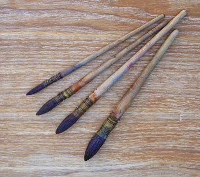
French Polishers Mops  (Isabey)

I  purchased four French Polishers mops in 1973, for French Polishing, from an artists supply retailer but none came to a point and were, what we call today a wash brush. As far as I can recall none came to a point. Those Ted bought did come to a point and they were his main brush throughout his career.

Today there is more written, and questions asked on forums, about mops than any other brush type. Traditionally made of squirrel hair with a quill ferule, bound with wire, but nowadays more are metal ferruled and synthetic versions are coming onto the market as popularity grows.

Not only are there mops in rounds but we have the Petit Gris, cats tongue, or filberts which, thanks to artists like Gerald Green and John Hoar, are increasing in popularity. Flat squirrel hair, one stroke brushes, are also available but it is debatable whether these come under the `mop' banner.

Possibly the major drawback with mops is sizing as there is no standard between manufacturers (this also applies to rounds in both synthetic and sable. PW. John says in response to this as follows: "Your comment is certainly correct but in round sables and synthetics, a Number 10 say can differ in size by a few mm in hair length and diameter but usually smaller to make it an 9 or 8. With mops sizing means little. Alvaro's go from 00 to 10. Harmony from 1 to 10, Jacksons from 6 to 22, Isabey from 3/0 to 10, W & N from 000 to 12 and Da Vinci from 0 to 6. Unless you know exactly what you are getting it's best to ask the retailer actual size or buy from Jacksons - they list ferrule sizes in their catalogue!"). The rounds are the problem as Petit Gris and flats are usually sized in fractions so when you order - for example - a three quarter inch brush you know exactly what you will get. If you order a No 8 round mop you will have no idea what the size will actually be. Some online retailers list hair lengths and diameters, where the ferrule meets the hair, which takes the gamble out of purchases.


Alvaro Castagnet

Prices vary across the range  with the Isabey - made of Kazan squirrel hair supposedly the best - and the Neef Alvaro Castagnet series at the upper price level with others somewhat cheaper. As usual one gets what one pays for and the hair on some of the cheaper brushes would appear to have started life on the tail of a feline (see what is said on this issue of `authentic' hair in the article on sables. Why should mops be any different? PW). One of the better budget sets is the Harmony brand from  Jerrys Artarama, a large American online retailer. You don't expect Kazan squirrel hair from Siberia at this price but I found them to be good, a no frills mop, albeit the hair a little coarser than most.


Harmony


Cats Tongue


It is purely conjecture on my part but I believe the Isabey genuine mops as used by Wesson were, and are, considered the Rolls Royce of mops. While I am not swayed by artists endorsements, Escoda have most high profile artists tied up anyway, I have bought mops with an artists name on the handle. The full set of Neef brushes marketed under Alvaro Castagnets name, and the single, metal ferruled, Escoda mop that Steve Hall sells. The Neefs have a longer handle and hair than most and I purchased them because other Neefs in my collection have performed faultlessly for 20 years.

Neef also do a synthetic mop which has had good reviews but I went with the Neptune brand. They only offer 3 quill mops, 4, 6 and 8, but their synthetic hair is very close to squirrel and by far the most popular synthetic quill mop brush on the market. I've not come across either the Harmony or Neptune brands on sale in the UK. PW

I bought the Steve Hall brush on impulse when buying his book, and whilst I find it a nice, long-haired, brush, softer than most, it is inclined to be uncontrollable when fully loaded. Rosemary & Co make some generic brushes for the British online retailer Jacksons, but I am unaware if mops are amongst them. Jacksons mops however are an excellent product and like all Jacksons own label brushes, built to a quality. rather than price, which is why I suspect Rosemary & Co are involved.


Jacksons Mops


Steve Hall, Princeton Neptune's and Rekab No8.

Rosemary makes  a series 1 Kolinsky quill brush and Jacksons a  series 777 synthetic quill, see the article on synthetic brushes. Although Rosemary calls her Kolinsky quill a mop there is nothing mopish about her high end series 1. They may bear a resemblance to a mop but are round Kolinsky sables and priced and perform accordingly (here I disagree slightly from what John writes based on my own experience with one of these mops, although mine was bought under the old ABS label. PW).

Traditionally polishers mops have quill ferules tied on with wire, the quill coming from the feathers of ducks, geese or swans, depending on the size of the brush. These days manufacturers use firm plastic sheeting in lieu of natural feather quills, but even if plastic it's still called a quill.

There was a time when all round brushes had quill ferrules rather than metal. Sizes took the name from the bird which the feather came from - the smallest a lark, which was the equivalent to a number 2 or 3 modern brush through thrush, crow, duck, goose ans swan - the Americans even had eagle in the mix! The hair was glued into the small end of the quill and the handle, referred to as the "stick", in the larger end but no glue - just a friction fit.

Due to the amount of water mops hold it is important they are dried with the hair pointing down in order that moisture doesn't creep into the ferrule, expanding the wood thus causing hair to be shed. Perhaps I would have more hair than I have today had I been suspended upside down after every shower.

Almost every high profile artist has at least one mop in their arsenal and I'm sure Ted Wesson would be surprised to see just how his mop, which was considered something of an oddity in the 1950s and 60s, has become a standard watercolour brush.

I am aware I have too many mops but, there again, like Peter, when It comes to art materials I have too much of everything, but if I hadn't got them I couldn't review them.


Peter Wards Mops

The top three brushes are Isabey, the large 4th one is a Rosemary squirrel (ABS), the 5th the Da Vinci Artissimo 44 size 2, while the last one is the Kolinsky sable mop series 1 ABS (Now Rosemary) size 4. The Da Vinci 44 size 2 approximates to a size 14 round, although a different shape so you can judge roughly what the other brushes equate to.. Look at the splayed out Kolinsky series 1! Even when loaded with water it doesn't point terribly well and is only useful as a wash brush (in my experience) PW.

My experience with mops is very limited. Currently the only one I use is the Da Vinci Artissimo 44 size 2. Initially I liked this brush very much but have gone off it a little, mainly because the hair became detached from the ferrule, although it was easy to put back in. I am afraid I am not a fan of the Rosemary series 1. Actually it was purchased under the old ABS label but I believe the brushes are the same.

That's it then folks. Thanks John for taking the trouble to produce this and give us the benefit of your experience. 
Viewing all 502 articles
Browse latest View live


Latest Images