Quantcast
Channel: The Watercolour Log
Viewing all 502 articles
Browse latest View live

Happy Xmas and Prosperous New Year

$
0
0
To my followers and friends, and  any other visitors to the blog,  may I wish a Happy Xmas and Prosperous New Year.


The above three photographs above show Avon Valley Artists end of year `bash' in the Church Hall organized by Yvonne, Jan and Robert.  Enjoyed by all and thanks to the organizers.  No painting just eating and drinking! The new program of subjects starts on January 8th.


New Charles Reid Book

$
0
0
Just announced a new Charles Reid book called `Charles Reid Sketchbook'. This is a collection of Charles sketches from over the years and is not a new `How to' book. Apparently he has received many requests in the past from his students to buy his sketchbooks so this is the result. I, and others, did ask him to produce a new portrait book but he decided that `Watercolour Solutions' - excellent indeed - was to be his last. However this book was obviously easier to produce and so we now have it.


There are no details of size or number of pages but an e-mail to Jreid514@aol.com, or an enquiry via his Facebook page (Charles Reid Art), run by his daughter, would produce this information

It seems the book is self-produced, an increasingly popular process possibly due partly to disenchantment with the way some publishers are behaving. I experienced this myself with my last book some years ago. Charles mentioned he had been unhappy, especially because he had  several changes of editor - I recall he said three - when he was writing `Watercolour Solutions'.

In any event the book is here and is being sold at $131 in the USA, including postage, and $150 international. This approximates to £87 sterling and 104 euros. These are eye watering prices for an art book and I can only assume it is being marketed as a collectors item in a limited edition  which would partly explain the high price, but these are assumptions on my part. The book has to be ordered from the artist and details of how to do so are on the website www.charlesreidart.com 

I have most of Charles books on watercolour, the only exception being the first flower book, There are many examples of his sketches in some of them. Personally I've never done much sketching - something many will be critical of - and have never made a painting from a sketch.  It is just something I've found very difficult. Because of this and the fact I find the price on the high side I won't be adding this to my library but I'm sure many will. 

Obviously if I don't buy the book I can't review it but if any readers do I'd be happy to add a review to this piece.


Latest Paintings

$
0
0
We had a very small attendance at the latest AVA meeting last Thursday, possibly due to the weather - it was raining `cats and dogs'. The subject was trees, an easy one you might think. I again had difficulty in focussing on the subject but eventually came up with the following based on a photo I `googled' on the ipad.


16" x 12" Centenaire 140lb not.

This is part of a large tree where a large branch was cut off and someone has then carved the face. I've no idea what or whether it symbolizes something in particular. I used several colours, arbitrary in Charles Reid's words - colours that aren't actually there. I found it difficult, especially as there is a lot of texture in this particular tree and I'm not much pleased with the painting.

As I finished early - I usually do - I started work on a portrait that I'd drawn  earlier in the week. This is based on a photograph of  the actor Emily Blunt in one of the weekend colour magazines. They are a good source of portrait material.


This is the work I did at the AVA session and I completed the painting at home this afternoon. I'll post the final painting in the next two days.

Latest Portrait

$
0
0
This is the completed portrait of the actor Emily Blunt. I've heard of her but she is one of the younger generation while I'm one of the older ............  The inspiration was a cover photograph in the Observer weekend magazine.


Emily Blunt - 16" x 12" Centenaire 140 lb (300gsm) not


Emily Blunt - modified version with hairline softened in places. Which is better?


I'm reasonably happy with this but getting my excuses in first fall back on Charles Reids exhortation `to be cruder', and also his view that `mistakes' are part of it! I can always see where things could be better but what the heck! IF I can capture the `essence' of the subject then I'm reasonably content. I think this has been achieved although you may disagree. 

I first made a pencil drawing as accurately as I'm  capable of  without too much detail using a Pentel mechanical pencil 07 2B. I then painted in two stages, the first session at the AVA and completion yesterday. Brushes were my usual Isabey Kolinskys ranging from the retractable No 6 to the 6228 No 8. As I've emphasized before the retractable is a very slim brush quite unlike a `normal' 6 - much smaller. In any event Isabeys tend to be slimmer and smaller than some other makes. I do like them though.

My primary concern is getting the features right starting with the eyes. I don't aim for a perfect representation but at least hope the subject is identifiable. I'm trying not to be too complicated with the rest, especially the hair. I've still not satisfied with this aspect.

Colours used were Cadmium Red LIght, the main colour, with small amounts of Raw Sienna and Cerulean to darken the mixture. I also used some Ivory Black for the eyelids. The hair is mainly Ultramarine Blue, Translucent Brown (Schminke) and a little Raw Umber. The yellow is Hansa Yellow Medium (Daniel Smith).


Food

$
0
0
This was the subject at the latest Avon Valley Artists session with 11 members present. As you can see this allows for a wide interpretation which is a theme of many of our subjects.


Pauline Vowles 
 Pauline used a lot of texture on this. I think she put tissue paper on prior to painting.


Not sure who this was???


Yvonne Harry


Jan Weeks 


Pat Walker


Peter Ward 
 This is my `secret` indulgence a BIG (full English) breakfast. Actually I'm not allowed it very often, only cornflakes or porridge! The main focus of the painting was the eggs. I thought if I got them right the rest would take care if itself. 


An interesting selection I'm sure you'll agree.

Portrait Painting at Bath College

$
0
0
Since moving, a year past September, my painting activities have reduced and  I've been somewhat lacking in motivation. Hopefully this is improving and so I decided to take another Portrait course at the College of Bath Further Education in order to move the process along. This is the same course I took a while back with the same tutor Jackie Harding. It combines both drawing and painting and both head shots and full figure drawings/paintings using different drawing mediums, although when we come to paint I'll stick to watercolour.  Jackie has a low key approach and we are into drawing immediately after a short introductory talk. The sessions are 10am until 12.30  and it is a ten week course. I obtained permission to take the following photographs.


This lady is one of the models we had last time. I've forgotten her name but she is coming again next week so I'll remedy that. 


This is the approximate view I had with my easel on the left of the photo. She wasn't quite as far away as she appears, camera distortion, but sufficiently so that her features weren't easy to identify.


This is my finished drawing. I've cropped it a little as the original is on A2 sketching paper. The college has a shop with a limited range of art materials, such as sketch pads, paper etc, on sale at very cheap prices. The cafe is similarly good value!

I used Faber Castell graphite pencils 2B, that I made sure were very sharp. After sketching the general outline I then drew the features checking distances, spacing etc constantly. In her short initial talk, complete with a sheet she gave us that had illustrations and an excerpt from Betty Edwards 'Drawing on the Right Side of the Brain', she. emphasized the principals to follow regarding the correct proportions of the head and not drawing what you thought was there be but by careful observation what they actually are. Rather than use a pencil for measuring I have some spacing sticks I've made from thin garden stakes, marked  in inches. Possibly I should go back to using pencils, but normally I use mechanical pencils which aren't so useful for measuring. Jackies method is to go quietly round the class then suddenly she is  by your shoulder suggesting this or pointing out errors. I might add I was constantly erasing and re-drawing throughout the session. For example she pointed out on one occasion that the height of the top half of her head, basically the hair, was too short in relation to the face, on another certain angles were not quite right.

I think there were seven students in total but another two were possibly missing on the day. The first three sessions are drawing then we move on to painting. We have the same model next week but the drawing session will be varied, not sure exactly how but possibly using charcoal.

Pat from my AVA group is also a student and thoroughly enjoyed it as I did. The only problem we had was finding a parking space in the Park and Ride. For a first session, warts and all, it went quite well and I was pleased with the result.   


Still Lifes - AVA

$
0
0
Last week the subject at Avon Valley Artists was a `Still LIfe' it being said this could be flexibly interpreted.


Once again a bit light on attendance by members


Yvonne Harry


Pat Walker


Peter Ward


Another interesting session .


Bath Portrait Drawing/Painting - 2nd Week

$
0
0

 This was the second week of the course and was more demanding. Jackie spoke to us first regarding what she wanted us to do, the overall purpose being to  adopt a more relaxed, more impressionistic and less formulaic approach, something many artists slip into - their comfort zone. The session was broken into four distinct parts using different drawing mediums, fine liners, graphite sticks, charcoal and drawing ink. We were told we shouldn't take more than ten minutes or so for each study but invariably they took longer.


Fine liner sketch on A2


This drawing was with a graphite stick and one of the things we were required to do was move to another easel - two places - after each session so the angle of the model was different. From this you can see I got the front profile of the features wrong and had to the redo them but was unable to erase the earlier marks.


Ocado Drawing ink applied with a sharp stick, one end chisel edged the other pointed. I rather enjoyed this even though it created a `black' result.


UGHH!!!

Sight unseen drawings. I was reluctant to put the above two drawings on here but warts and all! This was actually the third task and we had to place our body and head slightly in front of the paper and easel. We weren't allowed to look at the paper and were asked to draw a continuous line!  In effect your head was slightly ahead of the easel with your drawing arm hooked round onto the paper, while all the time looking at the model.. Jackie showed us several examples of where she had made drawings using this method and they were universally excellent even if each somewhat different. I found this very difficult as the above examples show. I wouldn't say most of the other (9 this week) were a lot better, although some were. Where comments were made about mine Picasso was mentioned but I fail to see that connection - rather just a mess.

As mentioned earlier we were supposed to take not much more than ten minutes on each but they still filled a two and a half hour session, even with a thirty minute break!  I think it fair to say that everyone on the course is enjoying it. I did this course two or so years ago and it has moved on to some degree.

Reflections - Avon Valley Artists

$
0
0
Last weeks theme was `Reflections' which once again gives considerable scope. We had twelve members present and a varied selection of paintings resulted. 


Jan Weeks - an interesting theme with nine similar pieces linked together.


Robert Heal


Peter Ward - A very simple composition


This is Yvonne Harry. Yvonne paints flat and is using Andalucia paper here.


A closer view of this unfinished (and complicated) painting. It aroused great interest. The finished one should appear on her blog .


The above three photographs illustrate the complete set of paintings and shows the various sizes. Next week is `Portraits/Figures' using own references as unfortunately we seem to have ongoing difficulties in getting a live model. I've offered to pose but my fellow artists don't seem too keen!

Bath Portrait Course Week 3

$
0
0
This week the medium was charcoal and we had a new model. The idea was you crushed a piece of charcoal into powder and initially worked the portrait with your fingers. Then add detail with small  pieces of charcoal of various shapes, sharp, blunt etc, depending on what was needed. The putty rubber also came into play erasing and creating whites.


 A2 Sketching paper

During the session Jackie quietly drifted around - you suddenly find her at your elbow - pointing out errors and suggesting ways of improving things. This is very effective and not at all negative. 

This was quite an enjoyable exercise, although I wouldn't do it by choice! Charcoal is very messy but also expressive. The idea once again is to avoid `tightness' and repetition in your drawing/painting with Jackie again stressing there is no one way of drawing. To illustrate this she had a book of Matisses drawings which clearly showed him drawing in many different ways, as well as examples of her own very good work.

Next week we are using pastels, something new to me.

Daniel Smith & Indian Yellow

$
0
0
Recently one of my painting friends and senior member of Avon Valley Artists - Yvonne Harry - has been engaged in an exchange of e-mails with Daniel Smith over the DS version of Indian Yellow. Essentially Yvonnes complaint was that the colour was simply not recognisable as Indian Yellow as understood by artists.

To give a little background it was originally, so we are told, produced in India in a revolting manner, cows being fed a particular type of leaf to produce a highly pigmented yellow cow dung from which the paint was extracted.  I have since read that this story is questionable but has been repeated time and again. As in other cases where the natural pigment became unavailable, or was ruled out on various other grounds, the paint manufacturers have produced alternatives under the same name. This then becomes complicated when there is no unanimity on what pigments to use. With regard to `Indian Yellow' the most popular pigment seems to have been PY153, although  Winsor & Newton called its PY153 paint `New Gamboge'.


The above swatches are from Yvonne and illustrate what she means about the colour being `off key' for want of a better description. I don't have the DS version being very happy with the much cheaper Daler Rowney version, which is PY153 until they run out. I have managed to buy a number of tubes so they should last a while!

Indian Yellow, as sold by all other makers is on the orange side of yellow - a deep yellow in other words - whereas the DS version  seems - to my eyes from the `Try -it' colour sheet - more inclined to a muddy orange. It is PY108 a different pigment to other makers. I realise that personal preference is a factor here and other views may differ.

The plot thickens when another of the AVA senior artists, Jan Weeks, reported that her latest tube of `Moonglow' was a different shade to the previous one. Jan is a very experienced and talented artist so she cannot be easily dismissed.


Different shades? What do you think?

`Moonglow' is a mixed pigment paint PG18/ PB29/PR177. A green, blue and red combination. Despite being a three pigment mix it has become  a favourite of many.

Yvonne was initially very annoyed at the response from Daniel Smith, which was rather patronising, but she is a determined lady and after further correspondence that changed.  In fact she has now received three 15ml tubes, Serpentine Green, Bordeaux and Carbazole Violet FOC as a peace offering and all is now well, although her opinion of Indian Yellow remains. She gave me a `sqeeze' of all these colours and they are lovely.

I think I should emphasize this isn't a general criticism of Daniel Smith paints. There is universal agreement they are excellent and handle beautifully, if somewhat expensive in Europe. The range is huge and there are so many tempting colours that are hard to resist, the inclination is to buy colours you don't really need. I've done it but then face the problem of how to use them. Artists palettes vary in size but  I would think the majority are in the 12 - 24 range. Daniel Smith produce well over 200 colours and do you really need up to 20 reds, 20 yellows etc? All it does is confuse the issue of what to buy. I think the Primateks are a different matter and would refer to the piece Bruce McEvoy of Handprint wrote about them some time ago. 

I do have one issue with Daniel Smith though. Sometime ago I read they had developed a method of making multi pigment paints behave as though they were a single pigment. This has implications when mixing with other colours.This applied to the Cadmiums where a `hue' equivalent was offered. I e-mailed them and enquired whether they did the same thing with other mixed pigment paints. I received no reply and a second e-mail also went unanswered.

More Paintings (3)

$
0
0
Another selection of watercolour paintings of different artists and diverse subjects. Some you may like others you may not but all have merit in one form or another and include paintings from well-known and lesser
known artists. Please note regularly updated Index to blog posts see July 2014.


Stephie Butler


Bev Jozwiak


David Taylor


Lars Kruse


Jonathan Kwegyir Aggrey


Mahmood Sandarian


Millind Mullick


Stan Miller


Gerda Mertens


Edward Seago


Wu Kuan-Te


Kimico Utida

I hope you have enjoyed this selection and more will follow in due course.

Moody Blues

$
0
0
This was the subject at this weeks AVA session. Only 8 members were present but as I forgot my camera (again!) I wasn't able to record those who were there.

 Not having been  the previous week I was wondering how this subject might be interpreted. `Googling' Moody Blues just produced masses of images of the well-known pop group, so I was in something of a quandary. In the event the usual flexibility was in place so I decided to do an Indian portrait in just blue colours. These were Turquoise (Lukas PB16), Cerulean, Ultramarine Blue, a little Cobalt Blue. I also darkened the Ultramarine slightly with Burnt Umber. 


Brave Buffalo - 16" x 12" Centenaire 140lb (300 gsm) not

Brave Buffalo, a Sioux Medicine Man, claimed he was able to deflect bullets using his `magic ' powers. Several indian prophets arose in various tribes claiming  similar magical powers, but all were found wanting. This mostly arose because of the Indian despair at the encroachment of the white man, and realisation the Indian way of life was fast disappearing. 

I had no idea how it would turn out with no pre-planning whatsoever. Actually when I arrived at the session I had no  idea what to do. After seeking clarification I decided on my old staple an Indian portrait. I did a basic drawing, using a photo on my ipad as a reference drawing from the inside out by starting on the eyes then the nose and mouth before working outwards. My Pentel mechanical pencil 07 2B was the drawing tool. I then painted starting with the eyes. 

I used three brushes, the Isabey retractable No. 6,  Rosemary Retractable Kolinsky sable Size 6 and an Escoda retractable Size 10. As I've mentioned before the Isabey, while long and slim and a lovely brush,  is smaller then a normal size 6.

I've no idea how this will go down but rather like it.


Bath Portrait Course Week 5

$
0
0
Due to illness I missed week four and last week was half term so I resumed after a two week break. The model was the same one as the initial two weeks, and we were allowed to do `our own thing' in terms of medium and/or whether to do a full length figure or a portrait. I opted to paint in watercolour with all the others working in charcoal. I should also add this painting is on fairly thin cartridge 
 rather than watercolour paper.


In reality the eyes, and eye sockets, were rather darker than appear here so I (over) emphasized them.


Here the eyes have been toned down slightly from the previous example.


This was as far as I got by the end of the session. I don't intend to do any more although Jackie said it would be improved by darkening the clothing areas - just indicated.

Overall I was fairly pleased with the session. Next week is similar and I will probably bring watercolour paper and possibly experiment further. I have been reading the article by Aine Divine in the latest issue of `The Artist' (April 2015). She featured in Sky Arts Portrait Artist of the Year in 2014 and was a finalist, although she didn't win, not surprising as the standard was amazing and other mediums predominated. I like most - not all - of what she does but her technique is completely different to Charles Reid, who is my guru, and I'm not really prepared at this late stage to completely change the way I do things. For example she uses large flats, including cheap brushes and paints on 535gsm Bockingford Not. She uses many colours with Ultramarine Blue predominant with Alizarin Crimson, Cadmium Red, Cadmium Orange and two greens amongst others with lots of layering. 


Avon Valley Artists - Fruit or Vegetables or Both

$
0
0
This was the subject last week at Thursday session. A better attendance with 13 present and a subject most people are happy to tackle. I had to leave slightly earlier due to my six month hearing aid checkup so took photos of my fellow artists working, rather than the finished paintings.


This was my setup


My initial simple drawing. I've enhanced it so the lines are much darker than actual.


The finished painting - Fruit 16" x 12" Centenaire 140lb (300gsm) not


Pat Walker - strawberries


Pauline Vowles -artichokes


Yvonne Harry - rhubarb 


Jo McKenna -beetroot (?)


Terry Twissell - gourd and onions


Jan Weeks -gourd (?)


All in all an enjoyable session with next weeks subject - animals.


Animals - Avon Valley Artists

$
0
0
This was the subject at last weeks session, at which fourteen members were present. I think one can say it is a fairly popular subject.


The early stages starting with the eyes


Peter Ward - Primate 16" x 12" Centenaire 140lb (300gsm) not

I relished this subject using an image picked up from Google and saved on the ipad. I wanted to diverge  (a la Gerard Hendriks) from the fairly dull original colours, roughly combinations and variations of Burnt Umber, Raw Umber and greys, put in painting terms, and add more colour. One of my many faults is a tendency to  carelessness and I reached a stage here when I thought it would end up as a dogs dinner of a painting. I don't think it quite that but it certainly isn't as I originally intended and I've been pondering it since, and may well have another shot. The lesson - study the subject in great detail, pick out the main features and don't rush things. Although some regard this as being beyond the pale I suggest the ipad apps Value Viewer and Waterlogue can be very helpful providing you don't become over reliant on them. 


Yvonne Harry


Jan Weeks


Jo McKenna (not watercolour)


All in all an enjoyable sesion. Next week it is `glass/china !


Bath College Portrait Course - Week 7

$
0
0
I have attended two more sessions at the above with mixed results. This week we had a fabulous black model Linda Odhiambo, a very tall statuesque lady, who towered above me. This isn't obvious from the photo but believe me she is tall!  Linda has a company called Kipenzi that sells Afrikan oriented products she designs www.kipenzi.co.uk


Linda 


Linda - Schut Noblesse 40cm x 50cm not

As you can see the sheet of Noblesse, much larger than my normal 16" x 12", is dwarfed by the size of the boards. Most students used sheets of cartridge or similar paper supplied by the college that were board-sized or close to it. I was the only one who painted in watercolour, with charcoal and pastel predominant.

It was suggested by our tutor Jackie that we might like to include her hands, although this wasn't mandatory. She also discussed the use of colour and suggested we emphasize it. As we have Linda for two more weeks I may do a fuller length study. I did a preliminary sketch including the hands but felt I needed a larger sheet of paper. I probably will use a cut down full sheet next week. I'll need to think about it.

After the preliminary drawing, not the easiest as I would have liked to have been closer to the model, which isn't practical given it might block others vision. I then began to paint starting as usual with the eyes, then the nose and mouth.. Colours used  were a mixture of Ultramarine Blue (PB29), Burnt Umber (Pbr7) and Schminke Translucent Brown (Pbr41). I like the Schminke but a bright Burnt Sienna would do equally as well. The hatband includes Cobalt Teal Blue (Daniel Smith PG50). My guru Charles Reid has done many studies of black models, both male and female, and I've gone back to his books, mainly 'Watercolour Solutions', to refresh my knowledge of what colours he uses and how he approaches the subjects. With two more sessions there is room for experimentation. 

I mentioned the previous week. I was still feeling out of sorts and the resulting portrait with the same model as my first two weeks, painted on Schut, was a poor representation. The eyes in particular are incorrect and it is inferior to the one I did on cartridge paper, which is a good resemblance. 


Schut Noblesse 40cm x 50cm not

This was a great session with a fantastic model and lovely lady. She did vary her position a little but this is something that is inevitable with her sitting for the best part of two hours, with only a major half hour break in between. Charles Reid always gives his models a break every twenty minutes. I was pleased with my resulting painting - I'm aware as always that it isn't anywhere near perfect - and look forward to next week.


Primate -Second Try.

$
0
0
After painting a  portrait of a `primate' recently - in other words a great ape -  it did not turn out quite how I wanted so I have had another try. Before starting I looked at all the possible variations using the ipad app Waterlogue, not in order to copy but see what other possible approaches there were to the subject.  My conclusion was that I needed to define the facial area much more, particularly the overall shape, while treating the surrounding areas - the hair - in a much less detailed manner. At the same time I wanted to continue with a colourful approach, including, in Charles Reids words `arbitrary colour', defined  by him as colours that aren't actually there. The original colours on the guide photo are basically combinations of brown and gray, on the dull side if followed faithfully.


`Primate' 16" x 12" Centenaire 140lb (300gsm) not

I began with a  loose but careful drawing, at least as careful as I'm capable, with the only real detail around the eyes and nose, using a  2B pencil rather than a mechanical one. I've been using pencils at the Bath Portrait course and I can see some advantages in doing so.

As you can see there are colours aplenty, Cerulean Blue, Quinacridone Gold, Translucent Brown, Ivory Black , Burnt Umber, Ultramarine Violet, Quinacridone Coral, Phalo Green, Cobalt Blue Deep and  ???  Regardless of what the `Painting Police' say I just want to have fun!


Best Buys

$
0
0
Despite talk of `zero' inflation, even deflation, prices of art products, specifically watercolour related, continue to rise. Here are a few suggestions for those who are finding it increasingly expensive to pursue our hobby. I refer naturally to the UK and the rest of Europe but for those who live outside the UK they have the benefit of not paying VAT (value added tax) which is currently 20%. As far as I'm aware UK art mail order specialists like Jacksons www.jacksonsart.com  and Ken Bromley www.artsupplies.co.uk charge carriage at cost and in many cases this will not exceed the saving on VAT.

Starting with paints I suggest the best current buys are Daler Rowney, Lukas and Sennelier. Rembrandt are also pretty good. These are all very acceptable paints. Maimeri are also currently being sold at very keen prices by Jacksons. I myself primarily buy tubed paint and where the maker offers different sizes, the larger ones like 21ml by Sennelier and Rembrandt, Lukas 24ml, are the best buys. To save money if they offer a 5ml or 10ml buy those in the colours you only occasionally use. Winsor & Newton, still the one to compare with, are frequently on special offer at much better prices than are available in the USA. I personally avoid the Korean brands like Shin Han but others swear by them. Lukas is not stocked by either Jacksons or Bromley which is a nuisance but is by Great Art, who are German but have a UK telephone number and website in English, and Lawrence. Unfortunately Great Art www.greatart.co.uk do not supply outside Europe. Lawrence www.lawrence.co.uk will but impose fixed carriage charges. There is also some movement in `student' quality paints with new ones like Turner, available from Jacksons, appearing on the market. Both Jacksons and Bromley have cheaper own label paints which are worth investigating.

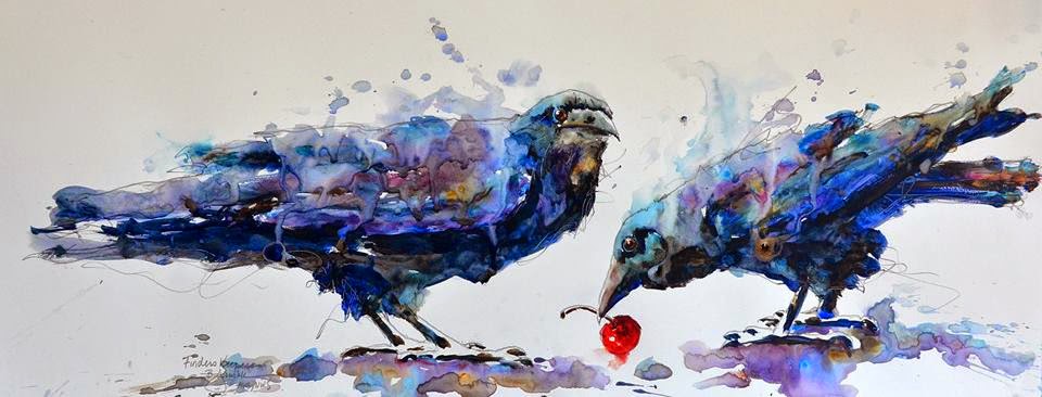
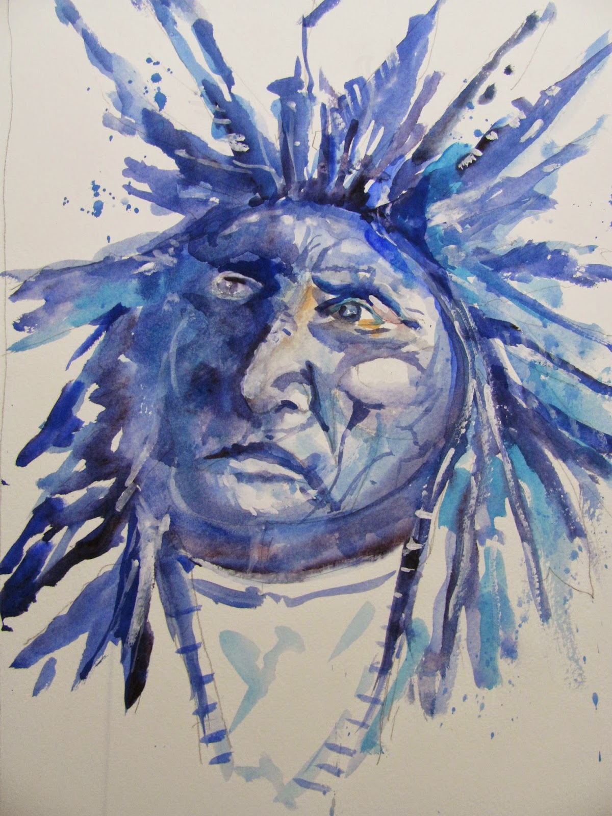
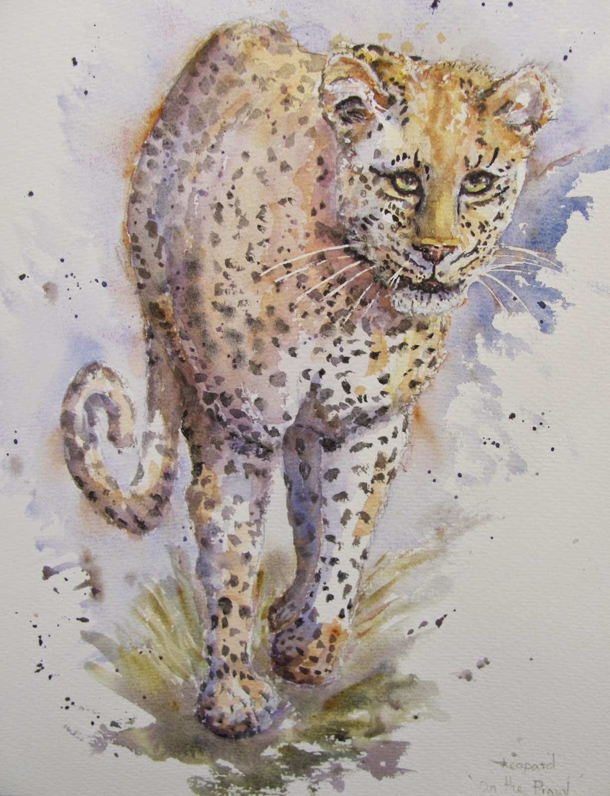
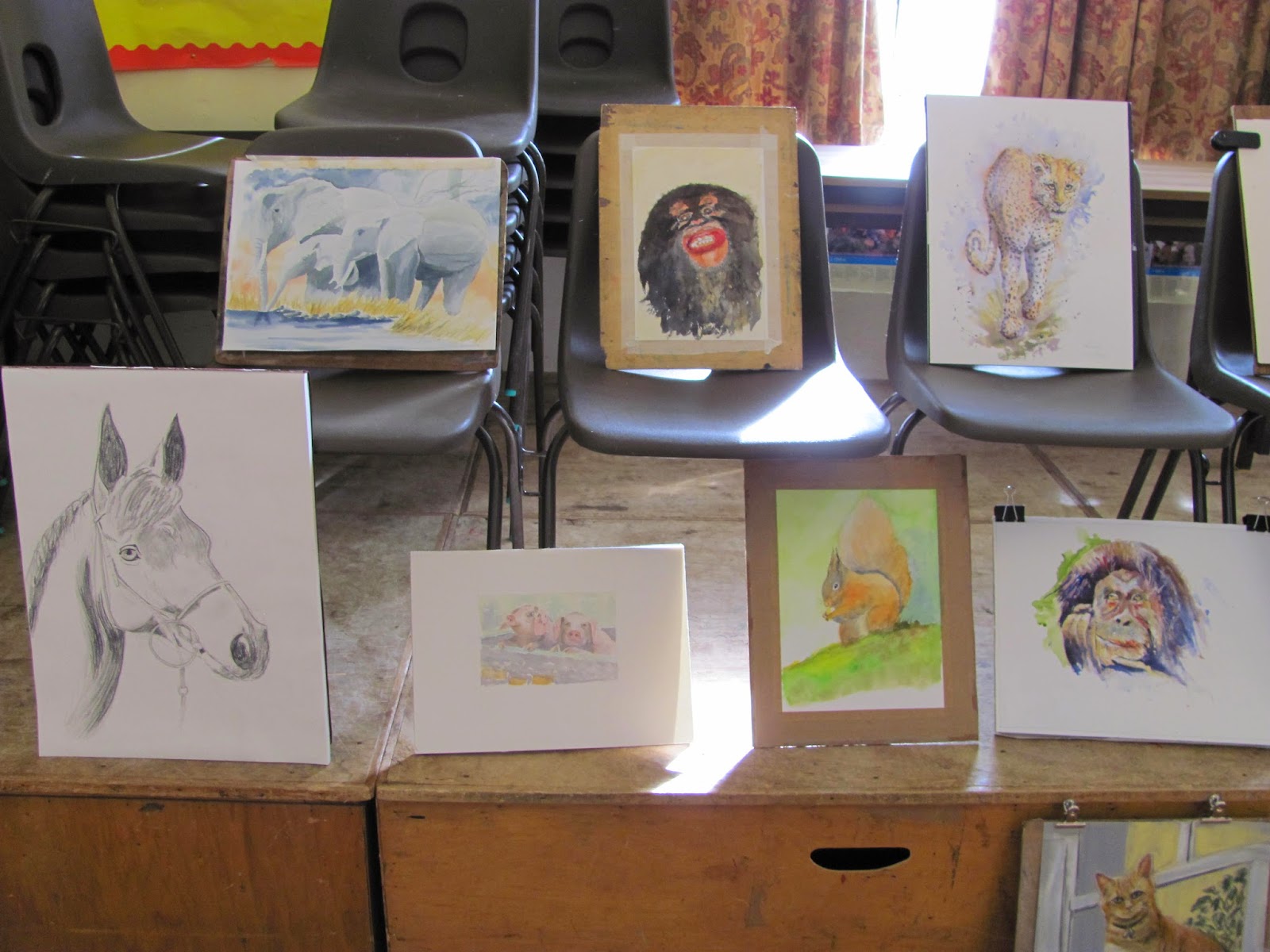
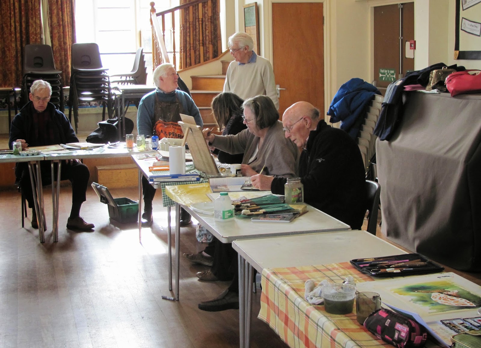
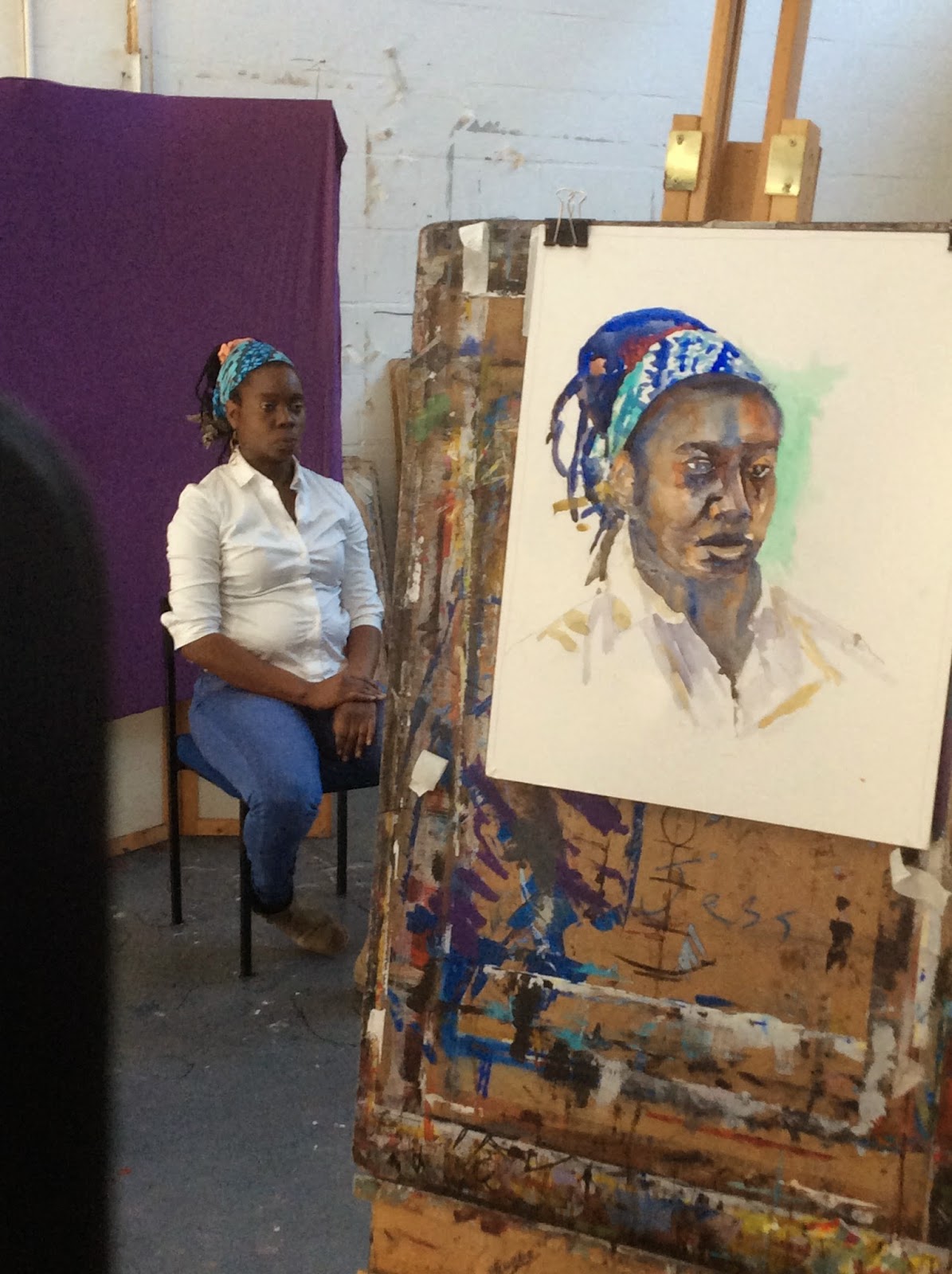
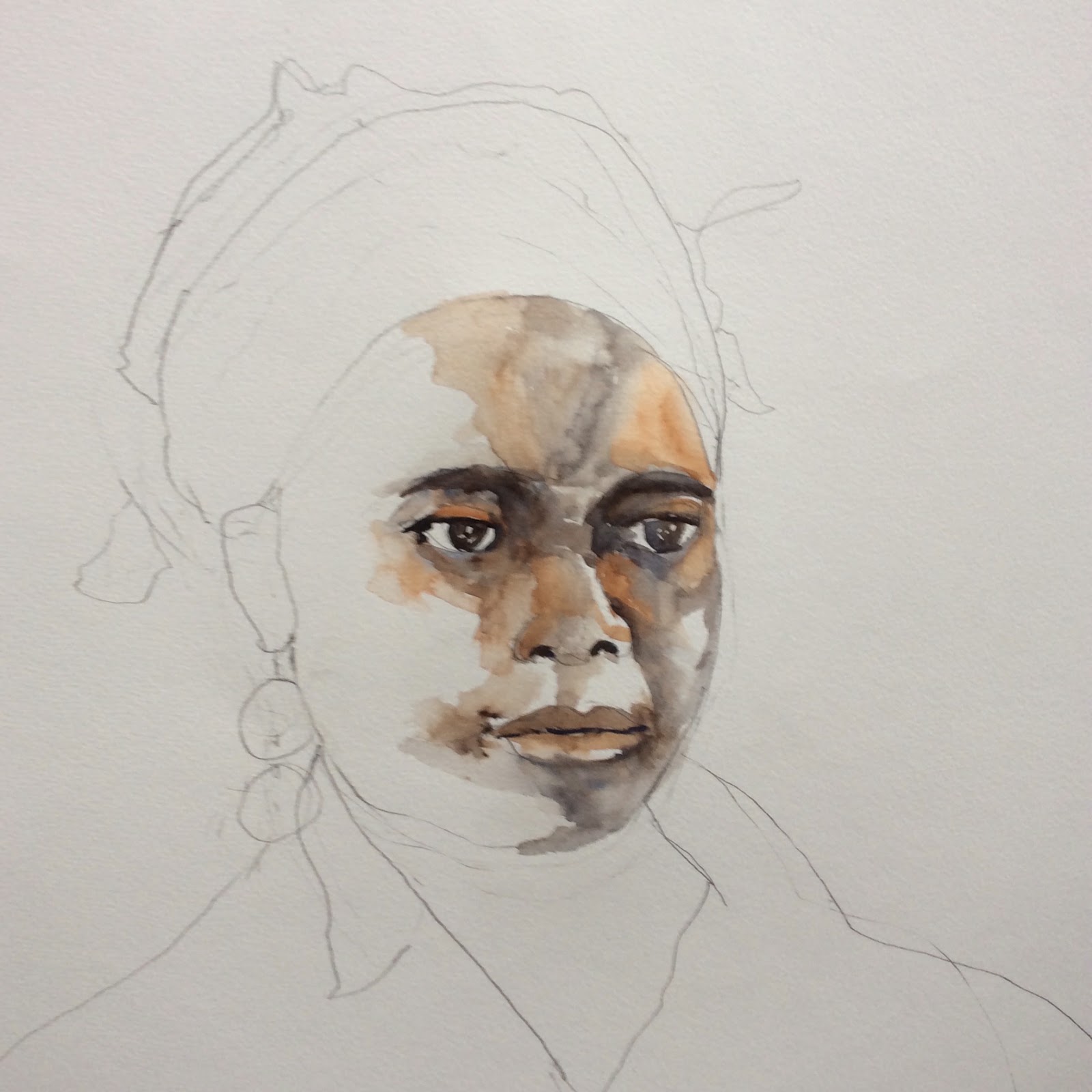
Brushes are one of the most expensive items, especially sable or Kolinsky sable (however see article on sable brushes Index June 2014), These are excruciatingly expensive once you get beyond size 8. I suggest trying sable/synthetic mixes from someone like Rosemary & Co www.rosemaryandco.com or Jacksons. There are several to choose from. I have also recorded the choices of great artists like Viktoria Prischedko and Piet Lap (see article Index June 2014) who use the Da Vinci Cosmotop series, a mix of synthetic and animal hairs. One friend of mine, who is a very fine artist, Yvonne Harry, uses synthetics, normally Pro Art and much prefers them to sable brushes. There is an increasing range of quality synthetics becoming available from the Catalan maker Escoda, and Rosemary & Co has a wide range. Synthetics are considerably cheaper. and affordable compared to sables.  The claim is that the latest synthetics are getting closer and closer to sables. The mail order specialists are also increasingly introducing own label brushes which are worth a try.

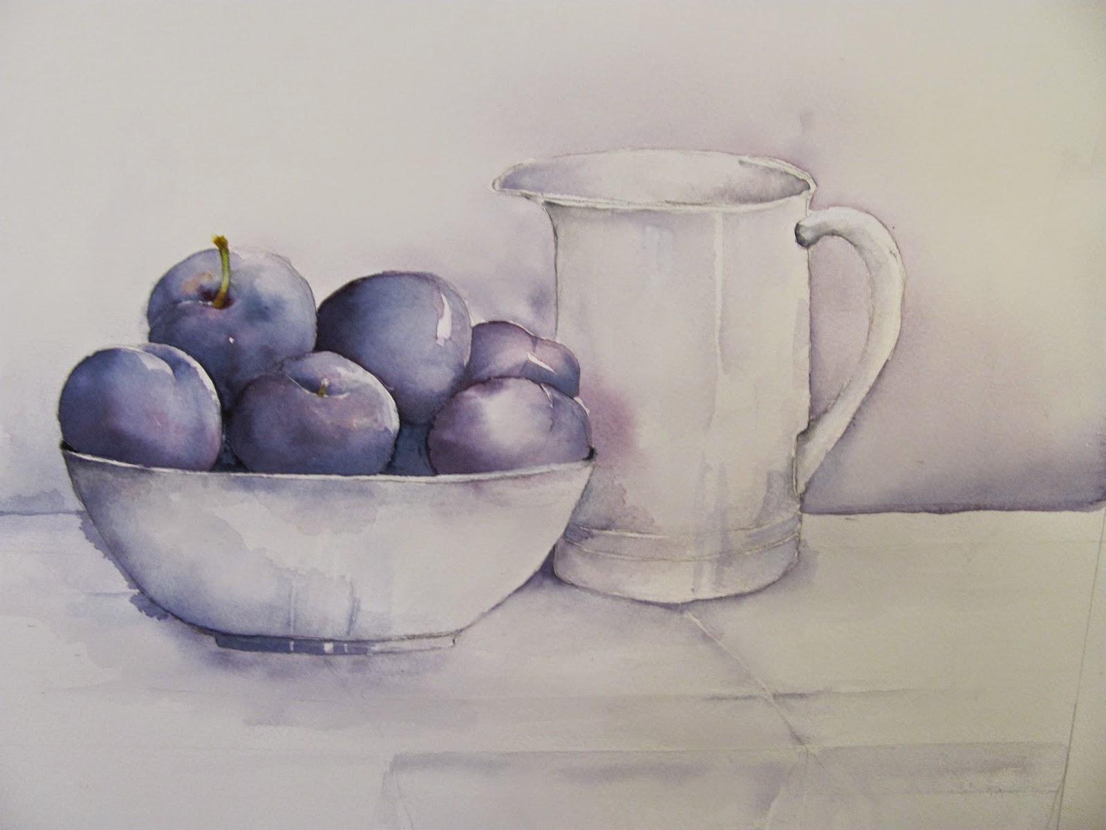
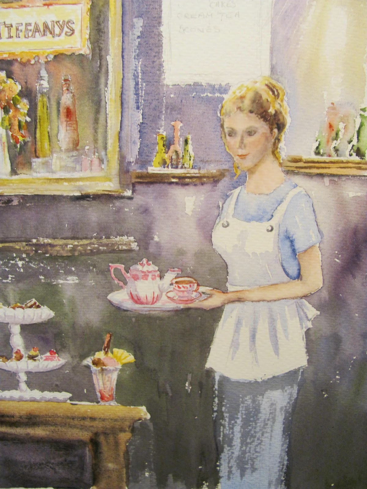
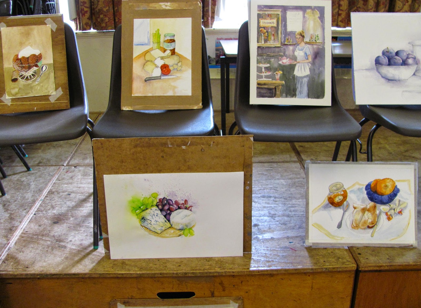
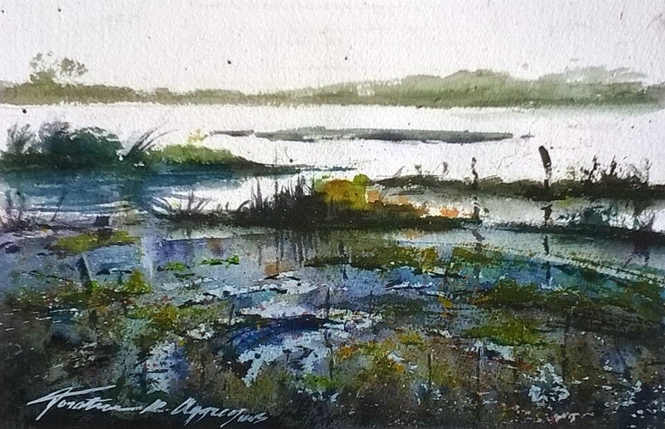
As for paper 100% cotton papers continue to rise in price. Cheaper non-cotton alternatives are some from the Hahnemuhle range, Britannia being one, while the perennial British favorite is Bockingford, used by many professionals as well as amateurs. Hahnemuhle Cornwall at 210lb (450gsm) is also favoured, and while roughly the same price as a 140lb cotton paper is cheaper than the equivalent cotton ranges in 200lb.

The best value 100% cotton paper, in my opinion, is Centenaire, exclusive to Great Art.

I don't know what the situation is in the USA but with a number of very aggressive online suppliers there are regular offers.


Weeks 8 & 9 Bath College Portrait Course

$
0
0
The final two weeks of this 9 week course were again painting our model Linda Odhiambo. 


Linda


This was my first effort  Week7  


Second effort Week 8 - 50cm x 65cm Canson 140lb (300gsm) not . I think I like this best of the three.


Early stages of `3rd attempt at `Linda'


Third and final painting 50cm x 65cm Canson 140lb not . This was slightly rushed with less time spent on it compared to the previous two.

In the first two instances I painted her at more or less the same, although not identically so, whereas for the final one I was moved around to the left so had a more sideways angle. With all three paintings I experimented with the skin colour as this was new to me never having done a black person before. The colours were mainly Ultramarine Blue, Burnt Umber, Transparent brown (Schminke PBr41), a little Cadmium Red and Cerulean Blue. I think that's it but I've probably missed something out - possibly Ultramarine Violet. I used my Isabey and Escoda Kolinsky travel brushes with the larger sizes like 14 predominant. The final two are the largest paintings I've ever done.  The boards holding the paper, held by strips of masking tape, were absolutely vertical. While I do paint fairly upright, usually not quite so much as this. I've tried to follow Charles Reids advice to be a little `crude' and to some extent went for it with the possibility that a disaster would ensue. This didn't happen although you may disagree. Certainly the number of `likes' on the Facebook group `Portraits & Figures (People) in Watercolour', which I started - almost 13000 members so far - are not particularly flattering side, very low compared to many other paintings posted. I've had a better response on my personal Facebook page.

As you may imagine this was quite an experience. I felt I coped with it quite well and came away thinking I'd definitely learned something - not bad at my age! Prior to the course I was beginning to think my learning capacity had hit a brick wall. I'm considering taking a Life Painting course with the same tutor although the timing of it is a slight problem, being in the evening rather than morning..
Viewing all 502 articles
Browse latest View live


Latest Images