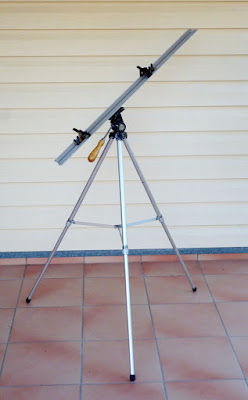
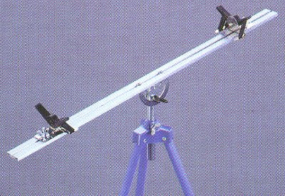
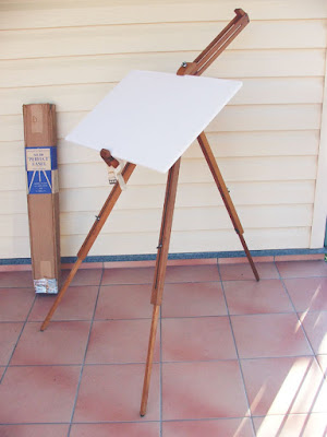
Quantcast
Channel: The Watercolour Log
Viewing all 502 articles
Browse latest View live

Latest Avon Valley Artists Sessions.

$
0
0
The last two session subjects were respectively, `Spring' and `Sunshine and Shadows'. As is usual we were given considerable leeway in how we interpreted the subject. You can see this from the resulting paintings, at least some of them! Attendances have been poor recently, a cause for some concern mainly due to the increasing ages of many members. We  need some new blood!


Peter Ward


Peter Ward


Pat Walker


Pauline Vowles


Subject `Sunshine & Shadows'


Yvonne Harry


Jan Weeks


Pauline Vowles


Gerald Pink


Another Amerindian

$
0
0
This is my latest study. I'm not absolutely certain but believe this to be an Inuit man, possibly one of the Alaskan tribes. The original photograph dates from the 1900s. I think it shows the influence of the recent portrait course I've attended at the College of Bath.


16" x 12" Centenaire (from Great Art) 140lb (300gsm) not

Colours were quite restricted, mainly to blues and browns plus Raw Umber and Cadmium Red Light. Completed in about one and a half hours. I used Pebeo masking fluid for the fine lines in his facial hair and a few other places.

Brushes were my usual Isabey and Escoda travel brushes, it was painted at the last AVA session. I'm quite pleased with it.

Watercolour Paintings (4)

$
0
0
Here is another selection of watercolour paintings of different subjects and different styles. Some of the artists are unknown to me. There are thousands out there! Not everyone will appeal but I'm sure most will find some inspiration from the variety of styles, use of colours and just plain talent on view.


Viktoria Prischedko


Stephie Butler


Morten E Solberg Snr


Igor Sava


Charles Reid


Gerard Hendriks


Millind Mullick


Lars Kruse


Gerda Mertens


Suzchiang Tan


Isabelle Fournier Perdrix

I like all of them, some more than others but feel free to coment if you agree or disagree.

UPDATED INDEX TO THE BLOG SEE JULY 2014


Book Review - Be Invigorated!

$
0
0
A while ago I mentioned this latest book from Charles Reid - a collection of his sketches from over the years produced in a limited edition `collectors' book. I gave my reasons why I wouldn't be buying it so don't feel it necessary to elaborate  further. One of my ` followers'; Ms `Mike' Gantt, having bought it, offered to submit a review so here it is. 


Book Review - Be Invigorated

If you want to be invigorated, order a copy of Charles Reids newest book" Sketchbook"! based largely on recommendations of his family and students who yearned to see a glimpse of the inside of his sketchbooks over 30 years, he has carefully selected some of his treasures to share with us! While it is not a "how to" book, it is a beautiful work of art.

He shares some valuable tips about why all of us need to keep a sketchbook... "it is portable and private","can be used as a diary of a trip", and can be used for future paintings or simply for studies. Because he includes sketches of his many travels, including handwritten notes. it is almost like taking a little trip with Charles and Judy Reid! His vibrant use of color is breathtaking and the book is so uplifting in the few words of wisdom he shares. I found it encouraging because he speaks openly about how he learned to draw and offers supportive tips for drawing. He stresses how watercolour artists with passion are anxious to paint, but states..."drawing and painting should be thought of as one and the same".

One of my favourite sketches is the one he did of Everglades City in Florida. Having just visited there last year, it immediately took me back to the little harbour we visited you can feel the heat of the day, the beautiful weather and the inviting coolness of the shade of the palm tree that welcomes you. In another sketch done in a studio with Gene Wilder, one can sense the calmness of the models and the intensity of concentration of the artists. It seems to me a sketchbook is often better than a camera since you have created it using all of your senses of seeing, touching and feeling.

It is my understanding that this is a limited edition book and Charles Reid signs each copy. If you simply love Charles Reids paintings, this book reflects his passion for watercolor and is one you will want to have in your collection. If you are an artist and are interested in learning more about the subtleties of Charles Reids techniques, this is a book you will want to have in your library for it will motivate you no matter if you are a beginner or an advanced artists, it is simply beautiful and powerful.

The sketchbook can be ordered from Charles Reids website (www.charlesreidart.com)

Ms `Mike'Gantt is a retired biologist from the U.S.Fish and Wildlife Service and took up watercolor just 4 years ago. She is a member of the North Carolina Watercolor Society and the Colored Pencil Society of America.

My thanks to `Mike' for this interesting contribution.

Latest Activities via the AVA (Avon Valley Artists)

$
0
0
My painting activities have been somewhat limited lately for reasons I won't go into but I'm still going to the AVA sessions and here are some of the paintings from some of the members and myself.


Peter Ward - an attempt at an abstract approach for the subject of  buildings, not one of my favourites


Yvonne Harry - actually pastels unusual for Yvonne.


A general view of some members work on the buildings subject


Peter Ward - Still like with flowers


Yvonne Harry- same subject. Yvonne and Jan were over an hour late due to a serious traffic holdup so their work was unfinished.


Clive Brotherton


Jan Weeks - unfinished for the reason given above.


Various still lifes


Walt Longmire from the television western `Longmire'

Peter Ward - I finished early one week so started on this one. Not very successful


 Model from the Next Ad in my newspaper. I rather liked this one but after viewing it the following day decided not to do any more, leaving me open to `the `unfinished' label


`Alert for Danger' - Latest Painting

$
0
0
This is my latest painting, painted at an AVA `catchup session'. Actually I missed the previous two so didn't have anything to catch up. I'm increasingly inclined to mainly confine my subjects to animals. birds and portraits. 


 Alert for Danger -16" x 12" centenaire 140lb (300gsm) not

I only decided what to do when I was at the AVA session. I first made a drawing using a Pentel  No7 2B mechanical pencil with my version of Charles Reids contour drawing technique. I really don't like over finished paintings so it's a sort of vignette.

Colours used were Raw Sienna, Gold Ochre, Raw Umber, Cerulean Blue, Ultramarine Violet and for the greens, Green Apatite. Green-Gold and Sap Green, various makes. The darks were a mixture of Ultramarine Blue and Burnt Umber

I only used three brushes, Escoda retractable Kolinsky no 10, Isabey retractable Kolinsky no 6 and Rosemary retractable No 6. 

It's a modest little painting but I'm quite pleased with it. 

Twelve More

$
0
0
Here are twelve more watercolour paintings by a variety of artists, some I know, some I don 't. They illustrate the wide range of subjects and the superb work that is attained by these and many other artists.


Charles Reid


Dioann C Benoit


Millind Mullick


N B Gurung


Stephie Butler


Morten E Solberg Snr


Jonathan Kwegyir Aggrey


Nusret Topuzoglu


Zhen Jing


Vasili Pohomov


Gerard Hendriks


Viktoria Prischedko


Not bad are they! Wish I could paint like some - most actually - of these artists

SEE INDEX JULY 2014 FOR LIST OF POSTS

Easels by John Softly

$
0
0
Once again I have enlisted the aid of my good friend John Softly whose research and experimentation of the subject is second to none so here we go.

EASELS  (PT. ONE) BY JOHN SOFTLY.

This review of watercolour easels is by no means extensive as models are restricted to those I own and have purchased over the last twenty years. 

I am somewhat pedantic as I like a painting surface to be sturdy, and my easels need to have little or no movement when erected. This has led to some expensive mistakes which were either sold or given away but the search for, what I consider to be the best easel, is at an end and the irony is the most versatile easel is possibly my first, made from a photographic tripod. Whether wood or metal is a matter of choice, and the balancing act between strength, stability, versatility and weight is paramount. All the easels pictured are strong and stable, but the versatility and weight varies between models.

 THE MABEF


This was my initial easel prior to equipping my studio (tin shed) with a drafting table. Many artists use box easels and the Mabef is one of the best. Heavy (5.5kg) and a pain to erect and dismantle it is stable and once in situ solid and versatile. There are after market shelves from American art suppliers but are difficult to set up. I rarely use the tripod these days but keep it oiled. Linseed oil is the preparation for all beech easels and applied annually to keep in good condition. 

THE MANFROTTO 190


Manfrotto 190 with Sun Eden Travel Adaptor and Easel Butler (Ikea) tray


Tripod Ball Head - the lever on the right frees the ball and the small lever on the left releases the Quick Release Plate.

This tripod was purchased for photographic work and as such was a great workhorse. Fitted with a ball head with legs splayed in three positions it was an ideal tripod to adapt as an easel/. Weighing in at 2kg it is a little heavy but with add-ons very versatile. Initially I used Gatorboard in conjunction with a Ken Bromley Tripod Adaptor but updated this with a Sun Eden Travel Adaptor, which fits all photographic tripods. After trying several methods of making a shelf I decided on an Easel Butler and, in a sub-tropical climate (Australia), an umbrella is an essential. The Bestbrella claims to be the best there is and I concur.


The Easel Butler - tray pulled forward - positioned in the lowest position - three positions available.

Hanging shelves and brollies off the tripod legs can make the ensemble front heavy - the oft quoted method is to hang a weight from the apex. A weight on the back leg is better as all the weight is situated on the front and unless a counter weight, I use a water bottle in the bag from Easel Butler which is purpose-made, is used the ensemble is inclined to lean forward. The splayed legs of the Manfrotto, which has three positions, help enormously in windy conditions,but once they are splayed the Easel Butler cannot be used.


Legs of Manfrotto splayed in the middle position

The new Manfrotto 190 is now a lightweight, carbon fibre, expensive tripod   but the older aluminium model can be found for under 50 pounds on auction websites. Anyone considering purchasing a tripod to use as an easel should go for a ball head or a headless one that can have a ball head added. A ball head can move anywhere on the XY axis with ease, whereas a pan head is restricted.

This setup is ideal most of the time but there are lighter, more compact, tripods that are almost as sturdy, and are ideal for travel, taking up very little room in a suitcase. 


THE NEST TRAVEL EASEL


Gatorboard with Bromley plate.

The cheaper method of attaching a support to any tripod is via a Bromley tripod adaptor plate. This needs to be screwed onto your support - Gatorboard - is possibly the superior board but, not readily available in the UK. First however a wooden plate must be glued to the board. The pictured plate is ready to accept the tripods quick release plate. I used 6mm MDF (PGW). Some web sites may suggest a small T nut with a quarter inch thread will suffice. This method has neither the surface area or strength to hold a half sheet board and should be avoided.


The Bromley Plate

For those who don't want to spend 50 + pounds on a Sun Eden travel adaptor see above, however this  tripod an do everything that the Manfrotto does. It is lighter (1.2kg) and will take the Sun Eden Travel Adaptor, Easel Butler and Best Brella. Not as sturdy as the Manfrotto with only one low position for splaying the legs, and is restricted to light weight supports of half a sheet or less.


The big plus with this easel is its compact size when closed. Together with the dismantled Travel Adaptor and the Easel Butler length is only 35 cm, yet when erected iis a full size easel. The brolly is better attached to the back leg for stability and is less wind resistant than larger tripods, but does everything you expect despite being so compact. I close this first installment with a novel, but nevertheless practical, do-it -yourself easel from the pages of Jack Merriots excellent book "Discovering Watercolour".


Strangely enough this works! 

This completes my photographic easel holdings and all my remaining ones are purpose-built but with the same criteria - strong, sturdy and versatile - more in Part Two. 

Best Brella:-http://www.bestbrella.com/index.htm
Nest Travel Tripod:-http://www.protog.com.au/buy/nest-pioneer-compact-travel-dslr-camera-tripod-235/NT235KBK  Website: nest-style.com/tripod-kits. Just try `googling Nest'.

The bottom two links don't seem to work however you can get to Best Brella at Bestbrella.com


This completes Pt One. When Pts 2 & 3 have been published  John will answer any questions put to him.


Latest Portraits

$
0
0
These are my latest efforts painted at the AVA `unofficial' session last Thursday. One is of the actor Emily Blunt and the other unfinished one of an old  Navaho man called `Many Goats', from a photograph dated 1913.


`Emily Blunt' 16" x 12 " Arches hot pressed.

I was given a nearly full block by Jan Weeks some time ago, as she doesn't like the hot press surface. I have tried it a few times and it is okay (with reservations) for portraits, although I think I prefer a not surface. I concentrated on the eyes and the rest is just `generality'. 


`Many Goats' 16" x 12 Centenaire not

Unfinished painting of `Many Goats' an old Navaho man, the guide photo emanating from 1913. I intend to finish it  The face is full of deep lines and `craginess' which I've tried to capture. I've done this without bothering too much about the skin colour, although in the original black and white photograph it looks moderately light.

In both instances colours used were confined to various combinations of Cadmium Red Light, Ultramarine or Cerulean Blue and Raw Sienna. The Cadmium and Raw Sienna are Rowney.

Only a few brushes used, Isabey Travel brush No 6, Rosemary Travel brush No 6 - the Isabey although called a 6 is smaller and very slim compared to the Rosemary which is a more normal size 6, and the other is an Escoda travel brush No 8 or 10. All Kolinsky sables.

Easels Pt 2 By John Softly

$
0
0
TESTRITE WATERCOLOUR EASEL

This easel; is manufactured in America and although mine is somewhat old they are still current. I first became aware of it when watching a Hazel Soan DVD and liked the way the support was held by spring loaded clips.


The Testrite apex adjustment mechanism


 The adjustment is similar to the mechanism of a photographic tripod with a pan head and, unlike a ball-headed tripod, the support bar only moves on the Y axis, whereas a ball head moves on the Y and X axis, which is the case in all the remaining easels depicted - with one exception.!

There have been several versions of this tripod over the years, this is one of the earliest. Hazel Soan has one with a lockable quadrant, to move the angle of the support bar (see pic). It is of average weight (2kg) but very stable and can take my Best Brella and Easel Butler. 


FROME EASEL


The Frome comes in different colours and some models have a couple of clips at the bottom horizontal support bar from which to hang a water container. 

This Italian-made steel easel is quite heavy at 2.2kg but  a model that is popular, possibly due to the fact despite the weight it is portable, although not to be carried for any length of time.

Australian artists visiting the UK  for the purpose of filming demos for APV or Townhouse Films invariably end up with a Frome, but they are not available in Australia. It is a positive sturdy easel with an oblong section support bar, with little or no play when locked, and my only criticism is the angle of the legs are set, and this can be a problem in windy conditions. 

WINSOR AND NEWTON TYNE EASEL


This one is similar to the Frome but is lighter (1.1kg) as it is made from aluminium. The main support bar is of oval section and as such not as positive as the Frome, really needing a pair of pliers to tighten the brass screws, even then the support is not entirely wobble free. The legs are basically the same as the Frome with no adjustment: they are either open or closed but it is light and very transportable. I have to admit I use this easel least of all those I have collected over the years, mainly as there is movement of an attached support as it is virtually  impossible to tighten the three round brass screws seen on the right of each movable piece.

My search for the perfect easel hasn't been a search as such - I just see an easel in use by a particular artist and think "That looks an interesting easel", find a supplier, be it new from an art supplier or second hand on Ebay, and either keep it if  liked or disposed of otherwise. Yes - I am fully aware I have too many easels but bear with me there are only three more to go!

http://www.hayneedle.com/product/testritedeluxewatercoloreasel.cfm -try this one for the Testrite
http://www.ukdigital.co.uk/nest-nt-235ak-tripod.html -  a UK link for the Nest


Latest Portraits

$
0
0
I have managed to complete a couple of paintings, mainly at  AVA `unofficial' sessions recently, although I did the drawing of `Many Goats' in my home `studio'. They are both portraits, although quite different.


16" x 12" Waterford 140lb (300gsm) not

This is an impression of the late Amy Whinehouse, a very troubled, if highly talented singer/songwriter. I saw what I presumed to be a very impressionistic photo/illustration in the Weekend part of the Observer newspaper. I was very taken by the colours and also the way the eyes and lips absolutely stood out. It's a new way of doing things for me, although based on my Charles Reid mantra of small areas of detail, large areas of generality. I concentrated on getting the lips and eyes as accurately as I'm capable of. To me they were the key, the rest just window dressing. Colours used were Sap Green (Graham)and Apatite Green ( DS), various reds, Gold Ochre (W & N), Ultramarine Violet with darks, mainly Ultramarine Blue with either Burnt Umber or Transparent Brown (Schminke), some Cerulean heavily diluted, in fact all the facial colours were heavily diluted. I'm quite pleased with it faults and all. 


Many Goats - Venerable Navaho Indian 1913 16" x 12" Centenaire

The top illustration was done a week ago and the final version yesterday. I think I prefer the partially finished painting! For some reason the finished painting has come out lighter.although taken with the same camera.

Never fear, next up will be the final part of John's excellent take on watercolour easels including a summary and much about Edward Wesson. It will take me a little time to type it all up.

Easels Pt Three by John Softly

$
0
0
THE HERRING VERSATILE EASEL

This the last installment of my take on artists easels consists of three of my favourites.The Herring Versatile Easel is a relatively expensive item (currently £109) for those living in the UK but the shipping costs to Australia double the price (the same applies for UK artists with regard to SunEden products from The USA which aren't cheap to start with PGW).


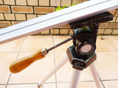
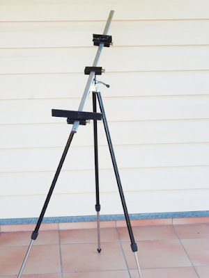
This easel has been in continual production for 55 years and is possibly the sturdiest easel I own. I did send e-mails to Potter in Norwich as I liked the wide support (see my view on the Potter PGW) but received no answer so I went for the Herring. Just as well I suppose as the heavier Potter would have cost more in shipping costs. The Herring weighs in at 1.5kg. I am unable to use the Easel Butler but can utilize the Best Brella. There are a couple of accessories for this easel. A metal shelf, 12" and 18" extension for the aluminium support and metal picture slides.


 Picture slides,12" extension and shelf.

Due to the shelf being somewhat narrow I am forced to use my Craig Young Paint Box as my usual palette, the CY palette box is far too large. As you can see the Paint Box fits perfectly.


The artist Robert Brindley, who uses both a Herring and a CY Palette Box, has bolted a larger shelf onto the small Herring shelf, which holds his palette and mixing palettes, something I intend to do. See it on his Town House DVD.
http://www.youtube.com/watch?v=FsfY5Pqntwl

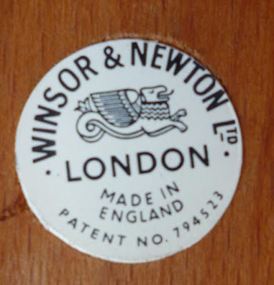
WINSOR AND NEWTON 116 PERFECT EASEL

I have had more trouble with wooden field easels than any other type. Due to my insistence that the ensemble be solid and not move when erected. I have sold or given away three Mabef wooden field easels. The problem was with the screw at the apex, which when tightened with normal pressure did not hold the legs and support tightly.More force was needed and the obvious happened - I stripped the thread.

Both Trevor Chamberlain and David Curtis use a W & N "Perfect" easel, having done so for the past forty years, so I considered that an excellent reference. The trouble is the last advertisement I saw was in an artists magazine from the late 1960s and I believe production ceased in the 1970s. However everything comes for those who wait and sure enough one appeared on eBay in Dublin. Not only a Perfect easel but one in the original box with papers. I was the only bidder so was I wrong in thinking this the best wooden field easel? My view is that this is the bees knees of easels. 


The apex screw holds the legs and support bar firmly, unnecessary force not being required.


The inlaid W & N Logo

Currently I am using this one more than any other, even though I consider my original Manfrotto photographic tripod the most versatile due to the ball head. I have no link for this easel, but refer you to the writings of Trevor Chamberlain and David Curtis.

 THE CARVER TABLE TOP EASEL

This easel is from Malcolm Carver, a high profile Australian watercolourist. An acrylic A3 board with weighted foot and ball head makes this the best table top easel I have found. It is also the most expensive.


The Carver easel ball head

I have other table easels but the Carver with the ball head is by far the most versatile.

http;??www.frankherringandsons.com/?section=products&prod=1179

To conclude; there was another high-profile English artist who used a `Perfect' easel and that was Edward Wesson. Between 1961 and 1981 Ted Wesson wrote 18 articles for `The Artist' and 15 for `Leisure Painter'. 

Ted died in 1983 before the advent of art videos and DVD's so his autobiography "My Corner of The Field", the five books written about him, the 33 articles penned by him, a couple of 16mm short films and the thousands of paintings he produced are the only insights into the man and his art. All six books mention his palette and the use of a French Polishers Mop. However in his magazine articles he delves deeper into methods, techniques and philosophy with eight quotes on easels.

My easel is a makeshift one, being an adaptation from the rather useless type often given to children. Not being a carpenter I will not attempt a description of it. Sufficient to say it is light in weight and simple to handle.( The Artist - March 1962)

Our easel should be light in weight and easy to carry. It can be one of the orthodox patterns or the camera tripod type with a swivel top and the appropriate screw fitting, which attaches to the board. There are a good variety of both types available. ((The Artist - January 1964).

The easel should be light in weight and I can think of none better than a metal telescopic tubular type. In a stiff breeze this may need a brick, but don't take one with you! There are usually some kicking around on the site. (The Artist - August 1967)

To my mind an easel is a must and the one I would recommend is the `Perfect'. This stands up to most conditions pretty well and can be used very satisfactorily for both watercolour and oil painting. ( Leisure Painter - June 1975)

Now whether we stand or sit .... one of the most essentials items in our equipment will be an easel and here we need to exercise care in our choice. One called `"The Perfect"* is most reliable, not too heavy but  fairly firm and safe. There is one lighter weight which has so many wing nuts to negotiate that, if not careful collapses as soon as we look at it. There are other more elaborate ones that look more like dentists chairs but I doubt whether they are any more efficient. As with so many other pieces of equipment in these modern times, the simpler they are the more effective they will be.
* Marketed by Winsor & Newton, this easel is now called the 116. (Leisure Painter - March 1978)

A stout but portable easel is a `must'.Don't have one that is too light; you will find it worse than useless. (Leisure Painter December 1978)

I have always preferred a box-easel which will contain everything including the canvas, and if this has legs attached,we have everything we need. I should mention that, when loaded, some ... can be very heavy. On the other hand the heavier they are they are better suited to stand up to boisterous weather conditions (Leisure Painter - Oil article March 1980) 

Now if we stand when painting, and I think this preferable the only other thing we need to carry is an easel. Of these there is a fair selection which always creates a problem. Which do we choose? There are wooden ones, one that reminds me of a barbers chair and , more recently, one that looks like a metal clothes horse. The snag with this latter is that when opened up, instead of adjustable legs, it just has two bars; so what to do if forced to work on a spot of uneven ground? No, I prefer the wooden type with telescopic legs, which used to be called the  "Perfect" (Winsor & Newton).` But, I do wish the wing nuts were on threads which have been `burred' off so the wing nuts cannot come away at the ends. This would surely be a very minor improvement and would certainly save me hours looking for pupils wing nuts in the meadow grasses or on river banks. The wonderful Le Franc easels do have this sytem and it is much appreciated by those of us who work in long grass or on river banks. (Leisure Painter - May 1980)

It would seem that Ted got his "Perfect" sometime after 1967 but still used a box easel for oil painting. As fas as palettes go he started off with a Roberson De Wint, switched to a Winsor & Newton Binning Munro and ended up with a Holbein 1000.

http://www.frandherring and sons.com/?section=products&prod=1179
http://carverstudio.com/online-store/

My experience with easels  (writes Peter Ward) is a fraction of Johns. I started off with a heavy metal easel of no obvious make which was later discarded. I have a Jakar metal easel, painted black, purchased from Great Art. This is not too heavy and easily dismantled to go in a carry case. I also have two `makeshift. ones, the first purchased from an artist who made them, after seeing them at EPC in Catalonia. I lugged mine to Spain only to find I could have used one of those. I've seen this called the `Alvaro Castagnet' easel . It is homemade with a cheap photographic tripod and two other parts, including a wooden shelf that fits on the tripod legs. Being homemade it cost quite a lot and is described fully with illustrations in an early post on here that you will find in the Index July 2014: regularly updated. I haven't used it for a while as I don't paint plein air these days. Would I buy one with hindsight? Probably not. My preferred option is the one described by John using a Ken Bromley bracket. In my case I bought a better quality tripod - about £30 - which has to have a screw top. There are plenty available and also adaptors with screw tops. I have two boards one large, one smaller each with a Bromley bracket screwed on. I used 6mm MDF but had to glue small pieces on to this, equating to the size of the bracket, which came from a piece of backing out of a photo frame. The reason was that the screws slightly protruded with the basic 6mm board, all detailed in an earlier post so if you are interested look it up in the index. The main problem is lack of a shelf so if you are  competent at `Do-it Yourself - I'm not - you can make one or get a carpenter to knock one up. When I became aware of SunEden products I  saw the perfect shelf arrangement but with the cost of carriage from the USA  equal to the cost of the product - the whole lot at least £80. My frugal upbringing in the North of England prevents me going to extremes, although I have strayed over the line on many occasions, primarily with palettes. I'm not sure that paying a fortune for a shelf is in the same league.

We now come to something I have experienced which John hasn't - The David Potter Easel.  At the time this was introduced it got rave reviews but then when have you ever seen a bad one in art magazines, especially when an advert for the product is prominent on the next page. I bought the lot which included two wooden shelves, very heavy, wheels and something else I can't remember. The easel is metal and the whole lot came to over £100. The idea is you can assemble the thing, and trundle it around when the wheels are connected. I did use it a few times but eventully looked for something less complicated and lighter. Overengineered? I think so. The one I had was an early one and it proved difficult to tilt. They did introduce some sort of modification later. I know some prominent artists have used this easel and when on a Judi Whitton workshop in Cornwall, she had one in the studio that she demonstrated with. I didn't see her lugging it around however. In the end I discarded it and sold or gave away a couple of bits. I still have the small shelf which I can use with my tripod setup but it isn't ideal, being quite heavy.

That's it then folks. Many thanks to John for this very comprehensive and mind provoking article. If you have any questions he'll be pleased to answer them.

COMMENTS

$
0
0
 I have recently had a small number of comments, mostly `anonymous' that I've taken exception to. One in particular has posted two in which he made sneering and snide comments about my attempts at Indian Portraits (and the fact I misspelled Amy Winehouse) - the last  saying I should give up Indian portraits. Well he's entitled to his opinion, it's the way he (I presume it's a he) expressed his views that I objected to, under this `anonymous' title. Anything that is `anonymous' is deleted as a matter of policy by the way.

I paint as a hobby and the actual  painting he objected to isn't a million miles away from the one I used as a guide. I'm not suggesting it is good or even 100% accurate as I have no illusions about my ability as an artist. All these posts emanated from Americans it would appear - not all on the same topic. I'm not anti American having been there many times. It's a wonderful country and the majority I've met have been really nice people, in fact some from Florida we met on a tour invited us to come and stay with them.

During the time I've been doing this blog I've had very little unpleasantness. The blog is just a hobby not life and death - there are far more important things happening as anyone keeping abreast of the news - not least in America - knows. .On one occasion a less than fulsome review of the then new magazine  `The Art of Watercolour' brought an anonymous comment that I was a moron. On another occasion a young lady got hot under the colour about the difference between amateurs and professional but later apologized after I pointed out it was the way she expressed herself not her actual opinions.

To clarify. To those who need reminding don't bother posting such stuff because it will just be deleted, especially, but not only, if it is anonymous, nor will I respond to it.  This sort of confrontational attitude isn't acceptable on a blog of this nature and I won't allow it.

Watercolour Paintings (5)

$
0
0
Another selection of watercolour paintings, mostly from well-known artists. A variety of different styles with something for everyone (I hope).


Millind Mulick - A very prolific and terrific artist with a huge following on Facebook. Uses a lot of green, considered a difficult colour by some artists.


Alvaro Castagnet - One of the top Worldwide workshop artists - enough said


Bev Jozwiak - this one and the one below are typical Bev. I love her jackdaws. She has a book out but you won't find it on Amazon or in Waterstones unfortunately. You will need to hunt it down probably via her website or Facebook page.


 Bev Jozwiak


Christian Couteau - A very distinctive style and use of colour.


Charles Reid - My guru (along with Gerard).


 David Taylor - One of the top Australian watercolourists


Edo Hannema - again less well-known but still good and this one appealed to me with its simplicity and subtlety, very hard to emulate.


Gerard Hendriks - a change from birds and animals, simple yet effective. Not one of my favourites - I love his birds.


Gerda Mertens - the famed Belgian artist, this one unfinished but very interesting to study how it is developing


 Jem Bowden - I don't know much about this artist, conventional but effective village scene, typically British.


Liu Yi - a Chinese artist now teaching at EPC Catalonia. Look how subtle this is.


N B Gurung - another  high profile artist with a large following on Facebook. 


Nita Engle - the terrific American artist who wrote an interesting book detailing her methods. Not for the fainthearted! I remember Ron Ranson showing her book to his students on a workshop.


Trevor Chamberlain. Considered one of the very best British watercolour artists, although originally painting in oils. 


Vickie Nelson - not so well known as some of the others but excellent nevertheless

Thats it then. I hope these prove interesting. I wish I could paint as well as many (most) of these people. You can almost certainly find the majority of them by just `googling' the name if you particularly like their style.  They are all on Facebook and some at least have their own web sites..


Latest Painting - Lemurs

$
0
0
I like painting animals and birds, and last week at an AVA Summer session I decided to paint some Lemurs, from a guide photo downloaded from the Web. Lemurs are mainly quite small animals native to the large island of Madagascar, in fact they are found nowhere else. According to a recent BBC programme there are 106 species and all are in the endangered category. Because of their appearance, which might be called `cute', they are a favourite of many and the highly popular animated children's film `Madagascar' , which most grandparents have probably seen, featured them heavily, undoubtedly adding to their popularity. The problem in Madagascar, as in many other poor countries, is the low standard of living of the bulk of the population, and in order to improve this deforestation , which reduces the Lemurs habitat, is being practiced on a large scale, in order to increase farming area. This is a very difficult problem because, in general, indigenous people see animals as competing with them for scarce resources and getting them to conserve both the animals and the environment is difficult when survival is their main interest. It would be tragic if they were to disappear.


The guide photo


First a loose drawing, quite lightly drawn


Just the main details


About two thirds of the way through


Mother & Child Lemurs - 16" x 12" Centenaire (Great Art own brand). 140lb (300gsm) not

I think the eyes were the key so I took as much trouble as I'm capable of using the Isabey Kolinsky travel brush Size 6. As I've said before, although listed as a 6, this brush is much slimmer than a normal six. 

Colours included Cerulean Blue, Raw Umber, Ivory Black, Transparent Brown (Schminke) and the eye colour (I think) was Quinacridone Coral with perhaps a slight tweak with another red-orange colour. Greens were Sap Green, Green-Gold and Apatite Green.

Brushes were primarily the Isabey and an Escoda travel brush size 8.


Latest Paintings

$
0
0
At the AVA session last Thursday I decided to continue with  animal paintings. I picked the subjects from photos I'd saved to the ipad and made the initial drawings the day before the AVA session. I used a 2B lead pencil which I sharpened before proceeding. The procedure again was to make a loose drawing, as accurate as I'm able, with not too much detail. I'm still affected by the accident to my right hand, that dislocated my little finger. My control has been affected and it's hard to be precise - even though I try not to be too fussy and don't want to get over detailed.


 Stage One - Cheetah and cub.


Painted the cub first, the head of mother then started on the greenery


16" x 12" Centenaire 140lb (300gsm) not


Tiger Waiting for Prey - 16" x 12" Waterford 140lb (300gsm) not


A closer look


16" x 12" Tiger Waiting for Prey! Waterford High White 140lb (300gsm) not

You may note that the paintings don't take up all the paper. I am loath to cover every inch with paint and the approach is more towards a vignette. I don't plan to frame them but if I did something like 12" x 8", with a wide mount would probably do. 

I completed the paintings in two hours, the exception being the Tiger where I added some white acrylic paint three days later.

Colours used included Raw Umber, Raw Sienna, Translucent Brown (Schminke), Quinacridone Gold (DS PO49), Quinacridone Rust (Graham PO48), Cerulean Blue, Ivory Black, Sap Green (Graham), Apatite Green (DS) and possibly touches of one or two others. Ultramarine Blue with either Translucent Brown or Burnt Umber for the darks.Does it look as if I've gone mad and used too many colours? I don't think so myself - why not?  

Brushes used were the Isabey Travel brushes Sizes 4 and 6, Escoda travel brushes 8 & 10 and the Rosemary Kolinsky travel brush Size 6. I think that's it.


Espon Unzo Owa

$
0
0
Despite my `anonymous' critic I continue to paint Amerindian portraits. Last week I was in Bath and called in  at `Good Buy Books' a shop that sells remainders - in other words new books at greatly reduced prices. I have bought many books at the shop but this was an unusual one. I spotted a book called `Edward S Curtis' by someone called  Hans Christian Adam. This was published by Taschen who, I am told by a keen photographer friend, specialize in high quality photographic books. It was £8.99p and although it did not show the original price I believe this was a fraction of it.

Edward Curtis created the largest known body of photographs of the North American Indian.devoting 30 years of his life to the subject. He has actually gained more fame in the years since his death. His most famous work is entitled `The North American Indian' which is a 20 volume series beautifully produced in a limited edition with an original price of $1000. I can't imagine what copies cost today.

When I bought the book it was encased in cellophane but when this was removed I wasn't disappointed. It has a superb collection of his photographs, a few of which I already knew but many I'd not seen before. No doubt more paintings will follow.


Espon Unzo Owa - Mohave Tribe 1903 16" x 12" Arches Hot Press

This is one of several paintings I've done on hot press, not all indians, and it certainly creates a different effect to other watercolour surfaces. Unfortunately not being an expert photographer it seems to me my paintings often lose something between photographing the original and transferring it here. Looking at the actual painting I think it better than the image above. Maybe this is just me making an excuse for my deficiencies as an artist. I keep trying.

The main problem in tackling this and other similar subjects is that the guide photos are sepia coloured and tend to be on the dark side with excessive contrast. Colours include a lot of guesswork on my part. I don't strive for a super realistic result but try to capture the subject with an impressionistic approach - the Charles Reid way. Sometimes it works sometimes it doesn't. I did this at the last AVA session and some of my fellow painters remarked I'd captured his likeness.

I used my small Craig Young Sketch box with Cadmium Red Light, Raw Sienna and either Ultramarine Blue or Cerulean, in various proportions, for the skin colours. Brushes were Isabey, Escoda and Rosemary travel brushes from size 4 to 10. The hair was a mixture of Ultramarine Blue and Burnt Umber with a little Raw Umber.


Watercolour Paintings (6)

$
0
0
Another selection of watercolour paintings with a mix of artists, some old (and well-known) others new. Hope you like them. A variety of styles .


Bev Jozwiak. A slightly unusual study for her but I love it.


Cao-Bei-an - The well-known Chinese artist.


Michelle Clamp - This lady is now heavily involved in the `Facebook community `Paint Colorful Birds for Fun' .


Christian Couteau - of the very distinctive style.


Charles Reid


David Taylor - one of the leading Australians.


Dusan Djukaric - look at the placement of the figure!


Gerard Hendriks sketches


Gerda Mertens


John Singer Sargent - enough said


John Yardley - still going strong at approaching 80, although this is one of his older paintings.


Jonathan Kwegyir Aggrey - a brilliant young African artist


Kate Osborne


Kuo Hsin-i

Some of these artists like Singer Sargent and John Yardley need no introduction, neither does Gerard Hendriks, Bev Jozwiak, Cao-Bei-an, Gerda Mertens nor David Taylor. The remainder I know less about but some `googling' would undoubtedly bring more information and they are all on Facebook in some form or other. 

UPDATED INDEX TO THE BLOG - JUNE 2014.

Nora

$
0
0
This is my latest Indian portrait painted at the AVA session last Thursday. 


Nowad luk (Nora) Ootenna Inuit Amerindian 1915 16" x 12" Centenaire 140lb (300gsm) not

I downloaded the original photograph from Pinterest OR it may have come from the Facebook community `Moses on the Mesa', a treasure trove of old Indian photographs. I don't really do it justice as in the photo her beautifully groomed hair tumbles down to her waist. Frankly I didn't feel able to portray this in a way that does it justice. Artistic licence?

I made a pencil drawing, not over detailed then painted, starting with the eyes, nose and mouth then gradually the rest of her face. When dry I put stronger colour in for the shaded areas. Colours used were limited to Cadmium Red Light, Raw Sienna, Ultramarine Blue and/or Cerulean Blue. The hair is a mixture of Ultramarine Blue, Burnt Umber with some Raw Umber. With more thought I might well have used other colours as I did in the Amy Winehouse painting. The original guide photo, as usual with these Indian paintings, is in black and white tending towards sepia.

Brushes used were Isabey, Escoda and Rosemary travelling brushes from 6 to 10.

In general I think it reasonable. I masked out some areas around the eyes and left them the white of the paper. I've pondered whether that was correct - too much white - but as I'm uncertain decided to leave them as they are rather than touch them up with some pale reddish washes.

Latest Paintings.

$
0
0
Not very active recently but did these at last weeks AVA session.  I'd made a pencil drawing of both some days previously.


Al Pacino - 16" x 12" Arches hoe pressed.

I was taken by the photo on the cover of the Guardian G2 supplement of the actor Al Pacino. He does look rather dishevelled  but as he said `he doesn't care any longer'. It isn't 100% accurate - I'd say about 80% - as I struggled to get the eyes right. The original is in black and white. I looked up other photos of him to check the eyes but that didn't help much. 

My usual colours, Cadmium Red Light, Burnt Umber or Burnt Sienna and Raw Sienna, Ultramarine Blue and Cerulean using various mixtures.

I started with the eyes, then the nose and mouth darkening the mixture of Cad Red and Raw Sienna with Ultramarine. I added the darker areas like the beard later.

Brushes were Nos 4 & 6 Isabey travel brushes, Rosemary No 6 travel brush and Escoda 8 and 10 similar


Heron - 16 " x 12" Centenaire.

I had done a loose drawing some time previously. The actual painting took about forty minutes and I'm not enamoured by it- too streaky I think - still `warts and all'. I did take more trouble  painting the head but the rest proved difficult.
.


Viewing all 502 articles
Browse latest View live


Latest Images