Quantcast
Channel: The Watercolour Log
Viewing all 502 articles
Browse latest View live

Avon Valley Artists - Animals

$
0
0
This was the subject at our meeting a week past Thursday. I decided to cover my effort in a separate post but show other members work, with some excellent paintings here.


Yvonne Harry


Cath Wilkins


Pat Walker


Jan Weeks

Gerald Pink

Since the above sadly Gerald has had a serious fall due to the current snow and icy conditions, and is in Bath RUH, where he is undergoing treatment. He is likely to take quite a while to fully recover and we send our best wishes to him and Sylvia.


Rhinos

$
0
0
The last meeting of Avon Valley Artists had as the subject `Animals'.  I selected a photograph of two Rhinoceros - probably mother and son (or daughter) but I can't be sure of this. The composition appealed to me, especially the head of the larger animal. 


`Rhinos' 18" x 12" Fabriano Artistico Extra White 140lb (300gsm) Not

I first made a careful drawing using a Pentel 205 2B Size 05 mechanical pencil. Although careful this was not over detailed. As can be seen in the photographs above I began by painting the head of the larger animal, starting with the horn and working across. I then painted the smaller one. There was a limited amount of over painting, particularly with respect to the darks, and I did a little more work on the rear leg of the smaller animal as Yvonne pointed out it was light by comparison with the adjacent darks. The background colours are Hansa Yellow Medium (Daniel Smith PY97) and Cobalt Teal Blue - I love this colour!

The main colours used were Quinacridone Gold (Daniel Smith PO49), Quinacridone Burnt Orange (Daniel Smith PO48), Raw Sienna, Raw Umber, Moonglow (Daniel Smith), Cobalt Teal Blue (Daniel Smith PG50) with the darks mixed from various combinations of Moonglow, Ultramarine and either Burnt Sienna or Burnt Umber. There is a little Ivory Black (Maimeri) in the eyes and a couple of other places. The Daniel Smith Burnt Orange is the same pigment (PO48) as the Graham Quinacridone Rust. I think it a little redder.

Brushes used were the Escoda and Isabey Kolinsky retractables sizes 4 to 10. Overall I am quite pleased with this one.


Snow Leopard

$
0
0
This is my latest animal portrait and is of a snow leopard. These secretive and solitary animals live high in the mountains of Central Asia and are in danger of extinction as there are less than 10000, some say even fewer, and they are hunted for their fur. There are several hundred in zoos around the World but do we want so many of these endangered species just existing in zoos?


16 " x 12" Gerstaeker No.3 200gsm 

Initially I made a `careful, drawing, avoiding `super' realistic detail, with a mechanical Pentel 05 2B pencil. I concentrated  on the face and reduced the detail outside of this to just a hint. The paper is a cheap own label Great Art product. It is basic but seems to work quite well on subjects like this. I wouldn't recommend it for large washes or where much over painting is done.

With the snow leopard being portrayed in Winter this is inevitably a  very `cool' painting although I have tried to introduce a little warmer colour for balance. Colours used were mainly Cerulean and Moonglow (Daniel Smith) with Raw Umber and (very) diluted Quinacridone Gold (Daniel Smith PO49). There is a little Ivory Black (Maimeri) about the eyes, nose and lip areas. The eyes have some Gold Green (Rowney PY129) in the lower parts. There may be slight touches with one or two other shades. Since I photographed it I have added a little red to the eyes.

I have done several of these animal paintings recently and will now be turning to other subjects, although I like painting animals and birds and will continue to do so. Judging from the lack of comments - apart from spam increasing exponentially - the Rhino painting, which I was very pleased with, seems to have  created little interest, although well received on Facebook, including a nice comment from Trevor Lingard. I am a little disappointed although that's life! I know animal subjects aren't everyone's cup of tea (or coffee). As the February challenge is of Irises I shall be working on some simpler compositions of this flower and if good enough may post the results, prior to the actual challenge subject, which is a much more complicated group of irises. 

Coming up soon are posts on Quinacridones PO48/ PO49 and I will also be featuring the artist Cao Bei-An.


PO48 & PO49 Quinacridones

$
0
0
PO48 and PO49 are two of the more interesting pigments, transparent and staining,  currently offered by a few -  very few - paint manufacturers. They are both synthetic pigments classified by Handprint in the `Earth' colours section and rated as `Top Forty' pigments. In the case of PO49 Quinacridone Gold the only source of the actual pigment is Daniel Smith and how long that will continue is a large question mark, as according to Handprint, pigment production ceased years ago, due to lack of demand from the automotive industry. As has been said the paint manufacturers are at the back of the queue, a long way behind the automotive and chemical industries so have to take the scraps!. One or two instances have come to light recently of manufacturers changing the formulation of their paints, yet the packaging and literature have remained unchanged. In other words what you see is not what you get! I wonder how this would play with trading standards? It would be foolish to expect the manufacturers to alter everything for the odd pigment substitution, but is to be hoped this isn't something that becomes widespread. When I have asked questions to at least two manufacturers  I received no response.

When Quinacridone Gold was originally introduced Winsor & Newton, Sennelier and Daniel Smith all listed it. They still do but, with the exception of Daniel Smith, the current paints are multi-pigment mixes that should correctly be called `hues'. In the case of Maimeri they changed to PY42 without telling anyone and the tubes still say `Quinacridone PV49'. Note PV49 which is and was incorrect and has never been altered. I found the Maimeri version, called Golden Lake, less than satisfactory. The Winsor & Newton Quinacridone Gold was called, by the doyen of Australian watercolour artists Robert Wade, as the `best thing for years'. It was a very nice paint and I still have two original full pans but is now a three pigment mix. I don't have it and while the shade may be similar the results of mixing it with other paints must surely be different.


From left to right we have Quinacridone Gold, Quinacridone Rust, Quinacridone Burnt Orange and Gold Ochre. Click on the photo to enlarge it. For more details go to www.handprint.com/HP/WCL/waterfs.html and then to the `Earth' section. I am not entirely happy with these swatches. The first attempt at photographing them turned out too light and using the colour adjustment feature has improved that, but there appears to be more difference between the two PO48 swatches than in actuality. My impression is that the Daniel Smith paint is equally rich if slightly redder. Gold Ochre is a lovely shade but very opaque.

The second paint featured is PO48 Quinacridone Orange. Handprint originally said production of this pigment had also been discontinued, but it appears this was untrue and it is currently available from at least three pigment suppliers. It is a lovely colour but the only sources, as far as I am aware, are Daniel Smith, Graham and Da Vinci. Graham call it Quinacridone Rust while the others Quinacridone Burnt Orange.  I have both the Daniel Smith and Graham paints and they are one of my favourites.

In the UK Daniel Smith paints are available from Jacksons www.jacksonsart.co.uk , Ken Bromley www.artsupplies.co.uk and a few others. Graham and Da Vinci only from Lawrence of Hove www.lawrence.co.uk . In the USA all  are freely available. I believe you can get Daniel Smith in Australia but (at a price). Whether any of the European art suppliers stock any of these makes is unknown, although Great Art certainly don't.  

Winter Scene

$
0
0
This was the subject at this weeks Avon Valley Artists session. Unfortunately I forgot to take my camera! The turnout was better than most recent ones with 19 members present.

I have taken to photographing Kelston Round Hill, which is a famous landmark I can see from my home. It is high and visible for miles around. It changes with the weather almost day to day, and I've been using the changing views as my header on my Facebook page. I'll have to change it again as the snow has now disappeared! It was shrouded in mist this morning and looked very atmospheric with the tops of the trees just visible, but by the time I got around to getting the camera out the mist had vanished.


 16" x 12" Waterford 140lb (300gsm) not

This was a very simple painting that took no more than 30 - 40 mins. I cropped it as you can see as I wanted the clump of trees to be the main feature and not be distracted by the mass of stuff at the forefront. Colours were very simple. A pale warm wash for the sky, very pale Quinacridone Rust (Graham PO48) and a mixture of Indigo and Prussian Blue for the trees , hedges etc. The scene looks almost black and white but I didn't want too dead a colour. Actually I think I struck lucky because I was looking at Yvonnes painting and asked what the very dark shade was she was using, which included some Prussian Blue. As the Daniel Smith Indigo is very black I wondered if mixing it with Prussian Blue (Graham PB27)would take away the `deadness'. I feel it helped. As for the snow I did add  in places diluted Cerulean and also some of the Q.Rust - very, very, diluted.  

I only used two brushes. An Escoda retractable Series 1214 Size 10 and a Rosemary retractable rigger, the 10 mainly for the sky and the rigger for the rest. 


Tuning up for the Challenge

$
0
0


The February Challenge between Mick Carney and me was my choice. Taking pity on Mick after the last two choices of mine, I selected a photograph of a group of irises. This is the actual subject and we have to produce a painting from it by the end of February. I intermittently paint flowers but  can't recall ever having done an Iris. As Mick has produced a series of these I thought I needed to tune-up by trying a few and this is the first.


Initial version. I wasn't happy with this and decided to consult our flower expert Yvonne Harry www.watercolourflorals.blogspot.com/ Yvonne took one look at it and immediately said `value' I had neglected to accentuate the darks. I should have known this but failed to address it. 


`Yellow Irises' 13" x 11" Fabriano Extra White Not

This is the `corrected' version where I have added several darks from a mixture of Indigo and Prussian Blue. Yvonne uses Indigo quite a lot, a standard colour with one of her favourite artists the late John Lidzey. They could probably have been applied in a more subtle way, a legacy of adding them later rather than when the rest is being painted. 

I was going to post the original photo but seem to have deleted it. Essentially you have a combination of yellows and greens. 

I first made a pencil drawing reasonably accurate but not over detailed, and then masked various bits and pieces on the flowers as there were quite a few white or near white areas. Looking at the colours I thought I'd try the Lukas Cadmium Yellow and Cadmium Lemon. as they seemed close to the yellows observed in the flower. Greens were a mixture of Hookers Green (Graham), Sap Green (Daniel Smith) and Green-Gold (Rowney). Where possible I mixed the colours on the paper. Blues were Cerulean, Cobalt Blue and Turquoise (Lukas PB17) for the centres, Raw Umber and Raw Sienna were used in the shadow areas and also some Yellow Ochre (Graham). There is a little Quinacridone Burnt Orange (DS PO48) in  a few places plus some spattered Apatite Green (Daniel Smith).

I only used two brushes, an Isabey 6228 Size 8 Kolinsky and the smaller Isabey 6201 retractable.

The main problem I face is keeping the painting nice and loose while avoiding it becoming over detailed and `stiff', or at the other extreme a shapeless mass. A couple more are on the cards before I tackle the Challenge.


Bei-An CAO

$
0
0
This is another of the artists I first became aware of in Kees van Aalst's popular book `Realistic Abstracts` (Search Press 2010). Apart from his portraits, which are more impressionistic, most of his other work is of an abstract nature with small areas of realism - which is why Kees van Aalst featured him in the book. Although watercolour seems to be his major medium he also uses pastels and acrylics. Many of the details that follow are from the literature that accompanied his 2013 workshop at the Moulin de Perrot Academy of Fine Arts at Gilhac-et Bruzac France. This is where Viktoria Prischedko also holds workshops.


Bei-An Cao was born in Shanghai in 1957. He graduated from the Academy of Fine Arts in Shanghai and subsequently held a number of  academic posts in several art institutions.  He moved to Brussels, Belgium to study at the Royal Academy of Fine Arts from where he graduated in 1998. He also attended other faculties and currently teaches at the Watercolour School at Namur.

Many of his works are in collections of professional painting in numerous countries including China, the U.S., Japan and various European countries. He has won many awards in both Europe and China.

For the course at MD Perrot his recommended materials included Arches 300gm (140lb) paper. He uses a variety of round and flat brushes and sells them on his courses. This probably means many are of Chinese origin as he admires Chinese calligraphers  and major Asian painters. He is a friend and disciple of the artist Zao Wou ki.. 

His choice of colours is interesting as he recommends either tubes or a Winsor & Newton box with some additional tubes. The colours given are Lemon Yellow, Gamboge, Orange Yellow, Vermillion Red, Cadmium Red, Permanent Rose, Red Ochre, Alazarin Crimson, Perylene Violet, Dark Violet, Ultramarine Blue, Cerulean Blue, Phalo Blue, Cobalt Blue, Light Green, Dark Green, Burnt Umber, Dark Brown, Ivory Black and white gouache. I don't know if these are all Winsor & Newton as the descriptions- Dark Green, Dark Violet etc - don't exactly match current W & N paints. nevertheless you get the idea -  20 paints in all. It strikes me that the `limited' palette is not in vogue with an increasing number of artists, principally - but not always - those who paint a range of subjects.

Following are a number of examples of his work. He does portraits which are impressionistic rather than abstract. His other work epitomises the `realistic abstract ' type of painting described and  well illustrated in the van Aalst book. This isn't to everyone's taste but I like it very much.


I think him a terrific artist and he has a large following. His website is www.caobeian.com/  where you will find a much larger selection of his paintings. Google his name and  more comes up. There is one video of his paintings on Youtube, more a catalogue of paintings rather than a demo.


Action!

$
0
0
This was the subject at the latest Avon Valley Artists session when once again I failed to take my camera, not deliberate I hasten to add. I was annoyed with myself at this latest lapse. 

There were fifteen members present and the subject lent itself  to a wide variety of interpretations. I can only show you mine but I'm sure you will see Yvonnes on her website. www.floralwatercolours.blogspot.com/   Her painting, very accomplished as usual, is of dandelion heads with the seeds floating away as they do.


This is the painting below in monochrome. After getting a mild slap on the wrist over the lack of darks (value) in my original Iris painting  I thought it might be of interest to publish monochrome versions of the paintings. The biggest problem in assessing value in colour is that what you might think is dark isn't necessarily so, or probably better described as applying values to colours. I hope this will prove of interest.

`Gotcha'! 16" x 12" Fabriano Artistico Extra White 140lb (300 gsm) Not
I'm unable to show the original photograph for copyright reasons but will describe it. Essentially it was similar in composition to the finished painting but with a solid black background and a large number of water splashes at the bottom part, which show up well against the dark colour. I decided to ignore this and go for a colourful approach heavily influenced by the Dutch master Gerard Hendriks, who I am pleased to call a friend. 

I first made a  pencil drawing, paying particular attention to the head but with only a basic outline for the rest. The intention was to make an impressionistic and colourful image of the bird, having caught a small fish, rising from the river. There is an element of abstraction and could be described as my take on the `Realistic Abstract' theme of Keest van Aalst. 

With the glorious colours of the Kingfisher  my colourist tendencies were given full reign. I painted the head first of all and did this with the small Isabey retractables. The colours are as described later except the eye was Ivory Black (Maimeri). The orange is principally Transparent Orange (Schminke PO71), a glorious colour, and although it isn't obvious there are also touches of Transparent Brown (Schminke PBr41) in the darker areas. The blue is mostly Turquoise (Lukas PB16) with some Cerulean. This Lukas colour is another star. The background colours allowed to mix on the paper, include Transparent Orange, Transparent Brown, Cerulean, Cobalt Teal Blue (DS PG50), purples mixed from Quinacridone Rose (Graham PV19) and Ultramarine Blue, Hansa Yellow Medium (DS PY97). I think that's it! I also splashed the same colours directionally to give the impression of the bird rising from the water. Finally, although not very evident. I splashed Vallejo Acrylic Gouache, slightly diluted, over the bottom area near the bird. This is useful stuff but beware - very messy!

My brushes were restricted to the Escoda and Isabey  Kolinsky retractables sizes 4,6, 8 and 12.

Winter Flowers

$
0
0
The subject this morning at the AVA session was `Winter Flowers'. Hellebores, Snowdrops and Primroses predominated, although it was suggested primroses are a Spring flower. Actually you will find the odd primrose in flower most months of the year. We had a good turnout today with 19 members present.

In my case I had few options so took a few Hellebore flowers from the garden, put them in a jar and that was my subject.


My Setup


Hellebores. 16" x 12" Waterford 140lb (300gsm) Not

Reds and maroons predominated with Moonglow (DS PG18/PB29/PR177), Perylene Maroon (Graham PR179), Quinacridone Fuschia (DS PR202), Quinacridone Coral (DS PR209) and Quinacridone Magenta (Rowney PV19 Violet Shade) plus some Ultramarine Blue for the darker bits. The light flower at the front is a mixture of very pale Hansa Yellow Medium (DS PY97), Viridian (Rowney PG18) and some Quinacridone Coral (DS PR209). The greens are a mixture of Sap Green (Graham PO49/PG7), Green-Gold  (Rowney PY129) and Hookers Green (Graham PG7/PY110). A little Cobalt Teal Blue (Daniel Smith PG50) in the background. The actual painting is a little stronger than it appears here.


Yvonne Harry

See the completed painting on Yvonne's blog www.watercolourflorals.blogspot.com/ 


Kath Wilkins


Jo McKenna

Jo is an enthusiastic for Shin Han watercolours, formerly used Winsor & Newton, and says she now won't  use anything else.


Brenda Parsons


Jan Weeks


All in all an enjoyable session. 


George Armstrong Custer

$
0
0
One of the most controversial figures in the History of the American West is George Armstrong Custer. Often referred to as `General' Custer, his brevet rank during the Civil War, he was actually a Lieutenant Colonel when commanding the 7th Cavalry at the famous battle of the Little Bighorn on  25 June 1876. Custer's total force amounted to 667 soldiers, scouts and civilians. Underestimating the Indians -  it is now believed there were about 1500 warriors, mainly Sioux, some Cheyenne and a few Arapahoes, although some estimates give much higher figures - he made the fatal error of splitting his force into three non supporting groups, his of 200 plus being completely wiped out. Total losses were approximately  253 soldiers and civilians killed plus 53 wounded. These are minuscule figures compared to what has happened in other conflicts but created a sensation at the time and has led to a huge literature, many films and continuing controversy to this day.  The 7th cavalry gained their revenge over the Sioux at Wounded Knee Creek on the 29 December 1890 killing 128 Lakota Sioux, including women and children, with 33 more Wounded. It was not the one-sided battle often portrayed as 25 soldiers were killed and 35 wounded, the 7th Cavalry's biggest loss other than at the Little Big Horn.


 George Armstrong Custer


George Armstrong Custer. A2 Waterford Rough 140lb (300gsm).

I first made a pencil drawing using a Pentel 205 mechanical 05 2B pencil. I then painted the features using various combinations of Cadmium Red Light, Yellow Ochre and Cerulean Blue. I avoided hard edges other than on the right facing side of the face.  The hat is a mixture of Indigo (Daniel Smith) in various dilutions with some Cerulean and the hair a mixture of Raw Umber, Raw Sienna, Gold Ochre and a little blue. His coat is Cerulean and Cobalt Blue with the bow and buttons a mix of Raw Umber and Gold Ochre (W & N). Possibly I've missed out some Quinacridone Gold (DS).

 Custer was played by Errol Flynn in the historically very inaccurate movie `They Died with Their Boots On'  - a typical Hollywood distortion - and I keep thinking my painting looks rather like Flynn!

Usual brushes currently the Isabey Kolinsky sables including retractables sizes 4 to 8 and the Da Vinci Artissimo 44 No 2 mop - roughly equivalent to between a 12 and 14 round.


Abstract

$
0
0
This was the subject at yesterdays Avon  Valley Artists session - not one looked forward to by most of the participants! Nevertheless one thing we all do is have a go at whatever subject is put before us, not necessarily enthusiastically, but with the intention of producing something that fits the topic.  Our approach is elastic, so that creativity rules, but in nearly all cases something resembling the subject emerges. In the case of `Abstract' it was suggested by Jan, who with Yvonne produces the programme, that `circles' might predominate. Some of us took this to heart some didn't, but again it was suggested one could use different approaches and Yvonne provided a number of small   photographs  that might be used as guides. 


Two hours earlier just blank sheets of paper!


Jo McKenna


???


???


Robert Heal


???


Yvonne Harry


Helen Newman (?)


Pat Walker


 Peter Ward (1) 16" x 12 Gerstaeker No.3  200gsm not.

As you can see I produced two paintings - about 30 - 40 mins each. The first conformed to the `Circles' suggested by Jan, the other was based on one of the small photos provided by Yvonne. At the very least it enabled me to play the range of colour options, in the first compliments etc, while the second was an exercise in shapes and colour - a collection of Ivy type leaves. In each case I used a cheap paper from Gerstaeker (Great Art). 


Peter Ward (2) 16" x 12" Gerstaeker No.3 200gsm not

Not everyone paints in watercolour. There are a number who use acrylics and pastels, although none of the above are pastels. Although Yvonne paints primarily in watercolour she slapped all sorts of things on the painting above which she describes on her blog www.watercolourflorals.blogspot.com/

My brushes were three, two Escoda retractables No.10 & 12 and a Rosemary retractable rigger (the only one she makes).


February Challenge

$
0
0
This month it was my turn to pick the subject and taking pity on Mick www.thepaintingstruggle.blogspot.com/ I selected a photograph of a group of Irises. Rather than one single large bloom I picked a group of flowers linked together in a sort of inverted v shape. The background is very busy - the whole scene is - which posed another problem.


Out of interest here is a monochrome photograph of the same subject - a wide range of values.


 13" x 11" Waterford 140lb (300gsm) Not

This is my first version. I wasn't entirely happy with as I felt it was tending to overworking, so decided to do a second one with a more simpler approach. Should I have had more soft edges? Too heavy handed?


15" x 11" Fabriano Artistico 90lb (200gsm) not

This is a simplified softer approach. I realise it may be said the flowers are floating on air as I have just hinted at the stems. This was deliberate as I keep thinking the background of the first painting is too heavy.

The colours used in both paintings were similar - as you might expect. The dark petals are a mixture of Indigo (DS) and Quinacridone Purple (DS PV255) - possibly also some Prussian Blue (Graham PB27). The orange is Schminke Translucent Orange (PO71). Other colours are Permanent Magenta (Rowney PV19), and Cerulean Blue. The background greens are combinations of Sap Green (DS), Green-Gold (Rowney PY129) and Hookers Green (Graham). There is also some diluted transparent orange. I'm not sure which I prefer.


It proved a fairly tough challenge, with a very busy subject, and considering I haven't previously done anything similar felt I'd made a reasonable stab at it, although you can always do better and that certainly applies here. When painting I often think to myself how would such and such (my favourite artists) handle this subject? 


Palette Update

$
0
0
Amongst the most popular posts since I started the blog are those on palettes. It amazes me that most reads even today are the palette ones. Much of the information is still relevant but things do move on so, as I'm not intending to repeat what has gone before, the relevant posts are as follows:

Palettes Pt.1 - August 2010
Palettes Pt.2 - August 2010
Palettes Pt.3 - March 2011
The Craig Young Experience - Mar 2011

To confirm interest in this subject - obsessional almost it seems with some artists - Wetcanvas have a thread still going strong under Watercolors (Palette Talk) called `Palette addicts' started in August 2012. As of 26th August 307 comments and 29713 reads! There is a lot of good stuff there if you are willing to wade through  it. My wife says I'm obsessional with my hobbies but some of the contributors leave me in the slow lane.

Just to summarize there are numerous types of palettes. At one extreme, used by some high profile artists, are dinner plates, butchers trays and various other receptacles made of either metal, china or plastic. Ron Ranson used the Stewart plastic trays sold at kitchen shops. It is really up to the ingenuity of the user and the way they paint. If you squeeze out a few colours onto the palette then the above solutions are fine. Some artists have an array of studio palettes which they lay out on a table, but if you paint outdoors then something more portable and compact is necessary. To my mind the John Pike (two versions) is hard to beat as a studio palette. The artist Mel Stabin uses his for all types of painting.

The most common palettes are plastic ones because they tend to be cheapest and are easier to manufacture. Plastic comes in two basic sorts, the more fragile vacuformed palette like the Robert Wade and Zoltan Szabo ones, and the harder, more durable John Pike and Herring palettes. No more are the days when Winsor & Newton and others produced metal palettes like the Roberson, Binning Monroe and De Wint. We do have some custom made palettes but more on that later.

Plastic palettes exist in numerous shapes and sizes. They are generally - but not always - much cheaper than metal, although there are metal palettes of moderate price. Since I wrote the original articles I have become aware of the Mijello range and very recently the extraordinary new $100 palette. Added 11/03/13: Apparently this palette is available on E-Bay for just under $70 so it has already dropped in price.


The Mijello - from Martin Universal Design - come in a range of shapes, sizes and prices. I have seen some classified under the `toy' section. Prices vary from around £10 to just over £40. I rather like the look of the second from last which has twenty four wells. In fact I was tempted to buy one when placing a Jacksons order for the AVA group last week. It is just over £16. I've seen some smaller Mijello palettes in a local art shop but didn't handle them and have no knowledge of how well they are made.  They do have a wide range and probably one to suit most needs. Plastic palettes are criticized for staining but I find the product Cif cleans them quite well. Some are less prone to staining than others. They are freely available from Amazon, several from Jacksons and if you `Google' `Mijello' watercolour (or watercolor) palettes various suppliers are listed. In the USA Dick Blick, Jerrys and others seem to carry them. It appears they are American but may be made elsewhere. What reviews I've seen are generally positive and they certainly have a range.

The latest Ken Bromley e-mail introduces two new palettes. They appear to be vacuformed so will be less sturdy than the John Pike or Herring-designed palettes.

The `Ultimate' Palette

This palette is 14" x 10" x 2" and has 12 separate internal palettes plus a separate mixing tray. It is £18.95p.

The `Premier' Palette

Also 14" x 10" but 1.7" deep , this palette has 20 wells and a separate mixing tray. It costs £14.95p. Both studio palettes I would suggest, not suitable for outdoor work If you go to Ken Bromley's website www.artsupplies.co.uk and type in `palettes' both are listed and clicking on them will bring up a video of each one which give comprehensive views.

I now come to the latest sensation. A plastic palette at $100 (plus shipping). This is being advertised via a Youtube video www.youtube.com/user/SHYsart?feature=Guide  You can stand on it  as demonstrated in the video - but why would I want to be able to stand on a palette? If you want a solid plastic, smallish palette then those designed and made by the Herring Bros, including a plastic version of the Roberson, are a much cheaper option. Herring do mail order but Ken Bromley also sell them www.artsupplies.co.uk/ 


The $100 palette a sort of variation on the Roberson.

There is also a Korean company called Shinhanart selling a range of Heung IL aluminium paint boxes on Ebay. They offer 13, 20, 26, 30, 35. 39 and 65 paint divisions! They are various prices based on size but nothing like as expensive as the brass ones, but obviously aluminium won't be the same quality as brass or heavy duty metal like the Fome boxes. It looks as if this is tied up with the company who sell Shin Han watercolour paints. I don't like boxes where the paint wells are on both sides, as when they are closed  one lot are upside down and leakage might well happen with those colours that remain moist. The only one that isn't like that is the palette at bottom right. 


Prices range from around $16 to $35 with - oddly - the sterling figure quoted for all the boxes identical at £10.90p. There is also free International economy shipping If you Google `Heung il Ebay' it takes you straight to a link so it is easy to access. They claim 100% positive feedback.


I now come to the cream of palettes, those made by Craig Young in the UK. The article listed earlier gives a detailed history of Craig and his palettes and they have been bought World-Wide by famous artists and other famous people as well as lesser mortals like me. He offers several types, the most popular being the Paint Box and the Palette Box, replicas of the original Roberson and Binning Monro boxes. Craig has also made a number of `specials' to the design of some well-known artists. Craig commands a very high price and there is mostly a long waiting time so he has never seen the need to increase the number he produces, all by hand. I have often thought that a small, specialist, metal working company might have gone into production with similar products at a lower price but this hasn't happened. (so far).

Craig has had this market to himself for some years but things are changing. There has been speculation that he might retire in the not too distant future although his son Robert is helping him. This may be just an unsubstantiated rumour as I've no information one way or the other. Added 7/03. I'm told by John of Little Brass Box that Craig doesn't have a son called Robert (he has a Basset Hound) and is not planning retirement for a while yet! John says  he also makes a small hand palette and a copy of the Fletcher Watson but has not been able - due to pressure of work - to update his website. John is completely inundated with orders for his Roberson type.

The first contender is a company called The Little Brass Box Company  also in the UK www.littlebrassbox.com/product.html  They are making a copy of the Roberson with three different models and several colour options.


Prices are up around the £200 mark and the approach appears to mirror Craig Young in that it is a small (one man?) operation hand making the boxes. This is a fairly recent development and I have no feedback on how good they are but it appears he already has a healthy order book.

At least two other contenders have also sprung up, one in the UK, one American. 


The above illustrates the box made by  Classic Paint Boxes www.classicpaintboxes.com   This is designed and made by David Cooper, an artist himself, in the UK. Both the little Brass Box and Classic Paintbox appear to be one man bands, which means they are expensive and waiting times will be a factor. This Classic design doesn't appeal to me and the artist producer justifies the 15 wells by saying you shouldn't use too many colours in a painting. Although a large number will agree it remains a matter of opinion.


These boxes are made by IBA-CO PALETTES www.iba-copalettes.com/ The website says that `IBA-CO brushes are `coming soon' so is this a larger operation?

Also posted on Wetcanvas was the following by someone called `Effers', all said to be in brass. It seems this is the individual behind IBA-Co.


Who makes these palettes? This appears on the IBA-Co site and all the products above are listed with names for each one. They actually look different and although the poster on WC was asked who makes them has not so far replied. There appears to be some differences between some of these and those in the first photograph. Look at the shape of the wells for example. Added 8/3: If you look down to the comment section you will see that the owner of IBA-Co palettes has posted various explanations and much useful information in response  to my piece. This is most helpful.


It is never a bad thing to have competition. It is interesting that these new sources of hand made palettes have sprung up and time will tell how good they are, and whether they make a success of it. Obviously being so new there is yet  little feedback from purchasers. The prices are lower than Craig Young and my guess is that, providing user feedback is positive, they will eat into his sales in America.

I asked my friend John Softly his views on the new entrants into the hand-made palette market. John has tried numerous palettes and has strong views on the subject. They are entirely his and I print them without  (much) comment.

"..From what I see Craig has little to worry about although the newcomers are considerably cheaper (my italics)... there will be obviously others coming..... in the not too distant future but design is everything"....  the one thing Craig has above all others is that he is a watercolourist and knows about art history and traditional design"

John feels, from studying the photographs of these new palettes, that there are  deficiencies in design due to lack of understanding of what is required. John's opinion is that the best are any of Craig's plus the Holbein if you are right handed. He has experienced rust problems with heavy duty Winsor & Newton boxes (made by Fome) and does not like the aluminium type at all as in his experience they flex and the joints give. A small 20 year old Holbein has lost some enamel but shows no sign of rust. John doesn't like plastic but thinks the Herring the best of the bunch.

There you have it  - strong opinions from someone who has considerable experience with different types of palettes. I probably take a more relaxed view of things. In my opinion price has to be considered and good plastic palettes are perfectly acceptable for many artists. As I've said earlier some fantastic artists use all sorts of odd receptacles. In the end you pay your money and take your chances. I own three Craig Young palettes, various plastic ones including a John Pike, and some of the small metal palettes you can buy empty and fill with half or full pans, which can also be bought empty. My most used palette is the Paintbox (Roberson design), and a small cheap supplementary metal one filled with a dozen or so empty half pans, which I fill with paint. I have adapted the Paintbox by sticking some half pans into a few wells so I have 24 colours compared to the standard 16. Craig produces a `large' paintbox with additional mixing wells and 20 smaller wells for paint. I have a pristine Binning Monro, in British Racing Green  from Craig, yet to be christened even though I have had it quite a while.  It's No.165. When will this happen? I just enjoy handling it! As for outdoors I have a small Sketchers paintbox made by Craig. I've rather gone off it to be blunt even though I got Craig to make me a  four pan clip on extension. I think it too small but Charles Reid uses it without difficulty, and Judi Whitton has a slightly larger custom-made version with twenty wells. Against these fine artists who am I to argue! Having just received the details for the Charles Reid workshop at Stow on the Wold in May I think I'll have to resurrect the Sketchers box for the outdoor sessions, assuming the weather allows us to paint outdoors. 

I know I'm open to criticism by those who say you should limit your palette to many fewer colours. Each to his own as I  paint several different subjects and don't normally use more than a dozen colours in a single  painting, often less. With the fabulous range of colours available it seems silly to restrict oneself to 10 or fewer in total. As an amateur artist I don't have any pressures on me to conform (or make a living from painting). I like to experiment.

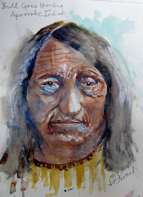
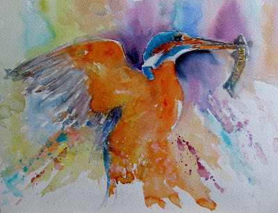
From the Wetcanvas experience it is obvious palettes cause much excitement and interest from users. Many other artists will wonder what all the fuss is about.  You may be enlightened or even more confused by  the above, and information in the previous posts. Remember when push comes to shove the important thing is getting paint on to paper. 

Tree Studies

$
0
0
At the most recent Avon Valley Artists meeting the subject was `Trees'. Once again I failed to take my camera so can not show other members paintings. However prior to the meeting I decided to do some tree studies, an attempt to try new things and improve an area of weakness. The first two were painted in my `studio' and the other two at the AVA Thursday session. 


This was No.1 - the left hand one based on a photograph 


No.2 Again based on a photograph


No.3 from my imagination


No.4 again imaginary

The first was more orthodox as far as the left hand tree is concerned but I varied the colours and let them run together.

The second one was an attempt to achieve a more textural result with spattering and sponges brought into play.

The third study involved the use of very strong colour - which I let run riot - in the trio of trees at the front. There are reds, blues and oranges with the background trees reduced in intensity.

The 4th and final one (for the moment) was purely imaginary using Transparent Orange (Schminke PO71) and Turquoise (Lukas PB16)  as strong colourful contrasts in the trunk. The foliage was blues and greens  with water first spattered on to give a blurred effect. 

I used my normal brushes but included a Rosemary Moongoose fan brush for both foliage and ground in Nos 3 & 4.

None took very long 20 -30 mins, No.1 slightly longer, but the one I like the best, number 4, the least of all at 10 -15 minutes.


Another Bird

$
0
0
I recently did two small paintings of Robins. I rather enjoyed it and inspired by Gerard Hendriks quick, colourful, and impressionistic current series of bird sketches off I went. Mine aren't as loose as Gerards, not deliberately just how they work out. They don't take that long, an hour at most including the drawing (and breaks). I'm not sure what the bird is. It looks like some sort of Finch but not a UK species.


`Pensive' - 24 x 32cm Cold Press Fontenay 140lb.

I first made a careful drawing, paying particular attention to the head. I then started to paint from the bill with Ivory Black (Maimeri). I then moved to the yellow on his head using Indian Yellow (Rowney PY153) and then to the red areas with Quinacridone Deep Gold (Daniel Smith PO48). The green/yellows were Green-Gold (Rowney PY129) and Sap Green (Graham). There is some Cerulean in the shadow area under his breast and a little Burnt Umber. The branches are also Deep Gold, sometimes with a little Burnt Umber.  

Brushes used were all Isabey. The retractable Nos 4 & 6, which are quite small and slim for their respective sizes and the No 6 Kolinsky.which is more like a normal size 6.


Turquoise PB16 (Pigment Blue 16)

$
0
0
A few months ago I purchased a few of the German Lukas paints to try. I had read some good reports about them and  they are very well priced, although the standard tube size, a large 24ml, might put some artists off - but they also have pans.  Great Art are currently running a `special' on the pans. With quality watercolour paints now excruciatingly expensive, a more economical alternative is welcome.  This is the price situation with Lukas in Europe but prices may be higher elsewhere, certainly in Australia, according to my friend John Softly.  I did cover the Lukas range in general recently (January 2013) so if interested you might  refer to that. There are certainly colours worth buying as you can mix paints from several manufacturers whatever may be said to the contrary.

 PB16 is one of the phthalocyanine pigments epitomised by the popular PB15, which appears in all ranges and comes in several versions. PB16 is described by Handprint as "a lightfast, transparent, heavily staining pigment, moderately dark to very dark valued".  Bruce also rates it as a `Top Forty' pigment.  It has been slowly gaining popularity and is available from seven manufacturers. Winsor & Newton call it `Phthalo Turquoise', Maimeri `Turquoise Green', Lukas `Turquoise', Old Holland `Caribbean Blue', Schminke `Helio Turquoise' , Holbein `Marine Blue' and Da Vinci `Phthalo Turquoise'. When Winsor & Newton introduced it Bruce McEvoy said Daniel Smith were sure to follow. So far they haven't but do have the superb Cobalt Teal Blue (PG50) which many prefer. A criticism of the Phalo pigments is that they are heavily staining and the colours can appear harsh and unnatural. On the plus side they are very lightfast and transparent. I used to think the colours were harsh but have changed my mind somewhat. They are also excellent for mixing with several other paints


The top left and middle paint are both PB16, the Lukas and Maimeri versions. I don't see much difference, the Maimeri perhaps slightly darker but that may be down to my mixing not the paint. For comparison purposes I have added the Maimeri  Primary Blue Cyan PB15:3  (Green Shade) which looks very similar and is the PB15 version most often offered. When you do swatches like this it does make one think and perhaps alter the existing perceptions you have. For example is there any point in not just having the PB15:3? Incidentally Lukas have several versions of PB15  (PB15:1 to PB15:6) in different blues as well as PB16.  Names vary with Phalo Blue, Cyan Blue as examples. I recommend always check pigments numbers and don't be seduced by names.

I gave both Yvonne Harry and Jan Weeks of Avon Valley Artists blobs of the Lukas colour to try. Yvonne liked it but is resisting buying any more colours as she has so many, and dreads me coming along - again - saying try this one! Jan much prefers Cobalt Teal Blue from Daniel Smith. I think there is room for both as the shades are distinct but certainly only in an extended palette of 20 plus colours. Look however at the W & N Cobalt Turquoise and compare it to the Daniel Smith Cobalt Teal Blue.

Just out of interest I have included a swatch of Rowney Cobalt Magenta (PV14) more for my friend John as anything else. He has been trying to find one that suits him and appears to be settling on the Graham version. John has tried Rowney, but his is the old version called Cobalt Violet while that above is from the current Rowney range. It granulates beautifully, although a rather weak colour which is a feature of PV14. I did have some little trouble with it which I related in the piece I wrote on the problems with the Graham Mineral Violet PV16  (October 2012 Problem Pigments). Compared to most other PV14 paints the Rowney and Lukas are the most economical price wise, but they are not consistent across makes, as a swatch John put on Wetcanvas of  several PV14s showed  a wide variation.

The compliment to PB16 Turquoise is orange, Handprint say Perinone Orange (PO43). I think it  great with the Schminke Transparent Orange or Lukas Permanent Orange, both PO71. 

Lukas is available from Atlantis Art in London who do mail order www.atlantisart.co.uk/ but the website  seems well out of date, Great Art www.greatart.co.uk/ and W.E Lawrence www.lawrence.co.uk/. In the USA and Canada it appears Jerry's Artarama www.lukasamerica.com/ have the franchise  If anyone has any information to add to the above or  other comments I'd be pleased to hear them.


Spring

$
0
0
This was the subject at todays meeting of Avon Valley Artists. The number present was only 12, which was a little down. Nevertheless those present tackled the subject with  enthusiasm and less than two hours later blank sheets of paper changed to the following.


Yvonne Harry (unfinished)


Helen Newman


Jan Weeks


Sue Macy


Pauline Vowles


Jo McKenna


Pat Walker


Peter Ward

I can only really comment on mine which was based on combining two separate photographs, one with the flowers and another with the Bullfinches. In general I was happy with it apart from the male Bullfinch where I didn't quite get things right. Still warts and all....


Fishers Lovebirds

$
0
0
On Facebook the well-known artists Gerard Hendriks and Robin Berry have instituted a modest painting competition where each posts paintings of the same subject - various small birds. There have been several so far and anyone who was interested was invited to join in. I don't know if they were serious but I've had a shot at one. The most recent  was of `Fishers Lovebirds' and here is my take on it, although my reference is a different one. Gerard calls this series something like `splashes, sploshes and scribbles'. It's a fun thing and mine was completed in about 30 - 40 minutes.


`Fishers Lovebirds' 10" x 9" Fontenay 140lb (300gsm) Not

I used two brushes, both Isabey. The No.8 Kolinsky and the No 6 retractable. Colours are Transparent Orange (Schminke PO71), Cadmium Orange (Maimeri PO20), Indian Yellow (Rowney PY153), Sap Green (Graham), Quinacridone Rose (Graham PV19), some Raw Umber, Ivory Black for the eyes,. The background is Cobalt Teal Blue (Daniel Smith PG50). There may have been slight touches of  Cerulean and Burnt Umber. 

Avon Valley Artists - Thursday 21 March

$
0
0
The subject today was `leaving'. If that doesn't lend itself to wide interpretation nothing does! Only 12 members were present but as usual served up some interesting paintings.


Yvonne Harry


Jan Weeks


Pauline Vowles


Peter Ward

I intend to `tweak' the eagle above so will post the `corrected' version  separately..


Another Indian.

$
0
0
Actually I've done this fellow before, an Apsorake Indian called Bull Goes Hunting. I know little about him nor could I find out anything.


16" x 12" Waterford 140lb (300gsm) Not

I  messed this painting up by overworking the hair and  almost binned it. That's where it will probably end up in any case but I was originally pleased with the face, so decided to try a `rescue'. This involved washing out much of the colour in the hair. I then let it dry and put in a few darks framing the face. It still isn't as I would have really liked it but enough is enough!.

The main difference in this painting was the use of the Schminke Translucent Brown (PBr41) to try and get a more authentic skin colour, something my friend Hap regularly pulls me up about. This was mixed with Cadmium Red Light and Yellow Ochre, plus Cerulean, in various proportions. There are probably small touches of other colours but I've forgotten which. Some Acrylic white was added at the end for highlights.

My usual brushes all Isabey except the Da Vinci Artissimo 44 No2.


Viewing all 502 articles
Browse latest View live


Latest Images