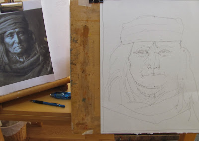
This Amerindian image is from the Edward Curtis series and represents a hostile Apache brave circa 1880. I have done this one before but I think this is better. The likeness is not 100%, round about 70% I would say.
I'm not sure what the paper is, possibly Indian hand-made, bought from Foyles in Cabot Circus, Bristol. Foyles are a famous London bookshop - now a small chain - not an art supplier but they were selling a small range of watercolour paper.

I used a scale divider to help me get the dimensions and spacing right scaling the guide photo up one and a half times, using a mechanical Pentel 07 2B pencil.

Stage 2 - approximately.

Stage 3

A Hostile Apache - 16" x 12" Not
Face colours were essentially various mixes of Cadmium Red Pale, Cadmium Yellow Light, Cerulean and Cobalt Blue. The major colour is Cadmium Red, very little yellow and small amounts of the blues to darken the mix.
The hair is basically Ultramarine Blue, Burnt Sienna, Burnt Umber and Raw Umber in various mixes. His headband is Quinacridone Rose, Quin Coral ad Perylene Maroon with some Cobalt Blue..

After seeing Charles Reid paint portraits using the small Craig Young Sketchers box I decided to do the same. I haven't been using this in recent months and decided to start with fresh paint. Charles checks the paint mixes consistency by holding the palette vertically and if it runs has too much water. The colours are, from left to right and top to bottom as follows:
:
Ist Row; Hansa Yellow Medium (Daniel Smith PY97), Cadmium Yellow Light (Lukas), Cadmium Red Pale (Rowney) and Permanent Carmine (Winsor & Newton)
2nd Row: Ultramarine Blue (Rowney), Cerulean (Graham), Cobalt Blue Deep (Rowney), Turquoise (Lukas),
3rd Row: Ultramarine Violet (Graham), Quinacridone Gold (Daniel Smith), Viridian (Rowney), Raw Sienna (Rowney).
4th row: Translucent Brown (Schminke), Raw Umber (Rowney), Burnt Umber (Rowney), Translucent Orange (Schminke)
You may note (some with horror?) that six different makes are involved. I have added three colours that have taken my fancy in recent months, the Schminke Translucent Orange and Brown. The orange replaces Cadmium Orange and the brown Burnt Sienna. The Schminke orange is redder than Cadmium Orange, and more transparent. The brown is a brighter Burnt Sienna. As for Turquoise (PB16) I just love that colour! I still have supplies of these other colours so no doubt they will appear again. They won't necessarily feature in portraits.
A few words about Graham paints. I do like Graham but they do tend to be over moist and remain so on the palette. When I squeezed out the Cerulean there was separation with liquid and pigment. Some tubes I have of Graham have leaked, apparently from pinholes. This is happening in a not particularly hot climate so I can understand the problems that occur in places like California. One colour, Mineral Violet, turned a muddy brown and three tubes later it still did the same thing, despite my being told the third tube was from a different pigment supplier. Will I buy more? Not sure but I do like some of their colours especially Quinacridone Rust.