The title may be melodramatic but this paint is one of the most controversial there is, damned by some and praised - or at least used - by other artists. Grey is even spelt differently, `grey' or `gray'!
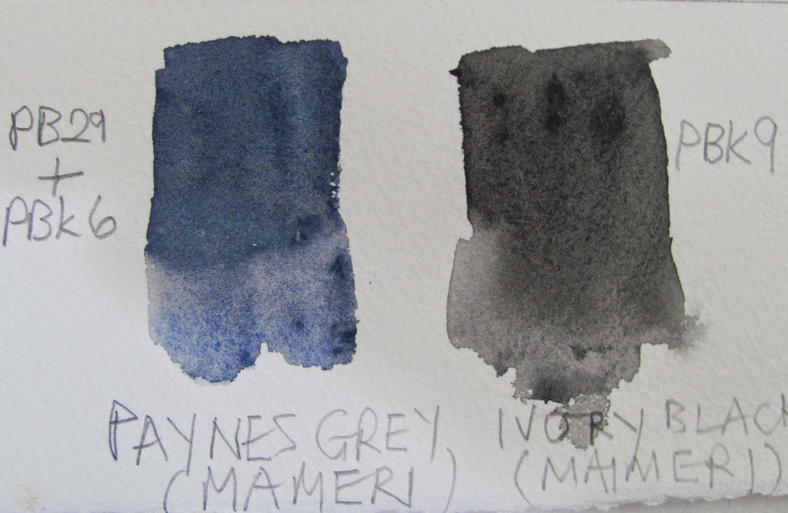
Maimeri : Paynes Grey on left, Ivory Black on right.
We then go to Ron Ranson who mentioned the controversy in at least one of his many books saying that combined with some yellows Paynes Gray made some interesting greens and concluded by saying it was " a tremendously useful colour". Charles Reid, while not having Paynes Gray in his normal palette certainly used it on occasion, mainly for skies.
What does Handprint say? This from Bruce McEvoy : " The watercolourists four traditional shadow colors were Neutral Tint, Payne's Gray, Indigo (See the Indigo convenience mixtures) and Sepia (see the convenience mixtures under Pbr7)"
Pigment information for Winsor & Newton is PB15 (Blue), PBk6 ( Black) and PV19 (Quinacridone Rose or Red), in other words a blue, black and red combination. Daniel Smith, the flavour of the moment combine PB29 Ultramarine Blue, PBk9 Black and PY42 a yellow often featured in Yellow Ochre or Raw Sienna paints. Maimeri on the other hand combine PB29 Ultramarine Blue with PBk9 black. Holbein have four pigments in their version PR83, PB27, PB29 and Pbr7 - note a red, two blues and a black. Schminke offer two versions, Paynes Grey (PR101, PB29, Pbr7) and Paynes Grey bluish (PBk6, PB15:6), which they say was produced `by demand', and finally Daler Rowney who use PBk7 and PB29 - a black and a blue. These are the ones I've looked at but I'm sure you get the picture. What to do and do you really need this colour?
The swatch is from an old tube of Maimeri Payne's Grey I've had for years. It is still viable although I haven't used this colour in recent years. I hesitate to differ from someone as exalted as Robert Wade, a charming man as well as a superb artist, but in my limited experience it was useful for dark storm clouds. As for making greens I wouldn't know.
Do you need this colour? I'm inclined to say no as it is easy to mix an approximate `Payne's Gray' from a combination of Ultramarine Blue, Burnt Umber or Burnt Sienna. You might have to play around with the proportions but you get there in the end.