Quantcast
Channel: The Watercolour Log
Viewing all 502 articles
Browse latest View live

Charles Reid at Stow - Day Three

$
0
0
Wednesday dawned, a thoroughly miserable damp and cold day, quite a contrast from Tuesday, but as we were indoors and the hall was well heated this wasn't a problem. The subject was Charles trademark combination Flowers/Still Life. 


 Guess Who!


Charles Craig Young palette. Note the small amounts of paint and his latest addition Cobalt Violet, in the bottom right position. His two greens are Oxide of Chromium and Viridian but he also mentioned Cobalt Green Dark and you can see two shades in the third pan across, second row down. Charles also talked about only putting out sufficient paint needed as it must be fresh, nice and juicy, so that the tip of the brush digs into it. Sometimes he mixes on the palette, quite often straight from paint well to paper. As for makes he mentioned Winsor & Newton but had many tubes of Holbein, his long time choice, in his box.

Charles started with a quite complicated drawing using on this occasion some Schut very rough paper. He draws lightly, using a mechanical pencil, and when painting will improvise. Mostly he uses Fabriano Artistico paper, although he likes Schut Noblesse, which isn't generally available. The Schut rough he used - I'm not sure what it is called - is very rough and can give a different effect, although not the easiest to paint on. He also likes the Czech Moldau hand made paper.


This was the subject and Charles spends some time moving things around, both flowers and objects until he gets them exactly where wanted.


Checking its just right.


The completed drawing.

When he started painting he usually starts at the rim of the receptacle and likes to let paints work together, with a quite complicated interaction between the green leaves and flowers. He paints shapes rather than things and connects stems when the flowers are still wet.


The flowers are painted first - shapes not things. Value is more important than colour. You will note that he likes to have a flower(s) in the lower position rather than a mass of green leaves as in the actual composition. Apparently he particularly likes to paint white flowers, not everyone's favourite colour.


He starts adding the window frames and said you must vary the colour. He added some background,  painting around the window frame. Avoid `mushy' colour apart from shadows. The darks are incorporated as he paints - no adding later. Timing is important as if too wet you can get a mess.


Almost there!


The finished painting a typical Charles Reid speciality, with many at this workshop particularly interested in this part of his repertoire. As usual Charles takes regular breaks - every 20 minutes or so - and goes outside to smoke his pipe. I noticed on more than one occasion clouds of smoke emanating from it! Probably contemplating a tricky bit. Charles is very communicative when painting, only occasionally going quiet when he needs to especially concentrate on a particular section. Part of the reason for the breaks is to let parts of the painting dry before pressing on. It isn't all wet-into-wet. He is actually quite pragmatic in his approach.


Together with the subject Charles painted,  four other still life's - all with the same basic flower theme - were set up for the students afternoon painting session. groups of three to four congregating around each one. Charles circulated and commented on work in progress, while helping those who asked for assistance.

One thing I've missed is the critique, which took place at around noon or a little earlier after Charles had finished his demonstration. Each student was asked to submit one painting which Charles would then comment on. In my case I submitted the painting of Chris at the Stow Lodge Hotel. I mentioned earlier  Charles made one basic criticism that the tree looked out of place and, the painting would be better without it - also the tree colours were too cool -  the rest being okay. 

The afternoon finished at around 4.30pm and all headed for their hotels, most thoroughly exhausted, or in my case a 20 mile car journey to my sister at Ducklington. Exhausted? After such  intense concentration you usually are.  Charles commented earlier that a two and a half hour session was enough for him during a day, and he found it hard to understand how some artists painted all day.








Charles Reid at Stow - Day Four

$
0
0
With the weather again inclement it was decided to repeat yesterdays subject of a Flowers/Still Life arrangement. Before going any further I should have explained that the way his workshops are planned is that Charles paints, demonstrates and instructs, while Jane and Judy ensure that things run smoothly throughout the week. This isn't as straightforward as it sounds. For example the caretaker had said we must not get paint on the carpet, although there were plenty of marks on it already.  This involved putting down sheets of cellophane and taping them together! 

For the Flower subjects they arrived with an enormous bunch of flowers, a bag of fruit and some vegetables, the flowers then split and arranged into five separate bunches. When this was being done I commented to Judy about the preponderance of white flowers. This was when she said Charles likes painting them.

On this occasion he chose a different arrangement. You may note the other objects not just fruit. The duck is a regular as are some of the other items.


After the usual checking and re-arranging Charles commences the drawing.

Charles starts drawing with the duck. He draws the vase - inside first. Don't draw straight stems look for ovals. He said the place you start is not as good as the place you end up or vice versa. 


 The completed drawing


 This was his palette for today with added paint. Compare it to yesterdays photograph.


The initial application of paint which always begins in the centre by the rim of the vase. Note the Cobalt Violet.  Use single strokes and keep the brush on the paper. You thus start darker and end lighter. Vary the direction of your brush strokes. When painting the bottle the brush takes different directions. The colours on it are made up, Lemon Yellow and Cobalt Blue were mentioned. It isn't always easy to follow Charles as he often improvises as the mood takes him and is certainly not regimented in any way.


Things begin to take shape. Flowers are just indicated without any real detail.


See how things develop. Note how the white flower is moved to just above the rim to break up the greenery. Charles always says don't overdo the leaves.


The flowers are virtually finished.


Not a great deal left to do.


A closer look.


The finished Painting.


The students paint under Charles eagle eye.

Following Charles demo a second critique took place in which students offered up another painting. Charles commented on each one after asking what the owner felt about it. We then broke for lunch and recommenced at 1.30.pm, everyone selecting a different arrangement to  previous. I did not have a good session and scrapped the first two attempts, one at a very early stage. I'm afraid I was somewhat distracted by phone calls I'd received on Wednesday afternoon from the estate agent involved in my house selling/ buying, which is causing a lot of grief, and lost concentration. That sounds like a cop out and probably is, although the painting I did then was better than on this day. 

Painting carried on until 4 -5.pm with Charles supervising as you can see above. We then dispersed with the much awaited portrait session scheduled for the final day. After my poor performance so far I determined to finish on at least a higher note! One sad (but happy) note. Latifa Kostas, a Charles Reid regular for some years left at midday to return to London. We were told the following day that she now has another granddaughter! Latifa never paints between workshops as she says she is just too busy. Over the course of the week you can see how her painting improves and is much better at the end than the beginning. I noted this on previous workshops and have told her so. A salient lesson that painting regularly is essential if you really wish to progress.  


Charles Reid at Stow - Day Five

$
0
0
Friday, the final day of the workshop dawned with much better weather, although as we were indoors this didn't matter. The subject today was the much anticipated portrait/figure session and the model was Jane, who I had first seen modelling for Charles in 2007, on my very first workshop at Burford. I gather she has also done so subsequently. I have a photograph of the painting Charles did on that occasion, which is one of my favourites, now owned by our organizer Jane Duke. You will note it was combined with flowers and other objects, quite a different approach from today's painting.


 Jane at Burford in 2007


Jane at Stow in 2013

Charles began with a faint outline creating a silhouette.  He then made the head smaller and drew the hands which he does very carefully, where things intersect. Charles took regular breaks as much for Jane's benefit as his own. These are about every 15 to 20 minutes. Charles is very solicitous for the models well-being constantly asking if she is all right, and to some amusement initially kept mixing her name up and calling her Mary.


With the face start with the eye and check position, using these as a starting point for the nose, mouth and chin. Check the corner of the eye with the face, the other side with the hairline. The next key problem is the length of nose which students often get wrong. Don't make a hard line of the light side and stress the upper line of the nostril without making it into a black hole. Use mouth for the distance to the hair. At bottom of chin go to the neck making the chin line faint and subtle. Keep losing lines by erasing.


Note this is an accurate but not detailed drawing- quite loose in fact..


The initial loose washes. Plenty of paint and water using an Escoda 1212 Kolinsky sable size 14. This is larger than any I have and I was able to examine it between breaks. It is a lovely brush and I'm sorely tempted to invest in one (I just have). In general the equivalent Da Vinci Maestro Series 10 is roughly two sizes larger, but comparing the diameter of the No.14 brush heads is only fractionally wider, while costing 50% more. I don't have a length comparison but I doubt there is a lot in it.


The painting has now dried before Charles moves to the next step.


Started detail changing to the Da Vinci Maestro 35 size 6, I think the number is different in North America, which is longer and slimmer (and more expensive) than the Series 10. Charles stressed that you shouldn't do the eye as a solid block but in pieces, placing paint. He adds green and Raw Umber, Cadmium Red at corners, over the top Cerulean and a little red, but not on the upper lid. He works wet in wet with up and down strokes then the eyebrows.. Don't overstress under the eye. Don't stroke - press the brush, Soften edges as you go. Edge control is really important. He restates quite a lot.


Next the nose painted with Cadmium Red and Raw Sienna. No blue in the nostril just a dot.


Under the nose and indicates mouth with light wash. First step the centreline - don't make too dark! Constantly softens and corrects.


The mouth is completed then the lips and chin. Stay away from sides -stay in centre. Starts on chin, softens adding red and brushes away from it. Don't leave a pronounced chin line.


A start on the hair and hat. Note they are painted as one shape and not separated. Don't fill out the hair leaving an escape route. Use the same colours under the hat brim  and paint out into the hair. Colours mentioned here Ivory Black and Burnt Umber.


Further work to define the hat.


Charles used a minimum of strokes (5) for the hair/hat and said more screws it up! Small final touches as he reviewed painting. Some white gouache was added at the end, although looking at the painting it isn't obvious where. He always says don't spend too much time on the hair, although in this instance the hat and hair are combined as one large shape..


The sequence above shows the final result.

This was a fascinating session and you could hear a pin drop most of the time, although Charles constantly explains what he is doing and why. We then broke for lunch and unfortunately as it was Friday and nearing the end  four of the students departed, as they had long journeys and connections to make. This meant only thirteen remained for the afternoon session. As the weather was somewhat better I went down to a fish and chip shop I'd noticed called Greedys and bought some  for my lunch. They were excellent and I enjoyed them sitting on a seat at the area where Charles first painted outdoors.

 I realise these notes are a little rough but it isn't easy to  write down or remember everything. I hope nevertheless that they convey the gist and flavour of the demonstration.

When we reconvened at 1.30.pm the students sorted themselves out position wise and began to draw and paint the model. As it was my turn on the front row this carried over to the painting session and I was able to position myself closer to Jane and also only slightly to the side. I think this gave me a considerable advantage over some of the others. I shall cover my efforts, and explain why I wasn't able to photograph other student paintings, in a final post in the next two days.

For those who are interested in Portraits the Charles Reid way I recommend the  DVD `Figurative Watercolours' (APV Films 2012). Portraits feature in many of his books but the ones that stick in my mind are his final book `Watercolour Solutions' and `The Natural Way to Paint'. Both can be obtained from Amazon and some other booksellers.


The Watercolourfanatic at Stow

$
0
0

Well it's over, my fifth and possibly final Charles Reid workshop in 6 years. I only intended to go to one originally but kept coming back for more. Why the final one?  Charles is only coming to the UK every two years so the next one would be in 2015, when we will all be two years older. Age is something I'm becoming more conscious of, even though my father was almost 96 before he departed. Will Charles and Judy come again? When I said goodbye to him his words were `see you again' so who knows.

This workshop was different to the others in that it was not residential. This was due to increasing insurance costs which rapidly increase as we get older and that was the case here. Jane Duke, who has organized Charles Workshops in the UK in the last few years, told me 2015 hadn't been mentioned although he was going to Italy in 2014. With all the travelling involved throughout  the United States and abroad it must be very tiring for Charles and Judy, as I well know, Charles and I being very close in age. As the students were aware that Charles, Jane and Judy were staying at the Grapevine Hotel  six also elected to do so, eleven more spread around various other hotels and B & B's in Stow. As I had free board and lodging with my sister a short drive away it was no contest, although as a result I partially missed out on the social side of the workshop. Charles seemed to me not quite his old self on the first four days, although his paintings were as good and exciting as ever. That's one of the great things about  artists - their painting skills never seem to leave them. The week after Stow was  Burford and Genevieve Buchanan, who I had met previously, was there and tells me it was excellent. By now Charles will have finished filming the DVD at Burford with Town House Films, and I imagine he and Judy will be back home.  I gather it will be called `Cotswold Sketches'. 

On previous workshops on the last evening an exhibition was held of the students paintings, to which any other residents and staff were welcome to visit. This enabled me to photograph them but that wasn't an option here and I apologize for that omission. Instead you will have to make do with my modest efforts. In previous reports I've said I was unhappy with my paintings. I had hoped to go out in a blaze of glory but it wasn't to be. 


I abandoned this one as I was unhappy with my handling of the greens above the rim of the vase.


This was average but inferior to the one hanging in my studio, painted at Urchfont (now sold to a private owner) four years previously, again the greens poorly handled..


The plein air study painted on the second day. I have detailed Charles remarks about it earlier.


This was my third attempt, another unsatisfactory result.

After these tales of woe I determined to do better on the final day, which was the portrait session. It was my turn to be on the front row for the demonstration, along with three others, and this carried over in positioning ourselves when we painted Jane.


You can see what an advantage I had regarding position.


The initial drawing


40 x 50cm Schut Noblesse 140 lb (300gsm) Not

When home I made some small changes, one being the left hand line of the face, otherwise I was pretty pleased with it, especially given my previous efforts. Strangely enough I thought Charles seemed much more like his old self on the final day, but perhaps it was me who perked up.

Did I learn from this workshop? I'm sure I did as it reinforced a number of things where I'd regressed and also refreshed me despite the aforementioned difficulties. When I've had more time to digest this workshop, and it's lessons, I may return to the subject. For now that's it folks I'm exhausted! 


More Bird Paintings

$
0
0
These are my latest bird paintings for `Painting Colorful Birds for Fun' on Facebook. 

Western Tananger -15" x 11" Gerstaeker No3. 200gsm Not

Oranges and yellows predominate with some green and yellow in the background..

Fork-Tailed Woodnymph Hummingbird - 15" x 11" Fabriano Artistico 90lb Not

Here it is mainly greens and blues.

Orange-breasted Sunbird (1) - 15" x 11" Amalfi Hand-made paper 90lb (or less)

Orange and Turquoise with some Ivory black, with yellows and greens in the background. Also a touch of red.

Orange-breasted Sunbird (2) - 15" x 11" Waterford Rough 140lb.

This is my favourite so far.The flower is a mixture of Quinacridone Purple (Daniel Smith), Ultramarine Violet (Rowney PV15) and Ultramarine Blue. The bird mainly Translucent Orange (Schminke PO71), Turquoise (Lukas PB16), and Prussian Blue (Graham PB27) with some Indian Yellow (Rowney PY153). There are touches of Sap Green, Ivory Black and Burnt Umber. Raw Umber in background and Sap Green for the flower stem.


Southern Gound Hornbill (1) -15" x 11"Gerstaeker No3 200gsm Not

This is the latest subject `The Southern Ground Hornbill'. What a handsome fellow - maybe to another Hornbill but otherwise..... Mainly blues, purples and oranges with Raw Umber, Burnt Umber and Ivory Black. Also some Acrylic white. Much more detailed than previous but I couldn't see how to handle him in any other way. 


Another Hornbill (2) -15" x 11" Gerstaeker No.3 200gsm Not.


I realise birds are not everyone's favourite subject but in this instance allow me to indulge my penchant for colour. They generally take from 45 mins to an hour including breaks. One good thing is that it helps me keep up the painting momentum. Also on the Facebook page you can compare how other artists tackle the subject and these include professionals, not just amateurs like me. Very instructive. A note on Gerstaeker paper. This is a cheap cellulose paper only from Great Art. www.greatart.co.uk It is very cheap bought in a large pad (65 sheets) and is even cheaper than Bockingford,  In this instance of turning out many paintings it is a budget choice rather than the £1.00 plus cost per sheet of cotton-based papers. More of a sketching paper really. You may note however that (in my opinion) the best painting is the Sunbird one on Waterford rough.  

Pacific Wreck

$
0
0
The final official Spring meeting of  Avon Valley Artists took place last Thursday. We will still meet during the Summer but there won't be a programme - just do your own thing, either indoors or outdoors. The subject was `Wrecks and Ruins' - again subject to wide interpretation. Unfortunately I forgot my camera (again) and I wasn't able to photograph the resulting paintings. Sorry about that. It wasn't intentional but the result of me missing several recent meetings and losing my routine.


15" x 11" Wrecked Mitchell WW2 Bomber

For `wrecks and ruins' I came up with a reference of a crashed B 25 Mitchell bomber, probably in the New Guinea area. New Guinea and the Pacific islands are still awash with wrecks from World War Two and efforts are still being made to reclaim parts of them for museum exhibition or - if still moderately intact - for full restoration. Judging by the state of it - stripped of parts and the original paint having vanished - I'd say it was taken post-war but exactly when I don't know. Several bomb groups of the Fifth Air Force were equipped with Mitchells, and operated from June 1943, initially from Port Moresby, until the end of the war. They were renowned for their very colourful  `nose' art, none of which is visible here so I could be mistaken.. 

I first made an accurate but not super detailed drawing then began to paint. I used my Escoda 1212 travel brushes, sizes 8 and 12, together with a Rosemary retractable rigger and an Isabey Size 6 retractable. Mostly the larger brushes. For the greens I used various mixes of Viridian, Hookers Green, Sap Green plus a couple of mixes with Cobalt Blue and yellow. The darks were mixtures of Ultramarine, Burnt Sienna and Burnt Umber plus Quinacridone Rose (PV19) and Viridian (PG17). The other blues are Cerulean and Cyan Blue (PB15:3). To warm things up a little I added Quinacridone Gold (DS PO49) and Quinacridone Rust (Graham PO48). I also used Raw Umber and Raw Sienna. I am quite pleased with the result as I feel I painted it with more freedom. Far too many colours? It doesn't look like that to me so who knows? I'm beginning to think the benefits of my most recent Charles Reid workshop has been to free me up, where I was previously tending to tighten up.  I'm not sure what the paper is as it was done on the reverse side of a discarded painting - it could be Centenaire. The total time was just over an  hour with breaks.

Charles Reid Watercolour Workshop Supply List

$
0
0
As a postscript to the Charles Reid workshop at Stow I thought readers might be interested in his recommendations for materials. This is a subject that always creates great interest although I suggest you read what Stan Miller says about the subject! I have slightly edited these comments - not much mainly about where to buy - and those in bold are mine. 

COLOURS: Alazarin Crimson or Carmine, Cadmium Red Light (Holbein), Cadmium Orange (other makes), Cadmium Yellow-Orange (Holbein), Cadmium Orange (other makes), Cadmium Yellow Light, Cadmium Yellow Pale, Cerulean, Cobalt Blue, Ultramarine Blue, Antwerp Blue (or Peacock Blue from Holbein), Ultramarine Violet. I use Viridian and Oxide of Chromium Greens, (bring the greens of your choice), Yellow Ochre, Raw Sienna, Raw Umber, Burnt Umber, Burnt Sienna and Ivory Black. This is my basic palette but these colours are not required. At the Crantock workshop in 2011 Charles had a number of Winsor & Newton pans side by side in the wells of his Craig Young Paintbox, as well as Holbein tube colour in most of the others. I counted 24 in all. This time he seemed to have gone back to Holbein tube colours (see illustrations in the workshop posts) and I counted no more than seventeen. Alazarin Crimson and/or Carmine? These are both PR83 which is considered fugitive (it fades), although only Daniel Smith amongst makers actually calls it fugitive. Winsor & Newton do give it, along with one more paint, it's lowest rating but most other makers are ambivalent in the way they rate it. Charles may be using the permanent version of Alazarin Crimson, and certainly mentioned `Alazarin Crimson - Permanent' at Crantock. Holbein Carmine though is PR83. I've never heard Charles talk about pigments, and when the question of the permanence of PR83 Alazarin was raised at a workshop by another student seemed genuinely puzzled, and remarked he'd never had any complaints of fading. If you wish to follow this controversy see my May 2011 posts on both Alazarin Crimson and the Permanent version.

BRUSHES: Good brushes are your most important consideration. I wish you could manage at least one round Kolinsky sable brush. I use Maestro No 77 from Art Express. The Escoda brush is a bit less expensive than the Maestro. If you don't stroke with the tip, your brushes will last for years. Along with your other brushes I'd suggest a No.8 Maestro OR an Escoda Reserva No.10. They are about the same size. On all workshops I've attended Charles has always recommended Da Vinci Maestro, although I've noticed examples of other brushes in his container. He visited the Escoda factory fairly recently when on a workshop in Spain and they now offer a three brush `Charles Reid' set of 1212 retractables. I have several Escoda 1212 travel brushes and rate them highly, although Rosemary & Co also do a fine range and so do Da Vinci (expensive and only up to a 6) as well as some others. You should note that Da Vinci appear to have different numbers for their brushes in North America and the UK equivalents are Maestro series 10 and 35. The recommended Series 35 are longer, slimmer and more expensive than Series 10.  

PAPER: I use 140lb (300gsm) Fabriano Artistico Rough and Cold Press but you should bring the paper you're used to. I discourage D'Arches blocks. They are highly `sized' and difficult to use with my direct painting approach. Always try put your paper before the class. Blocks come in various proportions depending on the maker. Choose a size that allows you to complete a painting in a single session (about 2 -2.5 hours). Charles also uses Schut and Moldau but Fabriano has been his long term favourite.

PALETTE: A Hand held palette is best. Plastic tray palettes are difficult for class painting, inside or on location. I've found students tend to have large amounts of old and dried paint in the overly large wells. It's necessary to have fresh or older paint that's very moist for this class. Holbein has a folding metal palette as well as a small inexpensive plastic palette with the colours I use squeezed out and ready to go. Use a small spray bottle to dampen the colours before class. A Watercolour Sketchbook, for notes and painting along during demos. 9.5" x 13" (closed) is a good size. I don't suggest corrections on students paintings so have your sketchbook handy. On this workshop Charles used his small Sketchers box, which holds 16 colours and also his other Craig Young paintbox as illustrated in earlier posts.  

STUFF: I use mechanical pencils, 7mm and 9mm HB in class. You will always have a sharp pencil for contour drawing with a mechanical pencil, a kneaded eraser, and a water container. If you're not using a block you'll need clips or tape to secure paper to board (I use a 1/2" thick foamcore panel, cut to the size of the paper I'm using).

AN EASEL THAT WORKS: Don't plan on tables or table top easels. Please make sure you understand your easel. It should be light, easy to set up and allow you to paint with your paper and board at a 30 - 45 degree angle.

LANDSCAPE SUPPLY LIST: You can't always count on shade.Painting in direct sunlight is hard on the eyes. It's also more difficult in judging colour, value and drying time. I often work on my lap with a small WC block or sketch book.  (I need an umbrella for my demonstrations using an easel). Travelling with an umbrella is proving too difficult. I'd just bring a chair or stool you can carry and use your body to shade your painting as you work on your lap.  An easel isn't necessary unless you need to work standing. A sketch book can be a good remembrance of your trip, perhaps better than a camera. The sketch book idea is ONLY a thought not a requirement.

You'll need a small hand held palette. if you don't have a metal or plastic hand held palette, a plastic palette with colours included is a good choice. I wish you wouldn't bring synthetic brushes. They are cheap but don't hold paint or water and don't "flex" well. Escoda have a fine line of Reserva travel brushes which I highly recommend. I'd choose Nos.6, 8 & 10. If you could manage it a 12 would be good but not necessary. Charles does not like synthetic brushes at all, which he says don't suit with his direct method of painting, but several top artists use synthetics so it is a matter of choice and how you paint.

You'll need a water container, spray mist bottle, mechanical pencil with extra leads, Nos 7 and 9 HB or 2B. Very important a kneaded eraser.

Think about your set before you come. If you bring an easel - Does it work? You'll need a small container to hold your brushes. I use the top of a thin mailing tube with holes to loop a string around a clip attached wherever handy - always bring extra clips.


Avon Valley Artists at Saltford Festival

$
0
0
For the second annual Saltford Festival Avon Valley Artists were invited to hold another exhibition in St Mary's Church Hall. Some 20 members exhibited paintings, in total 87 framed and 20 - 30 unframed. The exhibition took place at the opening Saturday of the festival and continued into Sunday. The standard of painting was good, especially so for an amateur group, with many high quality paintings. There were a good many watercolours, but other media, apart from oils, were well represented. 


Jan King, Robert Heal  and Jan Weeks man the table. Jan on the right sold 8 paintings, a mixture of framed and unframed, and was easily the most successful member.


The exhibition was actually open when I arrived to do my stint on Sunday midday but as it was lunchtime was empty. I  was unable to help earlier as I have been suffering from a virulent cold and cough.


I actually sold two framed and this was one of them. A Snow Leopard. This went right at the death!


Yvonne Harry


Pauline Vowles


Jo McKenna


Pat Walker


This was the other painting I sold, shown by request. 


I don't think any of the above sold (except the one I've just added on 11/06/ 13) which surprised me a little, although having seen what sells (or rather doesn't sell) at numerous amateur exhibitions it is very difficult to determine - not in every instance - the reasons people buy .  


A small exhibit at the entrance. The painting on the left from Jan Weeks (pastel) sold.


The painting top centre is another of Jan Weeks works and you can see from the red spot that it was snapped up. Really when one sees the quality of paintings and the prices asked, compared to gallery prices, it is strange more are not sold. I think many are quite as good as some of the paintings sold in many galleries


.


Two potential customers with Robert in the centre study a prospective purchase.


We had a steady trickle of visitors during the two days but traffic was not heavy. Despite this some 11 framed and 6 unframed were sold, not particularly high but reflecting the reality what happens at amateur art exhibitions these days. There can hardly be a week without exhibitions taking place within the general area so  the market is somewhat saturated and the austerity squeeze is also a factor.


Packing up at the finish. Always the worst part!

I think the exhibition can be rated a success as after all selling paintings is not the only aim. It reflected well on the group and its members. At the beginning of May, when I was at Stow, the AVA had a more successful day at the Newton St Lowe Mayday event when visitor numbers were much higher. 


Korean Watercolour Paints

$
0
0
 A year or two ago Jacksons www.jacksonsart.com/ introduced Shin Han watercolour paints to the UK. Shin Han are a Korean company, who like Mijello, appear to sell a range of art materials. The range comprises 72 paints and the naming of them leads me to believe they are shadowing Holbein the well-known Japanese maker. The marketing policy is to price them well below the leading makes and to get some well-known artists to promote them. 


One is always attracted by a possible alternative to the increasingly expensive leading makes. Shin Han looked attractive and I ordered a tube of Jaune Brilliant No.2 (PO20/PW6). Jan Weeks, one of the leading members of Avon Valley Artists, bought a tube of Mineral Violet. This is a very small sample I fully accept but I thought it horrible and Jan was not impressed with the Mineral Violet (PV15). PO20 is Cadmium Orange, PW4 white and PV15 Ultramarine Violet. There are opposing views which I will cover later.

When I was able to access pigment details I was even less impressed. Shinhans pigment choices vary. They do utilise a number of obsolete pigments, by which I mean those that have been dropped by the majors. There are also suspect pigments that are not considered fully lightfast. White is present in 12 colours and dyes in two others. PR83 (fugitive) is used in four paints and only 20 colours are single pigment out of 72, a much lower percentage than that of the majors. The single pigment argument is one that doesn't necessarily have universal agreement. There are good pigments used in many paints so you could selectively pick out some decent paints.

My overall conclusion is that Shinhans pigment choices and mixtures vary from the mainstream manufacturers, so is this an innovative company or are these examples of cutting corners on cost? Another  question  arises, especially when Mijello Mission Gold is included,  are they produced under a different philosophy?

I referred to differing views. Arnold Lowrey, the well-known Welsh artist swears by them - or he did - and a very good artist at my local group also loves them, having previously used Winsor & Newton. Some other members have bought the 72 tube box offer that works out at just over £2 a 15ml tube - about a quarter of the equivalent Winsor & Newton, and much cheaper than any other leading make. They `claim', apart from four colours including two dyes (!) classed as `Moderately Permanent', that all the rest are either `Absolutely Permanent' or `Permanent'. Personally, as a follower of Handprint, I wouldn't accept these ratings without a deal of scepticism.

I suspect sales have been very good as the prices are so cheap and many artists don't bother about such things, accepting that they are `Artist Quality' as that's what it says on the tin, Jacksons give them a fulsome write up. By all means try them. They may suit you but you need to be very selective, not easy as the pigment details are difficult  to find in chart form. I eventually did  but it was so tortuous I can't remember how I finally succeeded. I can find no other UK source than Jacksons so why not ask them to provide pigment details?

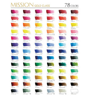
This piece was prompted by the emergence in America of another Korean make called `Mission Gold', made apparently by Mijello who also do a range of plastic palettes. There has been a  high profile campaign to promote them using a professional artists(s), and an extensive thread appeared on Wetcanvas which dissected them in quite a forensic way. They aren't in the UK yet, although the palettes are, but where America goes we are sure to follow. Mission Gold is also being promoted on Youtube. I might add a third Korean brand is called Alpha. When I accessed the latter website it left a banner across my opening screen that I struggled to remove.


This one has 34 colours

A thread was started on Wetcanvas asking if anybody had any experience with the new range. Immediately a lady called Mary Henderson popped up, claiming to be a professional artist with thirty years experience in teaching, making the most extravagant claims. She says `Mission Gold are as fade resistant as other brands...the normal is considered 100 years (!)'...I am now using Mission Gold watercolors for all my personal works and teaching. Very importantly, so are all the other professional artists that I personally know.....' and so on and so on. Somewhere else she claims they are `the best watercolors in the World'. It soon became obvious she was connected with the company, but some very strong and pointed comments did not bring any clarification. If you go on Wetcanvas go into `Watercolor' then either `Palette Talk' or `The Learning Zone' carries the thread. If you enter `Mission Gold' in the top right search window then `Forums' you'll get to it.

Dick Blick, the mail order art specialist, who have a superb site, list all the pigment information although you have to access individual paints to see it. Someone on WC went through the lot and came up with the following;

Total number of colours = 90.
11 colours were composed of fugitive pigments or dyes.
10 colours were `fair to good'
9 colours `may fade in tints, either whole or in part'.
5 colours had no pigment and/or lightfastness info.

The rest of the colours had ratings of either excellent or permanent, very good, or good but names are often misleading. Example Cerulean is made from Phthalo Blue, A majority are mixed pigments.

The conclusion from someone as particular and knowledgeable as Virgil Carter was `this doesn't look like a mature and truly artists-grade line of paints'.

There is some confusion over the number of paints on offer both 78 and 90 being mentioned but I found another chart with 34 so there may be a crossover somewhere. 

Once again some artists who had tried Mission Gold disagreed to some extent and there are many paints in the range made from excellent pigments. Another artist www.chrisbeckstudio.blogspot.co.uk/ said she had conducted extensive lightfastness tests   and recommended they be avoided. 

It seems to me these paints are produced in a different manner to that of the European and American makers and it isn't easy to judge them accordingly. There is talk of mixing them in Geranium jars to music!!! Apart from pigments the additives are different and they seem to lean towards a more opaque result.   Perhaps in this respect they are similar to Chinese watercolours like Marie's. According to the artist Lian Quan Zheng Marie's are `between watercolour and Gouache'. 

What conclusion can be reached from all this? Mine would be to avoid them but each to his own. Try them by all means if you are interested, if and when they become available, but always remember caveat emptor! 


A Peacock

$
0
0
This is the latest subject on Facebook `Painting Colorful Birds for Fun'. This is a complicated subject, especially if the bird is displaying, and I decided to adopt a minimalist approach with the head and neck the main focus, the remainder secondary with just an impression. Some others have attempted the full subject but it is too complicated for me. 


15" x 11" Not Possibly Artistico 90lb.

The colours on the neck and head are mainly Turquoise (Lukas PB16) and various other blues. Sap Green features as does Raw Umber and Ivory Black. Just a touch of Quinacridone Rose (PV19).


Pebeo Drawing Gum

$
0
0
The use of making fluid isn't universal, with some artists for and many against. I don't have any hangups and am prepared to use anything if I feel it beneficial. Don't overdo it though. I have used it sporadically from time to time and a few months ago attended a Bathampton demo where the head of the Bath University Art Department gave a portrait demonstration. During it he mentioned Pebeo Drawing Gum, which he said was hard to find but was the best he had ever used. I'd never heard of it but soon realised he was talking about  masking fluid. Subsequently, although he said one of the Bath art shops stocked it, I found it in Jacksons catalogue. It is listed on page 54 of the latest catalogue under Watercolour Mediums.  The small container contains 45 ml and I found it best applied with a ruling pen. It costs £3.95p. 


Pebeo Drawing Gum and ruling pen. The pen is four inches long and the bottle less than 3 inches from top to bottom. Note the huge relative size of the top.

I am still not expert in it's use but am getting better and the application of masking fluid is one where practice makes perfect or at least acceptable! With the ruling pen you can get very thin lines and the control is excellent - becoming better as I become used to it.

We now come to the negative bit. If you spill any liquid either on clothing, carpets or anything else lookout! This stuff is lethal and I haven't found a satisfactory way of removing it. Other masking fluids may be similar but I think the problem is compounded here by the cap design. For some reason - probably cost - makers are changing many of their bottled products from the old - easy to remove - smallish metal screw tops to these plastic ones, which are much larger and have a lot of threads. This coincides with the change from glass to plastic. Winsor & Newton have done the same and my latest bottle of ox gall has a top that is almost impossible to remove. You can get it partially off which then causes it to leak. With the Pebeo I returned from a Bathampton session to find most had leaked in my carry bag, went through it and onto the carpet. The cap was on but had not fully clicked into place and the liquid went everywhere. At another session drips from the cap went onto my trousers and can't be removed. Also make sure it is absolutely dry before painting because otherwise it will ruin your brushes.

Is it worth buying? If you use masking fluid in small amounts then absolutely providing you are extremely careful when unscrewing the top and even applying it. Liquid also collects inside the rings of the top and can drip out when you take it off. Be very, very careful.

I have not been terribly active on the blog recently due to a combination of circumstances, illness (nothing really serious), holidays, and complications with our projected house move which has affected my focus. The holiday is over and the illness improving but the latter remains a problem, hopefully for not much longer.

Drawing

$
0
0
It is often said that sound drawing is the basis of all good painting. I don't think many will dispute this and certainly my advice to anyone starting young would be to spend the first two years just learning to draw properly. Workshop teachers will tell you that one of the problems they have is that students - particularly those who have taken up painting late in life - want to start  painting immediately without getting too involved in the basics. I have made sporadic attempts to improve my drawing and it is certainly better. One of my problems is that I don't have the steadiest of hands, a reason why I was attracted to the Charles Reid method of modified contour drawing. I don't pretend I can do it as well as him, but even Charles has been heard to say some people think he can't draw a straight line. During my association with various local art groups, and on some workshops, one comes across quite a few people who have had occupations that involved precise drawing. Many want to `loosen up' but find it very difficult to use this kind of drawing skill to produce good paintings. This is a general comment  and there are always exceptions to the rule. 

There are hundreds of books on drawing, all claiming to be the best in various ways, and it is difficult to choose from such a variety. Some cover drawing from the basics to the pinnacle, while others cover specific subjects. I have accumulated quite a number but don't pretend I have studied them cover to cover.


This is the classic work by John Ruskin, first published in 1857 and remains: "one of the most sensible and useful, both for the amateur and the professional artist.


Originally published a century or more ago this is another classic full of sound advice. It isn't just a how to book but covers every angle ..."brings to the beginner a clear statement of the principles that he will have to develop and their importance in creating a work of art"...


If you wish to go the Atelier route then this book by Juliette Aristides is a good starting point together with her previous works `Classical Drawing Atelier' and `Classical Painting Atelier'. This type of drawing is enjoying a revival with a number of `Atelier' schools having been set up fairly recently. Probably best for the young, dedicated art student just starting up. It comes with a DVD and I shamefully confess I haven't viewed it - yet.

I'm not going to mention all the books I have just a few I particularly like.


This is my favourite recommended by Charles Reid, who considers it the best book on drawing. I like it a lot and  believe it would help most of us who wish to improve our drawing skills. Dodson wrote a second book but I didn't like it nearly so much.


This is written by the Bristol artist John Palmer in the Ron Ranson `Painting School' series. John has an idiosyncratic style that might put off many but is highly individualistic and exciting. Not for everyone. His pencil work is astonishing.


This is just one in a whole series written by Barrington Barber, a British artist and teacher. They are basic, inexpensive primers full of sound advice.

I have several others including the Betty Edwards `Drawing on the Right Side of the Brain', a seminal book which has sold in huge quantities and several editions. I've never really got into this one I have to confess. As an amateur `dabbler' I don't pretend to have an encyclopaedic knowledge of  drawing books and no doubt there are many other choices of equally valuable books. I once started a thread on Wetcanvas, actually as research for this post, asking for members views on the very best books but all I got  was the usual litany of advice about which or what one I ought to get, most missing the point completely. 

All the above were obtained from either Amazon or Abebooks. The only one that proved difficult to obtain, eventually from Abebooks, was John Palmer, which was also the most expensive. Prices on all the others were very reasonable.


Paintings I Like (Amongst Others)

$
0
0
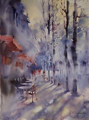
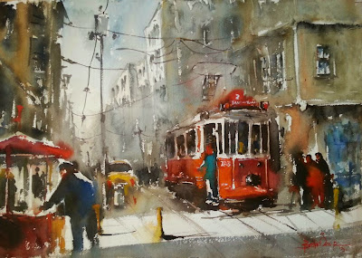
In my travels across the net, particularly on Facebook, I have accumulated a vast number of paintings, all watercolour I believe. Many are absolutely stunning although I realise this is down to individual preference.They cover a range of styles leaning towards the impressionistic and colourful. I have deliberately excluded portraits, of which I have a vast number. In most cases I know little about the artists. there are so many, of whom a lot are relatively unknown in the West. My own painting has lapsed in the last month for reasons I have indicated elsewhere, but looking at many of these  is sure to increase the desire to get out the paint brushes and just paint! 


Christian Couteau


Viktoria Prischedko


Gerard Hendriks


Burhan Ozer


Millind Mullick


Yuko Nagayama


Zhao Zhigiang


Direk (or Derek) Kingnok


Geoffrey Johnson


Z L Feng

I think that will do for now. I have many, many more and if this creates enough interest I will repeat the process with more stunning paintings. I think I have most of the artists names  but welcome corrections.


Schmincke Watercolour Paints

$
0
0
Schmincke are the leading German manufacturer of watercolour paints, which they have been making since 1881. Their motto is "I strive for the  best" and they are still owned by the Schmincke and Horadam families, now into the fourth generation. Contrast that with Winsor & Newton, sold to a Swedish company, who have now sold them to a German company and recently moved manufacture of the paints to France!


The above brochure I obtained some years ago, just after the range had been reformulated. It now comprises 110 colours and is available in both tubes, 15ml and 5ml, and full and half pans. It may no longer be available but have no fear it can be downloaded from the website as a PDF and studied at leisure. Details later.


The information presented for each colour is comprehensive and very useful. Information on transparency, and lightfastness is clearly stated and looking at the Schmincke ratings they seem to me to be pretty realistic and they also add that ...` no watercolour should be exposed to direct sunlight for a prolonged time due to the usually fine and thin and thereby light sensitive colour application'.... 

Schmincke use Kordofan Gum Arabic from the Southern Sahara region as the binding medium which they say differs from year to year, depending on the crop - like good wine! They are therefore very selective in only purchasing the best available crop. They also state Oxgall is useful but only if carefully integrated. Schminke however are dead against the use of honey.due to it's propensity to attract flies.

What of the range? Of the 110 colours 70 are single pigment paints and the use of good reliable pigments is prevalent. Only three colours are given no ratings, Brilliant purple, Brilliant red violet and Brilliant blue violet. The latter two are dyes. The controversial Alazarin Crimson  (and Rose Madder) are given two star ratings - limited lightfastness. 

I don't have a great deal of experience with Schmincke, currently  using only Translucent Orange (PO71) and Translucent Brown (PBr41), both excellent paints. The orange is a favourite. Like most manufacturers they do have their quirks. For example `Ultramarine Blue' is a mixture of PB15:1 Phalo Blue and PB29 Ultramarine Blue. `Pure' Ultramarine Blue is called Ultramarine Finest. Cobalt Blue tone is a mixture of PB29 and PW4 (white). Cobalt Blue Deep (PB74) and Cobalt Blue light (PB28) are the correct pigments. This illustrates once again that you should buy paints by pigments not colours.  They also have a few four pigment mixes, mainly in the brown shades and  a number of three pigment mixes. If you lean towards single pigment paints there is still plenty of choice.

Current prices from Jacksons www.jacksonsart.co.uk/  range from  £6.50 (15ml) Series 1 to £12,00 Series 4.  Once again you have to be careful as there are not that many in series 1 and manufacturers differ in the way they rate paints (pigments). See `Watercolour Painting on a Budget Pt.2' April 2013  for an explanation. I tried to find them on the Great Art site but the recent revised one is far less user friendly and although they do sell Schmincke could I find the 15 ml tubes? No, nor the 5ml and pans. Ken Bromley introduced Schmincke watercolours a year or so ago but discontinued them almost immediately claiming there was `no demand'.   A few other suppliers sell them like Pullingers and I found them in a large art shop in Truro, Cornwall. They are freely available in the USA from some of the leading mail order suppliers.

What does Handprint say about Schmincke? Overall not a particularly flattering review although he raves about the `marvellous colour brochure' and picks out Translucent Orange as `unique'.  Following this review a number of artists took issue with him, primarily photo-realistic and botanical painters, who preferred the `consistent texture and less emphatic chroma'.  

As Schmincke have been selling watercolours for well over 100 years they must be doing something right and I suggest one keeps an open mind. The literature is certainly second to none. The details of the full range could hardly be bettered and include notes on each colour which go beyond the simple statistics. To get this information go to the Schmincke website www.schmincke.de/ and look up watercolours. As mentioned the full colour/pigment information and much else can be downloaded as a PDF. It is identical to the brochure. I should mention that a budget range called Akademie is also offered in a limited range of half pans, mostly in sets..

Back to Painting

$
0
0
After my recent blank period I finally got back to painting. The relatively minor health problems I have suffered are more or less over, although the house move is still not finalized. Nevertheless the other day I managed a drawing in my `studio'. As I am sorting my art stuff ready for moving it is somewhat disorganized but nevertheless I managed.


Drawing of Eurasian Magpie. A `Colorful Birds' Subject.

Today was the `unofficial'  weekly Thursday Summer session of  Avon Valley Artists. What is meant by this is that members still meet at St Mary's Church Hall, but there is no programme and everyone does their own thing. The number varies but is lower than during the official Autumn and Winter programmes. I decided to take part and so did five other members - a little below normal.


Eurasian Magpie 15" x 11" Gerstaeker No.3 200gsm not.

When I made the drawing I aimed for an accurate but not over detailed result. The bird is essentially black and white, like most Magpie species, but includes some nice turquoise  areas, which I exaggerated slightly. I used two brushes, mostly the Escoda 1214 Retractable size 8, less so a Rosemary retractable rigger. The bird is Ivory Black (Maimeri) and Turquoise (Lukas PB16) with some Prussian Blue (PB27). There are small touches of Raw Umber and diluted Cerulean, the latter for shadows in the white areas. The branches are alternate warm and cool, with Cerulean for the cool and Raw Umber, Burnt Umber and Raw Sienna for the warm. A little Ivory black was added for the darker shadowed areas. I splashed Raw Sienna, Gold Ochre  (W & N PY43) and Quinacridone Burnt Orange (Daniel Smith PO48) onto the background, brushing out some of the splashes. Some over painting but kept to a minimum. I think that's it. I was quite pleased with the result. Painting is like many other interests in that a period of inactivity leads to rustiness. I should add the painting was done for the Facebook page `Paint Colorful Birds for Fun', which has proved very popular.  As I finished early (I always do) I commenced the next Colorful subject by completing the initial drawing. 


Northern Cardinal (North America).

I aim for a loose drawing and compare this with the guide photo as I go along. I do have to erase and redraw parts although I try and avoid too much erasing. This looks reasonably okay but I often make changes after further study.  


Northern Cardinal

$
0
0
This is the completed painting of the drawing shown at the end of the previous post. On studying the drawing I realised the tail was not quite right so changed the contours and erased the old line.


Northern Cardinal 15" x 11" Gerstaeker No.3 200gsm not

This was another in the `Paint Colorful Birds For Fun" Facebook page. It was done quite quickly and with a limited number of colours. The bird is mainly Cadmium Red Pale (Rowney PR108) and the surrounding green Hookers Green, which I splashed on. before painting.  I drew on a number of very fine lines of Pebeo Drawing Gum applied with a ruling pen. The eyes and chin are Ivory Black (Maimeri) and the beak mainly Indian Yellow (Rowney PY153). Pigment PY153 is becoming unavailable so I'll have to find an equivalent.  The tree trunk he is perched on is a mixture of Raw and Burnt Umber, some Cerulean and Quinacridone Burnt Orange. Also some darks from Ultramarine and Burnt Umber.

Gerstaeker No.3 is a cheap cellulose paper, exclusively from Great Art, which comes in a pad of 65 sheets, and the only brushes used were the Isabey 6 retractable and the Escoda 1214 No.8.

Don't think I'm only concentrating on birds from now on. This is just to get me into the painting groove again. I think I shall attempt a portrait or two very soon and then other subjects. My pending house move will interrupt things when it finally happens, possibly in around a months time.

Avon Valley Artists

$
0
0
This week the Thursday session took place, after last weeks abortive attempt, and sixteen members took part. This is informal with everyone `doing there own thing' rather than a fixed subject. Some prefer this but in the discussion that took place afterwards, the consensus seemed to be that the majority favoured a  programme with defined subjects. We may not like some of the subjects but it does make you exit your comfort zone.


Even the seating is informal!


Yvonne Harry at work. This coming week sees the annual exhibition of Yvonne and Jan Weeks at the famous Wells Cathedral - some 130 paintings on show.


The finished work


Jan Weeks at work.


The painting at bottom left is by Pat Walker, while that at bottom right is by Pauline Vowles. 


This was mine which was done for the `Paint Colorful Birds for Fun' page on Facebook, the subject being the Barn Swallow. Struggling as I have been recently to do any painting it was a difficult subject and I didn't do it justice -it's another one for the recycle bin -  but at least I got some paint onto the paper.


A replacement for PY153, New Gamboge, Indian Yellow etc?

$
0
0
In 2012 the popular pigment PY153 Nickel Dioxine Yellow was discontinued, no doubt because of lack of demand from the chemical and/or auto industries. As has been pointed out previously makers of watercolour or other types of paint are very much at the bottom of the pile and have to take whatever is available. Although not offered by a huge number of paint makers PY153 was the pigment used by both Winsor & Newton and Daniel Smith for the popular New Gamboge paints. Both have already reformulated with a multi pigment mix. In addition Rowney and one or two others called it `Indian Yellow, supposedly a replacement for the notorious original Indian Yellow. Why notorious? It has been said, and repeated many time, that this paint was made in a vile process by feeding cows in India with certain types of leaves, that turned their urine yellow, and this was the foundation of the paint. Although this story has been repeated many times I, in my capacity as a (very) amateur historian, researched the story and discovered that it might all be nonsense with no real basis in fact.   

The Rowney Indian Yellow is a staple in my palette so I have to decide at some stage on a replacement. I still have a full tube so this isn't urgent. Handprint claims several orange-yellow and yellow-orange paints make adequate replacements but basically plumps for three, PY35, PY65 and PY110. Before I continue you will find that several paint suppliers still list PY153 and may continue to do so. Can you trust the labelling? Possibly but I have my doubts and in fairness one can't expect a manufacturer to immediately change the labelling for just a single paint. I notice that Winsor & Newtons new style bare metal tubes appear to have the information printed on them so that may mean they can change details quite rapidly.  Winsor & Newton have also said that their usage of pigments is so large that, when a pigment is discontinued, they run out quite rapidly.


The left swatch is Indian Yellow from Rowney. The two middle swatches are Permanent Yellow Deep (PY139) from Maimeri and Venezia respectively, while the right  one is Cadmium Yellow Light ((PY35) from Lukas. The closest appears to be the Lukas paint but, being a Cadmium, is opaque and also toxic. The two Maimeri paints appear more orange. Neither PY65 or PY110 are (as yet) widely available but PY65 is listed by W & N  as Winsor Yellow Deep, also by DaVinci as Hansa Yellow Deep and Arylide Yellow Deep. Daniel Smith call it Hansa Yellow Deep. So far PY110, which is highly praised by Handprint, is only on offer from Daniel Smith and Graham - Permanent Yellow Deep - Indian Yellow  respectively. This may change  in the medium to long term.. Daniel Smith call PY108 Indian Yellow.

What to do? I don't have to change immediately so will ponder the problem for a while. My inclination is to try PY110 maybe from Daniel Smith. Any corrections or additions to the above are welcome and can be incorporated in the text.

Latest Paintings.

$
0
0
Despite all the background noise and current distractions I have managed to do some painting recently, although rustiness is evident. I read somewhere that in order to maintain your current standard you need to paint at least three times a week, and in order to improve more than that. Having done very little painting since late May I know the feeling.

A while ago my friend John Softly sent me some photos of boat scenes at Staithes in North Yorkshire. John has become friendly with the artist Robert Brindley who supplied them. I hope Robert won't mind me using them as guide photos and acknowledge him as the source.


The Red Boat 18" x 12" Fabriano Artistico Extra White 300gsm Not

What attracted me was the red boat. It was a very misty scene and the background was only hinted at. Apart from the red - a mixture of Cadmium Red Pale and Translucent Orange (Schminke PO71),with Cerulean on the other boats, most of the background has various greys, quite a bit puddle colour, the bane of my guru Charles Reid. Raw Sienna and Raw Umber also feature. The greys primarily from Ultramarine and Burnt Sienna. It is on the crude side but here I am following my guru who often says on his workshops `be cruder', aimed at preventing fussy over detailed paintings.

This one is the latest bird painting for `Paint Colorful Birds for Fun' on Facebook.


The Puerto Rican Spindalis. 16" x 12" Fabriano Artistico Extra White 300 gsm Not.

As you can see a colourful subject. Colours used were Translucent Orange (Schminke PO71), Gold Ochre (W & N PY43), Cerulean, Ivory Black and ? 

I have also started on another Indian portrait. Actually I did one at Thursdays Avon Valley Artists session but it was a bit of a disaster. It was of an Amerindian called Chief Washington. I'm sure I've read about him in one of my books but a search on Google came up with nothing. I used hotpress paper as an experiment. I really was much too careless, just wanting to get back to painting, and I shall have another shot at him soon taking much more care - and using cold press paper! The previous portrait I did was in May at Stow so this emphasized the need to keep ones hand in. 


Mijello watercolours arrive!

$
0
0
As I predicted - I'm not always wrong - Mijello are now available in Europe and the UK from Great Art www.greatart.co.uk/ In the latest special offers booklet, which arrived today, a full page is devoted to them. The heading is `Save up to 50% on Quality Watercolour'. Prices are extraordinary cheap but at least they don't say `artist quality'. Read the following though:-

.....to further improve the properties of their paints classical music is played for the water during the mixing and dispersion process as the unique sound wave patterns stimulate the water and paint molecules and enhances their complexity and beauty. And once the initial production is complete they allow the colours to mature in traditional Korean pots which create natural germanium and help ensure the best quality paint.....

Oh and by the way these are claimed to be the first watercolour paints than don't utilize the hardening agent silicium dioxide. Almost lost for words after that lot I don't quite know what to say - at least when I get my voice back!.

See my piece in March about these paints and what others on Wetcanvas had to say about them, including an analysis of the pigments used and lightfastness tests by the artist Chris Beck. To summarize there are 90 (it says 89 in another place) colours and Great Art prices, in 5 series, start at £2.10 up to £4.35. I doubt I'll buy them but I'm sure many will attracted by the prices and marketing blurb, and we know a great many artists, not just amateurs, don't have a clue what paints are made of  accepting what it says on the tin. Am I being cynical?

What other offers are there for watercolour artists from Great Art. Apart from this incredible offering - and I don't mean incredibly good - we have Schminke watercolours at up to 50% off, Clarefontaine and Canson Montval paper, DaVinci squirrel brushes all at reduced prices plus other bits and pieces. Free delivery if you spend over £39.95p..
Viewing all 502 articles
Browse latest View live


Latest Images